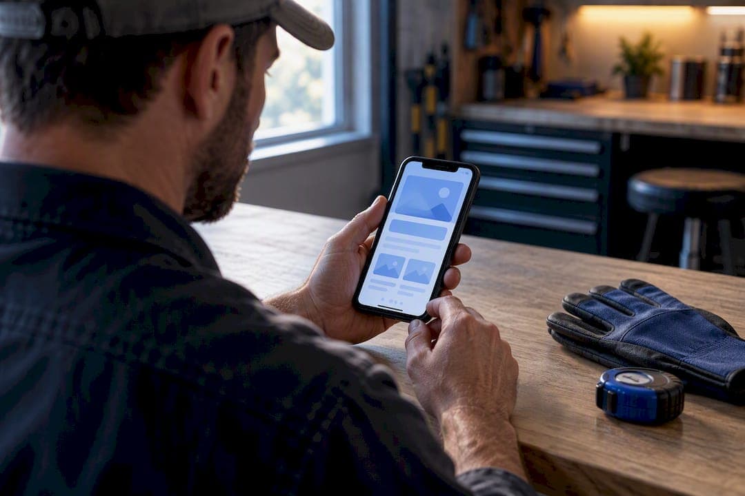
A lead-generating portfolio website layout is a mobile-first page structure built around one job: turning a phone screen glance into a call, text, or form submission. On mobile, that means three things above everything else: a hero that names the outcome and puts a tap-to-call number in the thumb zone, one primary call-to-action repeated instead of buried, and trust signals visible before anyone scrolls.
TL;DR:
- Most local service websites fail to prioritize mobile clarity and single-strong CTA, significantly reducing conversions compared to optimized layouts.
- Contact forms should be limited to three to five fields with proper input types, and click-to-call should be a persistent, prominent element for urgent trades.
- Service pages must focus on one specific service with a clear outcome, correctly structured local signals, and a prominent CTA to attract quality leads.
- Website speed targets include a load time under 2.5 seconds for Largest Contentful Paint and proper lazy-loading, to prevent visitor loss and improve Google ranking.
- A high-converting mobile layout features a hero with a headline and tap-to-call, trust signals, three key services, a case study teaser, and a sticky CTA that remains accessible as users scroll.
Table of Contents
- What Makes a Portfolio Website Layout Convert on Mobile?
- How Should Contact Forms and CTAs Work on Mobile?
- What Belongs on Service and City Pages for Local SEO?
- How Do Case Studies Build Local Trust?
- Which Performance Metrics Actually Protect Your Leads?
- What Does a High-Converting One-Screen Layout Look Like?
- Why Visual Hierarchy and Grid Systems Matter More Than You Think
- How Should Navigation and User Flow Work on a Lead-Generating Site?
- How Do Typography and Color Build Brand Consistency?
- What Responsive Design Means Beyond Just Mobile-First
- Using Images, Video, and Animation Without Slowing Things Down
- What Accessibility Standards Should a Small Business Site Meet?
- Author Perspective: How Forge Web Studio Approaches Portfolio Layouts for Texas Service Businesses
- How Forge Web Studio Builds Layouts That Actually Convert
- Sources
- FAQ
What Makes a Portfolio Website Layout Convert on Mobile?
Most Texas contractors and service owners still design for a desktop monitor, then shrink it down and hope. That's backwards. Google itself crawls and ranks the mobile version of your site first, so the phone layout isn't a secondary concern. It's the main event.
The hero section carries the heaviest load. A headline that names the service and the outcome ("Emergency AC Repair in San Antonio, Same-Day Service") outperforms a vague tagline every time, because visitors coming from a search or a paid ad need instant confirmation they're in the right place. Below that, a short subheadline, one large primary button, and a phone number formatted as a tap-to-call link.
Button sizing isn't a design nicety. Apple recommends 44x44 point tap targets and Google recommends roughly 48x48 dp, and thumbs miss smaller buttons constantly, especially on the edges of the screen where most people hold their phone. A trust bar sitting just under the hero, showing review stars, a license badge, or years in business, resolves credibility before a visitor has to think about it.
Elements that belong in the first screen:
- Headline naming the specific service and outcome
- One primary CTA button, full width, high contrast
- Tap-to-call phone number, visible without scrolling
- A short trust bar (reviews, badges, or a guarantee line)
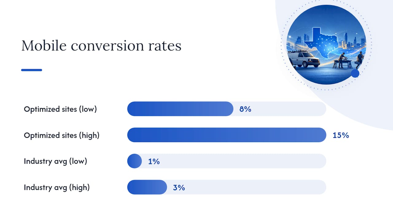
Local service sites built this way convert at 8 to 15% versus the 1 to 3% industry average, and the gap almost always traces back to hero clarity and a single obvious action.
Pro Tip: Write your hero headline as if someone found you through a Google ad and has eight seconds before they bounce. If it doesn't answer "can you fix my problem, right now, near me," rewrite it.
How Should Contact Forms and CTAs Work on Mobile?
Forms lose leads at every extra field. Keep them to three to five fields, single column, with input types set correctly so the phone keyboard adapts (tel for phone numbers, email for email addresses) and autofill actually works.
For high-urgency trades, plumbing, roofing, HVAC, locksmiths, click-to-call should be the default path, not an afterthought buried at the bottom. Mobile devices generate more than 60% of website traffic, and a visitor searching "burst pipe repair near me" isn't looking to fill out a form. They want to tap and talk.
Build the contact flow in this order:
- Put a tap-to-call number in the sticky header or a floating action button that stays visible while scrolling.
- Offer a short form as the secondary path for non-urgent inquiries (quotes, consultations, general questions).
- Add a text-to-schedule or booking link as a third option for visitors who prefer not to call.
- Test one long form against a shorter multi-step version. Progressive disclosure, asking for name and phone first, then project details, often outperforms one long form because it feels less like work to complete.
Sticky elements need care. A sticky call button and a sticky header can visually collide on smaller phones, so test at 375px width before launch. Done right, a persistent click-to-call element can lift call conversion by 25 to 40% in tested layouts.
Pro Tip: If you run paid ads, send traffic to a landing page with only a phone number and one form field. Every additional field after that costs you conversions on paid clicks specifically.
What Belongs on Service and City Pages for Local SEO?
Each service page should cover exactly one service, with a clear outcome statement and a CTA above the fold, not a laundry list of everything you do crammed onto one page. A roofing company should have separate pages for roof replacement, storm damage repair, and gutter installation, each answering a different search intent.
Local signals matter as much as the words on the page. Keep your name, address, and phone number identical across your site, Google Business Profile, and directories. Local searchers are acting on immediate intent, so visible hours, a linked address, and a Google Business Profile connection all reduce friction between search and call.
A few structural habits that make service and city pages work harder:
- List a price range and the factors that move it (square footage, materials, urgency) so calls come in pre-qualified.
- Link each service page to its relevant city or neighborhood page.
- Link service pages to a related case study or completed project for proof.
- Repeat the CTA at the top and bottom of longer pages.
Vague pricing scares off serious buyers and attracts tire-kickers. A published range does the opposite.
How Do Case Studies Build Local Trust?
A portfolio project only earns its place on the page if it follows a clear structure: the challenge the client faced, the approach taken, a measurable outcome, supporting visuals, and a closing call-to-action. Skip any one of those and the case study reads like a photo gallery instead of proof.
Forge Web Studio structures its own case studies this way. The Calder & Vale project, Fieldwork Architecture, and Northline Private Wealth each pair a specific business problem with the layout decision that solved it, then show the result rather than just describing it.
A few rules for using case studies effectively:
- Show three to six projects on a homepage or services page, not everything you've ever built.
- Lead each one with the specific problem solved, not just a screenshot.
- Include a real client testimonial or a quantified result (faster load time, more calls, higher form completions) where you have one.
- Link each teaser to a full case study page for readers who want the details.
Before-and-after visuals work especially well for redesign projects, where the contrast tells the story faster than paragraphs of copy ever could.
Which Performance Metrics Actually Protect Your Leads?
Speed isn't a technical detail you can push to later. A slow site loses visitors before they ever see your hero headline. Aim for a Largest Contentful Paint (LCP) under 2.5 seconds, a full page load near 3 seconds, and a fast Interaction to Next Paint (INP) score so buttons respond the instant someone taps them.
Practical build rules that get you there:
- Compress every image before upload; don't rely on the browser to do it.
- Lazy-load anything below the first screen so it doesn't compete for bandwidth on initial load.
- Defer non-critical JavaScript (chat widgets, tracking pixels) until after the page renders.
- Serve assets through a content delivery network.
- Use semantic markup for contact details (
tel:links, correct input types) so screen readers and browsers handle them properly.
A slow, clunky mobile experience pushes people to leave fast, and that behavior feeds back into how Google evaluates your site over time, since mobile engagement is now the primary signal it measures. Fast sites don't just convert better in the moment. They tend to hold their ground in search results, too.
What Does a High-Converting One-Screen Layout Look Like?
Picture the mobile homepage stacked like this: hero with headline and tap-to-call, trust bar, three core services with short descriptions, a case study teaser, then a closing CTA block. That order isn't arbitrary. It mirrors how someone actually decides whether to trust you enough to call.
A workable one-screen wireframe breaks down like this:
- Hero: headline, subheadline, primary CTA button, tap-to-call number.
- Trust bar: review stars, license badge, or a guarantee line.
- Three services, each with an icon, one sentence, and a "learn more" link.
- Case study teaser: one project photo, one result, one link to the full story.
- Sticky CTA that follows scroll and never overlaps a form field.
Before launch, run through a short checklist:
- Phone number visible without scrolling on every page.
- Forms capped at five fields with correct input types.
- All buttons meet the 44 to 48 pixel tap target minimum.
- Page speed tested on a real mid-range phone, not just a laptop simulator.
- Analytics tracking calls, form submissions, and button clicks separately.
One-page sites work well for a single-service business in one city. Multi-page architecture, with separate service and city pages, wins once you offer more than two or three services or serve more than one metro area.
Why Visual Hierarchy and Grid Systems Matter More Than You Think
Visual hierarchy is the order your eye moves through a page, and on mobile that order gets compressed into one narrow column, which means every design decision carries more weight than it would on desktop. If your headline, CTA, and trust bar all fight for attention at the same visual weight, none of them win.
Size, weight, color, and spacing establish hierarchy. Your headline should be the largest text on the page. Your CTA button should be the highest-contrast element. Everything else, body text, secondary links, footer content, should visually recede so the eye lands on what matters first.
Grid systems bring order to that hierarchy. A 12-column grid on desktop typically collapses to a single column on mobile, but the underlying spacing rules, consistent margins, aligned edges, predictable gutters, should carry through. When elements snap to a grid, the page feels calm even when it's showing a lot of information. When they don't, the layout feels cluttered no matter how good the individual pieces look.
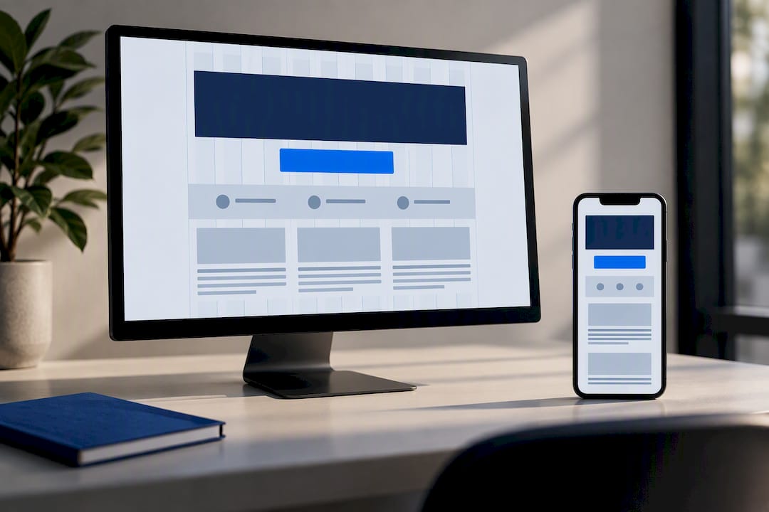
Whitespace does real work here too. Cramming a hero, three services, and a case study teaser into a tight vertical space without breathing room makes a phone screen feel chaotic. Generous spacing between sections signals structure before a visitor reads a single word.
A practical rule: if you can't explain why an element is bigger, bolder, or higher up the page than another, its position probably needs rethinking. Hierarchy should always trace back to what you want the visitor to do next.
How Should Navigation and User Flow Work on a Lead-Generating Site?
Mobile navigation works best when it's boring. A hamburger menu with four or five items, home, services, about, case studies, contact, gives visitors exactly what they expect and nothing to figure out. Clever or hidden navigation patterns look creative in a portfolio deck and frustrate real visitors trying to find your phone number.
The ideal user flow assumes most visitors land on one page, not your homepage. Someone clicking a Google ad for "roof repair Austin" should land on a roof repair page, not your homepage where they have to hunt for the service they searched. That page needs its own path to conversion: headline, CTA, trust signal, without forcing a detour through the main menu.
Keep the call-to-action reachable from every screen. A sticky header with a tap-to-call button or a floating CTA that follows scroll means a visitor three screens deep into your case studies never has to scroll back up to take action. That single design choice recovers leads that would otherwise get lost mid-scroll.
Breadcrumbs help on deeper multi-page sites, especially for city and service page combinations, since they show visitors exactly where they are and give search engines a clearer read on your site structure. Keep the click depth shallow. A visitor should reach a service page, a contact form, or a case study within two taps from the homepage, three at the absolute most.
How Do Typography and Color Build Brand Consistency?
Typography choices signal professionalism before anyone reads a single word. Two typefaces are usually enough: one for headlines, one for body text. A serif or bold sans-serif headline paired with a clean, highly readable sans-serif body font covers nearly every service business without looking generic.
Font size matters more on mobile than most owners expect. Body text under 16 pixels forces visitors to zoom, and zooming breaks the layout you carefully built. Headlines should scale down gracefully on smaller screens rather than wrapping awkwardly across four lines.
Color does two jobs at once: branding and function. Pick one primary brand color, one accent color for CTA buttons, and a neutral palette for backgrounds and text. The accent color should appear nowhere except on the elements you want tapped, buttons, links, urgent alerts, so it keeps its power to draw the eye.
Consistency across every page matters more than any individual color choice. A roofing company using a different shade of blue on its homepage than on its contact page looks unfinished, even if each page looks fine in isolation. The same headline font, button style, and color palette should repeat identically from the homepage to the deepest city page on the site.
What Responsive Design Means Beyond Just Mobile-First
Mobile-first sets the baseline, but a genuinely responsive layout has to hold up on tablets, laptops, and the occasional oversized desktop monitor a client browses on at the office. Designing mobile-first and stopping there leaves awkward gaps on larger screens, stretched images, orphaned whitespace, buttons that look tiny on a 27-inch monitor.
Breakpoints should reflect actual usage, not arbitrary pixel counts. Common ranges cover phones, tablets in both orientations, and desktop, with layout adjustments at each stage rather than one jump from a single column to a rigid three-column grid. Images need multiple resolutions served through responsive markup so a phone doesn't download a desktop-sized file it doesn't need.
Testing on a browser resize bar isn't enough. Real devices behave differently. Older Android phones render fonts and spacing differently than a new iPhone, and a tablet held sideways changes how much content fits above the fold. A layout that only gets tested in a simulator at a handful of preset widths will always have blind spots real visitors find for you.
Print styles and email-shared links deserve a thought too. A visitor forwarding your quote page to a spouse or business partner often opens it on whatever device is nearest, and a layout that breaks outside its intended range loses that second decision-maker entirely.
Using Images, Video, and Animation Without Slowing Things Down
Photos of real completed work outperform stock photography every time for local service businesses. A visitor comparing three roofing contractors trusts the one showing their own crew and their own finished jobs, not a generic stock image of a house that could belong to anyone.
Video works well in small doses: a fifteen-second clip of a completed project, a short founder introduction, a walkthrough of a finished space. Long autoplay videos with sound, though, drain mobile data and patience fast, so keep them short, muted by default, and optional to expand.
Subtle animation, a button that shifts slightly on tap, a section that fades in as you scroll, adds polish without distraction. Animation that delays content from appearing, or that moves elements around while someone is trying to read, does the opposite of its intended job. It gets in the way.
Every image needs compression before upload, and anything below the first screen should lazy-load so it doesn't compete with your hero for bandwidth. A gallery of forty uncompressed project photos can quietly add several seconds to load time, and that delay costs you visitors before they ever see the work you're proud of.
What Accessibility Standards Should a Small Business Site Meet?
Accessible design isn't a compliance checkbox. It's the difference between a visitor completing your form and giving up. Contact links using proper tel: and mailto: markup let screen readers and assistive tools recognize them correctly, which matters for visitors using voice navigation or switch devices, not just screen readers.
Color contrast needs to meet a readable standard, particularly for CTA buttons and body text against background colors. Light gray text on a white background looks clean in a design mockup and becomes nearly unreadable in direct sunlight on a phone screen, which is exactly where a lot of local searches happen, in a driveway or a parking lot.
Every form field needs a visible label, not just placeholder text that disappears the moment someone starts typing. Placeholder-only forms cause confusion, especially for older visitors or anyone interrupted mid-form who forgets which field they were filling in.
Tap targets that meet the 44 to 48 pixel guidance help every visitor, not just those with motor impairments. Alt text on images benefits screen reader users and gives search engines more context about your completed projects. None of this requires a specialist. It requires treating accessibility as part of the layout decisions from the start rather than a fix applied after launch.
Author Perspective: How Forge Web Studio Approaches Portfolio Layouts for Texas Service Businesses
Templates get a site online fast, but they rarely match how a specific trade actually generates calls. Forge Web Studio's priority order stays the same on every build: mobile clarity first, lead flow second, local SEO baked in from the start, custom work where it changes outcomes, and rapid launches without treating speed as a shortcut past strategy.
— Dylan
How Forge Web Studio Builds Layouts That Actually Convert
Most agencies quote you a redesign timeline measured in months and a retainer that never seems to end. Some agencies quote you a redesign timeline measured in months and a retainer that never seems to end. Custom, mobile-first sites can be built rapidly, with clear pricing and no ongoing lock-in unless you want maintenance help.
Projects can start with a Free Website Review, a direct look at your current mobile hero, contact flow, and speed, so you know exactly what's costing you leads before committing to anything. From there, pricing is transparent: a Starter Website begins at $500, a Growth Website at $1,200, and a Custom Business Website at $2,500, each scoped to a fixed price with no surprise add-ons.
If your current site already gets traffic but isn't converting it, a Website Redesign rebuilds the layout around the priorities covered above. If visitors simply can't find you, Local SEO work fixes that separately. And if your site technically works but loads slowly on phones, Responsive Website Development addresses the underlying build. Every project stays yours: full ownership, no templates. Start with the Free Website Review and see exactly where your current layout is losing leads.
Sources
Start with Google's mobile-first indexing documentation to understand how your mobile layout affects ranking. Run your site through PageSpeed Insights to check LCP, INP, and overall Core Web Vitals scores against real thresholds, not guesses.
For lead-generation specifics, the Shopify guide to mobile lead capture covers form and CTA sizing in more depth. Local service businesses comparing conversion benchmarks can check the PinPoint Promote local service conversion guide, and professional services owners looking for credibility patterns should see the Tatem Web Design guide for business owners. Test everything on an actual mid-range phone, not just a desktop browser's device simulator.
- Mobile sites: mobile-first indexing - Google Search Central
- Mobile lead generation: how to capture leads on phones — Shopify
- Website Conversion Optimization for Local Service Businesses (2026 Guide) | PinPoint Promote
- Mobile-First Design for Local Business Websites | ProfileTree
FAQ
What is a lead-generating portfolio website layout?
It's a mobile-first page structure built to turn a phone visitor into a call, text, or form submission through one clear action rather than a decorative gallery. The hero, contact flow, and trust signals all point toward that single conversion path.
How fast should a mobile page load to keep visitors?
Aim for a Largest Contentful Paint under 2.5 seconds and a full load near 3 seconds. Slower load times push visitors to leave before they see your CTA, and that behavior can affect how Google evaluates your mobile site over time.
How many form fields should a mobile lead form have?
Keep it to three to five fields in a single column, with correct input types for phone and email so autofill works properly. Shorter forms consistently outperform long ones because mobile visitors abandon complex forms faster than desktop visitors do.
How much does a custom small business website cost?
Forge Web Studio's pricing starts at $500 for a Starter Website, with Growth and Custom Business options priced higher based on scope. Full current pricing and package details are listed on the pricing page.
Should I use a one-page site or separate service pages?
A single-service business in one city can work well with a one-page layout. Once you offer multiple services or serve more than one city, separate service and city pages perform better for local search relevance and pre-qualifying calls.