
Prioritize this structure: a benefit-led hero headline, three tier cards with one clearly highlighted as recommended, a visible monthly/annual billing toggle that shows real savings, a scannable feature comparison, and CTAs sized and worded for mobile thumbs. The goal is simple: a visitor should understand what to buy and click within about 10 seconds of landing.
TL;DR:
- Having a prominent hero benefit statement and a clearly highlighted middle tier boosts conversion regardless of layout.
- Placing the billing toggle above tier cards with real, upfront savings encourages more customers to choose annual plans.
- Collapsing feature comparison tables into accordions on mobile prevents layout issues and helps visitors compare plans easily.
- Including social proof or a logo row near CTAs reduces hesitation, especially when paired with a short FAQ close to the pricing section.
- Prioritize mobile-first design, clear benefit language, and fast-loading, accessible elements to outperform complex or slow-loading pages.
Table of Contents
- Real Pricing Page Examples Worth Stealing From
- What Every High-Converting Pricing Page Gets Right
- How to Build a Pricing Page Step by Step
- A 10-Minute Pricing Page Audit You Can Run Today
- How Forge-web-studio Thinks About Pricing Pages
- FAQ Content Near Pricing and Enterprise Options
- The Overrated Advice and the Part Nobody Skips
- Skip the Guesswork, Get a Page Built for You
- Sources
- FAQ
Real Pricing Page Examples Worth Stealing From
You don't need to invent a layout from scratch. Most high-converting pricing pages fall into five recognizable patterns, and knowing which one fits your business saves weeks of design debate.
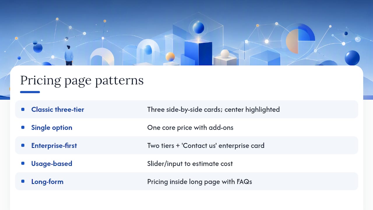
Classic three-tier grid. Three cards, side by side, with the middle option visually boosted (a border, a badge, a slightly taller card). This is the default for subscription software and works because it uses contrast to nudge choice without forcing it. Galleries like Pricing Pages collect dozens of variations on this exact format, which tells you how durable it is.
Single option with modular add-ons. Instead of three competing tiers, one core price with optional extras listed below it. Agencies, consultants, and service businesses use this pattern often because their actual scope shifts client to client, and forcing that variability into rigid tiers just confuses people.
Enterprise-first, contact-sales. Two visible tiers plus a third card that says "Contact Us" instead of showing a number. Workflow automation tool n8n's pricing page is a clean example of this, mixing transparent lower tiers with a gated enterprise option for buyers who need custom terms.
Usage-based / calculator. A slider or input field lets visitors estimate their own cost based on volume, seats, or API calls. This suits products where value scales with usage rather than feature count.
Long-form, content-heavy pages. Less common but effective for complex B2B products: pricing sits inside a longer page with FAQs, comparison logic, and trust content woven throughout rather than isolated in cards.
A large roundup of 65 pricing pages groups examples by exactly these jobs, which makes it a fast way to see how competitors in any category solve the same problem differently.
Mobile behavior separates the good examples from the mediocre ones. The strongest pages stack tier cards vertically, collapse comparison tables into accordions, and keep the billing toggle pinned near the top instead of burying it below three screens of scrolling.
What Every High-Converting Pricing Page Gets Right
The anatomy of a pricing page that actually converts hasn't changed much in years, even as visual trends shift. Design teardowns consistently point to the same set of components, each doing a specific job.
The hero. Lead with the outcome, not the number. A headline like "Get found by local customers this month" outperforms "Our Plans" because it frames price as an investment rather than a cost. Keep the subhead to one line.
Tier naming and descriptions. Starter, Growth, and Scale (or equivalent names) should map to a real difference in who buys them, not just a features count. Write each tier's description around one outcome: "For solo owners getting their first site live" reads better than a bullet dump.
The recommended tier. Give it visual weight, a contrasting CTA button color, and a small badge ("Most Popular"). Position it in the middle or, on some pages, slightly larger than its neighbors.
Billing toggle. Place it directly above the tier cards, default to whichever cadence you want more customers choosing, and state the savings in plain numbers rather than a vague "save more."
Comparison table. Group features by category (not one long list), bold the differences between tiers, and on mobile convert it to an accordion instead of forcing horizontal scroll.
CTAs. Vary the copy slightly per tier ("Start Free," "Talk to Sales") and keep contrast high against the card background.
Social proof. A logo row or one short testimonial near the CTA reduces last-second hesitation, according to Mailchimp's guidance on pricing pages.
Accessibility and speed. Maintain 4.5:1 text contrast minimum, make touch targets at least 44 pixels, and lazy-load table graphics and logos below the fold.
- Hero headline states a benefit, not a price
- Middle tier gets visual and CTA emphasis
- Toggle shows savings in real numbers
- Tables collapse cleanly on mobile
- Logos or a testimonial sit near every CTA
Pro Tip: Test your comparison table on an actual phone, not a resized browser window. Accordion tables that look fine in dev tools often clip text or hide the CTA below the fold on real devices.
How to Build a Pricing Page Step by Step
- Define value metrics before you design anything. Decide what separates each plan: seats, projects, storage, or support level. Every tier needs one clear reason to upgrade.
- Pick the pattern that fits your business model. Subscription software usually wants three tiers. Service businesses with variable scope often do better with a starting-at price plus add-ons than rigid packages.
- Write benefit-led microcopy for each tier and CTA. Draft three versions of each headline before picking one; the difference between "Buy Now" and "Start My Free Trial" is measurable.
- Build responsive behavior first, not last. Stack cards vertically, convert tables to accordions, and pin CTAs to the bottom of the mobile viewport using responsive frontend patterns.
- Wire CTAs to checkout or lead capture and instrument every interaction. Track clicks on the toggle, each tier's CTA, and any comparison-table expansion so you know where attention actually goes.
- Launch with one A/B hypothesis at a time. Test the recommended badge, the CTA color, or the default toggle position, not all three simultaneously, or you won't know which change moved the number.
Pro Tip: If your checkout flow lives on a different platform, test the full path from pricing card click to confirmation page before launch. A pricing page that converts on paper but breaks at checkout is worse than one with mediocre copy.
A 10-Minute Pricing Page Audit You Can Run Today
Before your next redesign, run through this quickly on your live page:
- Is the headline benefit-led, or does it just say "Pricing"?
- Can a visitor find the billing toggle and see savings without scrolling?
- Is the recommended tier visually obvious in under 2 seconds?
- Does every tier have its own CTA, sized for a thumb tap?
- Does the comparison table collapse cleanly on mobile?
- Is there a logo row or testimonial within eyeshot of the CTA?
- If you're enterprise-only, is a starting-at range shown, or does "Contact Us" feel like a dead end?
| Issue Found | Quick Fix |
|---|---|
| Price-first headline | Rewrite around the outcome the buyer gets |
| No visible savings on annual toggle | Add the exact percentage or dollar amount saved |
| Recommended tier blends in | Add a badge, border, or CTA color contrast |
| Table breaks on mobile | Convert to accordion, group by feature category |
| No social proof near CTA | Add one logo row or short testimonial |
| Slow load from table graphics | Lazy-load images and defer non-critical scripts |
How Forge-web-studio Thinks About Pricing Pages
Forge-web-studio builds mobile-first, lead-focused sites for Texas businesses, which means pricing pages get judged on one thing: does a visitor understand what to do next. Service businesses with variable scope often do better showing a starting-at range than forcing a rigid tier grid.
FAQ Content Near Pricing and Enterprise Options
Most pricing pages lose visitors right at the FAQ, not the tier cards. A short FAQ block directly beneath the comparison table, answering billing, cancellation, and upgrade questions, catches the objections a buyer would otherwise abandon the page to research elsewhere.
For enterprise or custom-scope offers, avoid a bare "Contact Us" with no context. Pair it with a short line explaining who the enterprise tier is for ("teams over 50 seats" or "custom integrations and dedicated support") so the CTA feels like a next step rather than a wall. If your business genuinely can't publish a fixed price because scope varies by client, a "starting at" figure still does more conversion work than silence, since it filters out mismatched leads before they ever fill out a form.
Placement matters as much as content. FAQs that sit far below the fold, after unrelated marketing copy, get skipped. Keep them close to the tier cards and comparison table, where the buyer's questions actually surface. Common entries worth including: what happens after a trial ends, whether plans can be changed mid-cycle, what payment methods are accepted, and whether there's a discount for annual commitment. Each answer should run two or three sentences at most. This is not the place for a wall of legal text; save that for a terms page and link to it if needed.
For contact-sales tiers specifically, set expectations on response time ("we reply within one business day") right in the FAQ. That single line often reduces the anxiety that keeps larger buyers from submitting the form at all.
The Overrated Advice and the Part Nobody Skips
Most pricing page advice obsesses over the tier cards and ignores the moment right before someone clicks: the ten seconds where they're deciding whether to trust the page at all. Three tiers and a highlighted middle option get treated like a magic formula, but that layout means nothing if the headline still leads with a dollar sign instead of an outcome, or if the comparison table turns into a horizontal-scroll mess on a phone.
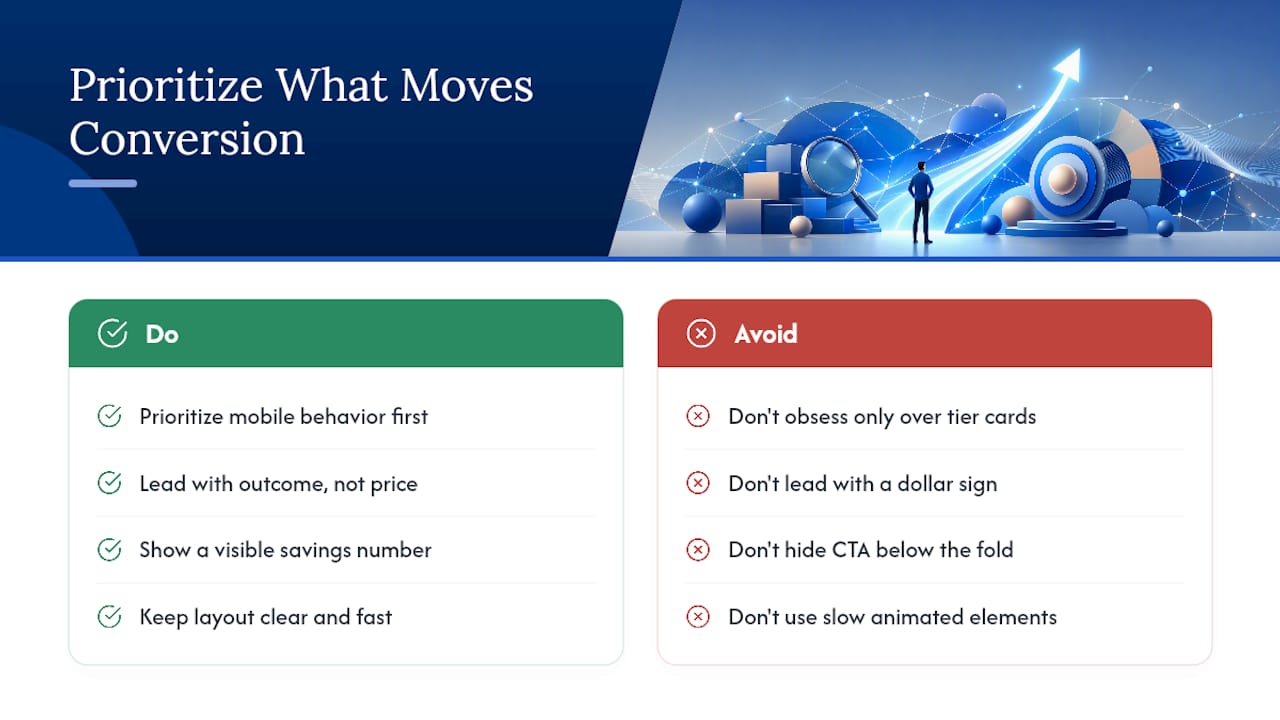
The gap between what most guides promise and what actually moves conversion is smaller than it sounds: clarity and speed beat cleverness almost every time. A plain three-tier page with a working mobile layout and a visible savings number will outperform a beautifully animated page that loads slowly or hides its CTA below the fold.
If you're prioritizing one thing first, make it mobile behavior. Most pricing-page traffic arrives on a phone, and that's where badly stacked cards and broken tables quietly kill deals nobody ever hears about.
— Dylan
Skip the Guesswork, Get a Page Built for You
Reading a checklist is one thing. Wiring a pricing page that actually converts on a phone, connects to your booking or lead form, and loads fast is another. Forge-web-studio builds custom sites for Texas businesses in as little as three days to a week, with mobile clarity and lead flow built into the structure from day one, not patched on afterward.
For a pricing-page project, that means:
- Benefit-led hero and tier copy written around your actual services, not a generic template
- Mobile-first layout with tested stacking, accordion tables, and thumb-sized CTAs
- CTAs wired directly to your contact form, booking flow, or checkout
- Basic analytics setup so you can see which tier and CTA people actually click
Plans start with the Starter Website at $500 one-off, up through the Custom Business Website at $2,500 one-off for more complex builds, with a $250 project deposit to get started. Browse the demo gallery to see real builds, or head to the pricing page to pick a starting point and request your project.
Sources
- Pricing Pages — A Curated Gallery of Pricing Page Designs
- 65 Best Pricing Page Examples For Design Inspiration
- SaaS Pricing Page Design: Convert More Customers
- How to Create a Pricing Page: Examples, Tips, and Best ...
FAQ
What Is the Best Design for a Pricing Page?
The best-performing structure combines a benefit-led headline, three tier cards with one visually highlighted as recommended, a visible billing toggle showing savings, and a mobile-friendly comparison table. Design teardowns consistently point to this same combination across successful pages.
How Do I Create a Pricing Page From Scratch?
Start by defining what separates each plan (seats, features, or scope), then choose a pattern that fits your business model, whether that's three tiers, a starting-at price with add-ons, or an enterprise-first layout. Write benefit-focused copy for each tier, build the responsive version first, and connect every CTA to your checkout or lead form before launch.
How Much Should I Charge for a Website Design?
Pricing depends heavily on scope, but Forge-web-studio publishes fixed starting prices: a Starter Website begins at $500, a Growth Website at 1200 USD one-off, and a Custom Business Website at $2,500, each one-off. Larger custom builds or Next.js/SaaS projects are quoted based on scope, so a starting-at range works better than a fixed number for complex work.
What Are the Four Main Types of Pricing Methods?
Pricing pages generally rely on four structural approaches: tiered plans (three-tier grids), usage-based pricing tied to volume or seats, a single option with modular add-ons, and enterprise or contact-sales pricing for custom deals. Which one fits depends on whether your value scales with usage, features, or negotiated scope.
Should I Show Prices If My Service Varies by Client?
Showing a starting-at price still filters leads better than hiding pricing entirely, even when final scope depends on the project. A single option with clearly listed add-ons reduces the choice paralysis that rigid tiers create for service businesses with variable scope.