
A high-converting thank-you page confirms exactly what just happened, tells the visitor what to expect next, and offers one clear next step, not five. That's the whole rule: one primary call-to-action matched to the conversion someone just completed. For a service business, that usually means a "book a call" button, not a menu of options competing for attention.
TL;DR:
- A thank-you page should focus on one primary, relevant call-to-action aligned with the original conversion to maximize reconversion opportunities.
- It must include specific confirmation copy, a clear next step, and the correct technical setup to ensure accurate tracking and reliable ad data.
- For each conversion type, the page should deliver immediate access to the promised content or details, supported by social proof and proper technical flags.
- Common mistakes such as offering too many options, using shared URLs, or neglecting mobile optimization can significantly decrease post-conversion engagement.
- Building thank-you pages as part of the initial site launch ensures better lead retention, mobile responsiveness, and effective tracking, reducing lost opportunities.
Table of Contents
- Thank You Page Ideas That Actually Drive Conversions
- The Core Elements Every Thank-You Page Needs
- Thank You Page Examples and Templates by Conversion Type
- Thank You Page Best Practices (and the Mistakes That Kill Conversions)
- Technical Checklist: Tracking, SEO Flags, and Developer Handoff
- How Forge Web Studio Thinks About Lead Attrition
- Get Your Thank-You Pages Built Right the First Time
- Sources
Thank You Page Ideas That Actually Drive Conversions
Most businesses treat the thank-you page as a formality, a digital receipt nobody reads twice. That's a mistake. The visitor just said yes to something. They're paying attention, their guard is down, and they're waiting to see what happens next. OptinMonster's research on thank-you page tactics points to this exact moment as one of the highest-leverage opportunities in the entire funnel, largely because reconversion rates on a focused thank-you page tend to be higher than on a blank confirmation screen.
There's also a practical reason this page deserves real design attention: it's often the only place your conversion tracking fires reliably. Every pixel you've set up (Meta, Google Ads, LinkedIn, TikTok) needs a clean, dedicated URL to trigger correctly. A messy or reused thank-you page URL means bad data feeding your ad platforms, which means wasted spend on the wrong audiences.
Here's what marketers should expect a well-built thank-you page to deliver:
- A measurable lift in reconversion (newsletter signups, referrals, add-on purchases) compared to a static "thanks" message
- Reliable retargeting audience data, since this page is where most conversion events actually fire
- A second chance to build trust with reviews, guarantees, or a clear next step
- A natural bridge into email marketing, since most autoresponder sequences trigger right after this page loads
None of that happens by accident. It happens because the page was built to do a job, not just say thanks.
The Core Elements Every Thank-You Page Needs
Strip away the design flourishes and every effective thank-you page shares the same five components. HubSpot's guidance on thank-you page best practices frames these as the baseline: access to the promised content, a social share option, a next-step CTA, and a plan for autoresponder follow-up.
- Confirmation copy that's specific, not generic. "You're in!" beats "Thank you." Better still: "Your download is on its way, check your inbox in the next 2 minutes." Specificity kills the doubt that makes people refresh the page or email you asking if it worked.
- One primary CTA that matches the original ask. Someone who booked a demo should see "Add to your calendar," not a newsletter signup box. Someone who bought a product should see order details, not an unrelated blog link.
- Delivery details placed correctly. Show the download button or access link directly on the page. Save deeper instructions, receipts, and terms for the follow-up email, so the page stays clean.
- Social proof in a supporting role. A short review, a client logo, or a trust badge reinforces the decision without competing with the main action.
- Technical flags set correctly. Unique URL,
noindexwhere appropriate, and confirmed pixel firing, covered in detail further down.
Pro Tip: Write your confirmation headline as if you're texting the customer directly. "Your appointment's booked for Thursday at 2pm" reads like a human wrote it. "Your submission has been received" reads like a form processor wrote it.
Getting the primary CTA right matters more than any design choice on the page. Match it to the funnel stage: a lead magnet download wants a related resource, a purchase wants a cross-sell, a booking wants a calendar add. Everything else on the page should support that one action, not distract from it.
Thank You Page Examples and Templates by Conversion Type
Different conversions call for different follow-through. A donor doesn't want a discount code, and a webinar registrant doesn't want a tax receipt. Below are compact templates you can adapt today, organized by the conversion that triggered them. Mailchimp's collection of thank-you page examples makes the same point: match the content to the conversion type and keep the page focused on that one outcome.
Lead magnet or digital download. The visitor traded an email for a guide, template, or checklist. Give them the file immediately, on the page itself, not buried in an email they'll open in an hour.
Headline: "Your Guide Is Ready to Download." Button: "Download Now." Below the button, add one related resource, a second guide or a short video, positioned as "You Might Also Like" rather than a hard sell. This is a low-lift build: a download link, one image, one secondary link.
Purchase confirmation. The customer just paid. Show them exactly what they bought and when it's arriving.
Headline: "Order #4521 Confirmed, Here's What Happens Next." Include a brief order summary and a shipping or delivery estimate. Then add one cross-sell ("Customers who bought this also grabbed...") or a referral incentive ("Give a friend 15% off, get $10 back"). Apexure's research on form-submission thank-you pages backs this up directly: a single, well-matched next step consistently outperforms a page trying to do three things at once.
Booking or appointment. This is the highest-stakes thank-you page for local service businesses, because a cold lead here is a lost customer.
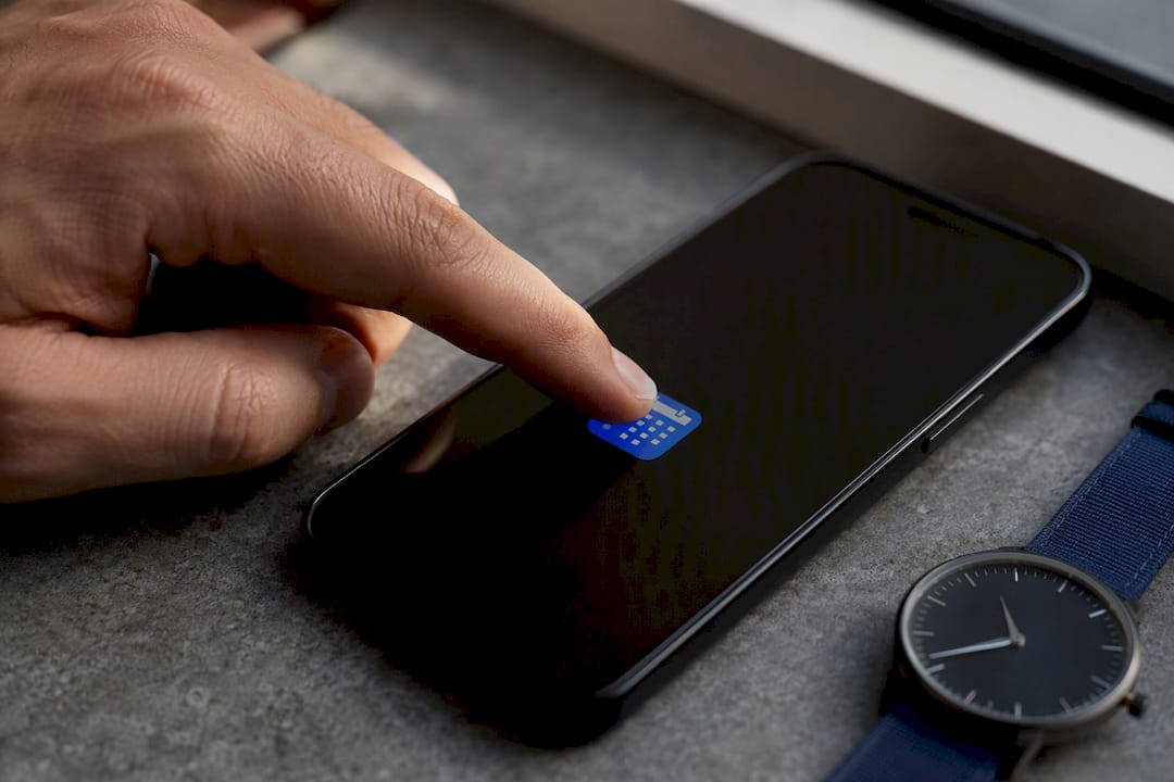
Headline: "You're Booked for Thursday at 2:00 PM." Button: "Add to Calendar." Beneath it, list what the visitor should prepare (photos of the issue, a list of questions, measurements) and a specific response-time promise: "We'll confirm by text within 2 hours." A calendar-add button and a click-to-call number, placed prominently, do more to prevent lead attrition than almost any other single change you can make to a service site.
Webinar or event registration. Registrants forget events. Give them tools to remember and to bring a friend.
Headline: "You're Registered, Save Your Spot." Button: "Add to Calendar." Include a one-line speaker blurb for credibility and a "Share to Invite" button with prewritten social copy already loaded, so inviting a colleague takes one click instead of ten minutes of typing, as shown in this LinkedIn lead generation for expanding agency case study. Prewritten share copy is one of the more underused tactics here; it turns registrants into unpaid promoters without asking them to do any work.
Donation confirmation. Donors want to feel the impact, not just get a receipt.
Headline: "Your $50 Gift Just Funded 10 Meals." Show a concrete impact statement tied to the donation amount, then offer a share button ("Tell your network why you gave") and clear tax receipt details, either on-page or promised by email within a specific timeframe.
Account creation. New users are the most likely to abandon if the next step isn't obvious.
Headline: "Welcome Aboard, Let's Set Up Your Account." Skip the celebration and go straight to a short onboarding checklist: two or three steps, with "Complete Your Profile" as the primary CTA. The goal is momentum, not congratulations.
Survey completion. Survey respondents rarely expect anything after hitting submit, which makes this a low-cost opportunity.
Headline: "Thanks for Sharing Your Feedback." Offer a small incentive for referring another respondent, or link to a related article or resource that builds on what they just answered. Unbounce's collection of thank-you page templates shows several low-effort versions of this pattern that only require a headline swap and a link change to reuse.
| Conversion type | Primary CTA | One-line takeaway |
|---|---|---|
| Lead magnet | Download now | Deliver on-page, add one related resource |
| Purchase | View order / cross-sell | Show order details, then one relevant upsell |
| Booking | Add to calendar | Pair with a stated response-time promise |
| Webinar/event | Add to calendar + share | Prewritten share copy drives referrals |
| Donation | Share your impact | Lead with the outcome, not the receipt |
| Account creation | Complete your profile | Skip the fanfare, start onboarding |
| Survey | Refer a friend | Low-cost incentive, minimal build effort |
Thank You Page Best Practices (and the Mistakes That Kill Conversions)
The single biggest mistake is offering too many choices. A thank-you page with five buttons, a chat widget, a video, and a coupon code isn't generous, it's confusing. Choice paralysis kills the exact reconversion you're trying to capture. Pick the one action that matters most for that funnel stage and build the page around it.
Common mistakes worth checking for right now:
- Redirecting to the same URL for every form on the site. This breaks tracking entirely, since your pixels can't tell one conversion from another.
- Forgetting to verify the pixel actually fires. A page can look perfect and still send zero data to your ad platforms.
- Leaving the thank-you page indexed in search. This lets people find your "confirmation" page organically, which inflates your conversion counts with visitors who never actually converted.
- Designing desktop-first. Most confirmations happen on mobile, especially for bookings and purchases made from a phone.
- Burying the primary CTA below the fold. If a visitor has to scroll to find the next step, most won't.
Pro Tip: Test your thank-you page the way you'd test a landing page, not an afterthought. Load it on a phone, time how long it takes to find the CTA, and if it takes more than three seconds, move it up.
Accessibility matters here too. Button text needs enough contrast to read in bright light, tap targets need enough space for a thumb, and confirmation text needs to load fast, since a slow-loading thank-you page is often the last thing standing between a customer and full trust in your business.
Technical Checklist: Tracking, SEO Flags, and Developer Handoff
Hand this list to whoever builds your site, whether that's an in-house developer or an outside studio. LanderLab's technical guide to thank-you pages frames these as the non-negotiables for accurate measurement.
- Give every conversion type its own dedicated URL, never a shared or reused page.
- Set
noindexon the page when it shouldn't appear in search results. - Verify every pixel fires correctly using each platform's own debugger (Meta Events Manager, Google Tag Assistant, LinkedIn Insight Tag Helper).
- Deliver downloadable assets directly on the page, and send an email backup in case the page is missed or refreshed.
- Add event tracking or structured data if the conversion feeds into a CRM or automation sequence.
- Run a full end-to-end test: submit the form yourself, confirm the pixel logs the event, and check that the email backup arrives.
| Check | Tool or method | Why it matters |
|---|---|---|
| Unique URL | Direct URL per funnel | Prevents tracking overlap between conversions |
| Noindex flag | Meta robots tag | Keeps confirmation pages out of search results |
| Pixel verification | Meta Events Manager, Google Tag Assistant | Confirms ad platforms receive accurate conversion data |
| Email backup | Autoresponder / CRM trigger | Covers visitors who miss the on-page delivery |
How Forge Web Studio Thinks About Lead Attrition
Most lost leads don't vanish because of price. They vanish because the thank-you page gave them nothing to do next. Forge Web Studio builds every local service site around a calendar-first CTA and a stated response window, something like "We'll text you within 2 business hours," instead of a generic confirmation that leaves the visitor guessing.
Mobile clarity matters just as much as the CTA itself. A booking confirmation that renders awkwardly on a phone, or a calendar button that's hard to tap with a thumb, undoes the momentum a visitor had the moment they converted. Small, deliberate changes here, tightening copy, fixing tap targets, adding a real deadline, tend to move lead follow-through more than most redesign projects twice their size.
— Dylan
Get Your Thank-You Pages Built Right the First Time
Reading a checklist is one thing. Getting the calendar widget, the pixel firing, and the mobile layout all working together on launch day is another. Forge Web Studio builds thank-you pages as part of every site launch, not as an afterthought bolted on later, which is exactly where most local business sites lose leads without ever noticing.
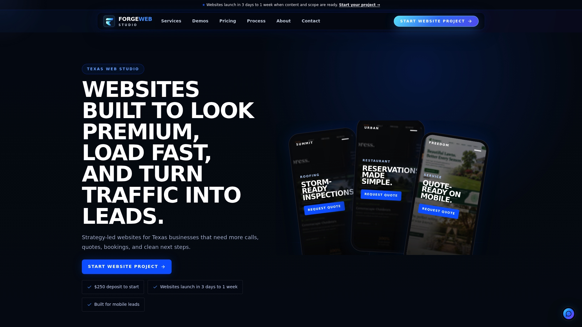
That means responsive frontend development built for phones first, calendar integration wired directly into your booking flow, tracking pixels tested end-to-end before launch, and local SEO work that makes sure the right pages show up in search while your thank-you pages stay properly noindexed. If your current site sends every visitor to the same generic "thanks" screen regardless of what they just did, that's a fixable problem, often in a matter of days rather than months.
Browse the demo gallery to see how these pages look in practice, or get a responsive website build started with a quote request. Either way, the next step is simple: tell us what your current thank-you page looks like, and we'll show you what's costing you leads.
Sources
- 11 ways to increase conversion rates on your thank-you pages
- Great Thank‑You Page Examples to Keep Customers Engaged
- Thank you: come again — best practices for thank-you pages
- Thank You Page: What It Is, What It Needs, and Real Examples