
Website trust signals are the concrete cues, like verified badges, real reviews, security indicators, and clear contact details, that tell a stranger your business is legitimate before they ever talk to you. The single highest priority fix isn't a design overhaul: put verifiable proof (a clickable third-party badge, a real phone number, a specific guarantee) right where the reader decides whether to click "buy" or "contact us." Everything below explains why and where.
TL;DR:
- Adding verifiable trust badges linked to live verification pages significantly increases visitor confidence and reduces perceived risk at crucial decision points.
- Social proof, especially reviews with dates, verified purchase labels, and owner responses, has a stronger impact on trust than generic testimonials or star ratings.
- Place trust signals prominently above the fold, beside calls to action, and on product pages to maximize their influence on visitor behavior.
- Conducting simple audits to ensure all trust elements are current, clickable, and specific can improve conversions and reduce cart abandonment.
- Starting with quick fixes like displaying a real phone number and address, then moving to verified third-party badges and industry-specific case studies, creates sustained trust growth.
Table of Contents
- What Are Website Trust Signals, Exactly?
- Which Types of Trust Signals Actually Move Visitors?
- Why Do Trust Signals Actually Change Buyer Behavior?
- Where Should Trust Signals Go on Your Site?
- How Do You Audit and Measure Trust Signal Impact?
- What Trust Signals Work Best by Industry?
- What's the Fastest Path to Fixing Trust Signal Gaps?
- How We Prioritize Trust Signals in Client Projects
- Get Trust-First Web Design Without the Guesswork
- Sources
What Are Website Trust Signals, Exactly?
A trust signal is any element on a page that reduces a visitor's perceived risk. Online, buyers can't shake your hand, read your body language, or ask a neighbor if your business is any good. Their brain substitutes four things instead: consistency across your site and social channels, specificity in your claims, third-party endorsement, and longevity, according to a behavioral framework from Science of Selling. Every trust signal you add is really just feeding one of those four checks.
It helps to sort signals into a framework rather than treating them as a random pile of badges:
- Identity — real names, addresses, phone numbers, and photos of actual people
- Expertise — author bios, credentials, and clear explanations of methodology
- Authority — press mentions, industry certifications, association memberships
- Social proof — reviews, testimonials, case studies, usage numbers
- Security — SSL, payment icons, privacy policy links
- Transparency — pricing clarity, AI-use disclosures, honest limitations
- Recency — updated dates, recent reviews, active blog or news feed
- Guarantees — refund policies, warranties, satisfaction promises
The gap that trips up most site owners is confusing decorative badges with earned ones. A static security icon pasted into a footer proves nothing on its own. A badge that links to a live verification page showing what was checked and when is a different animal entirely, and it's the difference that matters most going into 2026.
Which Types of Trust Signals Actually Move Visitors?
Not every signal carries equal weight, and some come with real limits you should know before you lean on them.
Security indicators like the padlock icon and SSL certificates are table stakes now, not differentiators. Every browser flags an insecure site automatically, so having HTTPS just keeps you off a blacklist. It won't win anyone over by itself, but skipping it actively repels visitors.
Social proof does heavier lifting. Reviews, testimonials, and user-generated content work best when they're structured, not just present. Verified-purchase labels, recent review dates, and visible owner responses all improve how genuine a review set looks, according to checkout and review research from TeardownHQ. A five-star average sitting alone with no dates or names reads as fake, even when it isn't.
Third-party endorsements and earned badges carry the most persuasive weight of any category, but only when they're verifiable. TrustedSite's guidance on trust badges makes the point directly: the graphic itself is decoration. The verification page behind it, the one stating exactly what was tested and on what date, is the actual trust artifact. A badge a visitor can click through to confirm is worth far more than one that just sits there looking official.

Guarantees and risk reversals punch above their weight for the effort required. A specific refund window ("60-day money back guarantee") beats a vague promise ("satisfaction guaranteed") because specificity is one of the four cues buyers substitute for real-world trust.
Design and transparency signals round out the list. Clean layouts, working links, current copyright years, and honest disclosures about pricing or AI-generated content all signal that a real, attentive person maintains this site. A partner guide on secure website design covers how security choices get baked into layout decisions rather than bolted on afterward, which is the right way to think about all of these signals: built in, not added as an afterthought.
Skip the impulse to stack ten badges into your footer. Fake or outdated seals, unverifiable claims, and badge overload actively undermine credibility rather than building it, since visitors have gotten good at spotting decoration versus proof.
Why Do Trust Signals Actually Change Buyer Behavior?
Trust signals work because they short circuit a specific kind of anxiety, not because they look nice. A 2019 neuroimaging study measuring simulated purchases found that third-party seals of approval produced stronger, cleaner trust responses in participants than star-rating systems did. Ratings, by contrast, generated more ambiguity and activated risk related signals in the brain. That's a meaningful distinction: a rating asks the visitor to interpret a number, while a seal offloads that judgment to a third party the visitor already trusts.
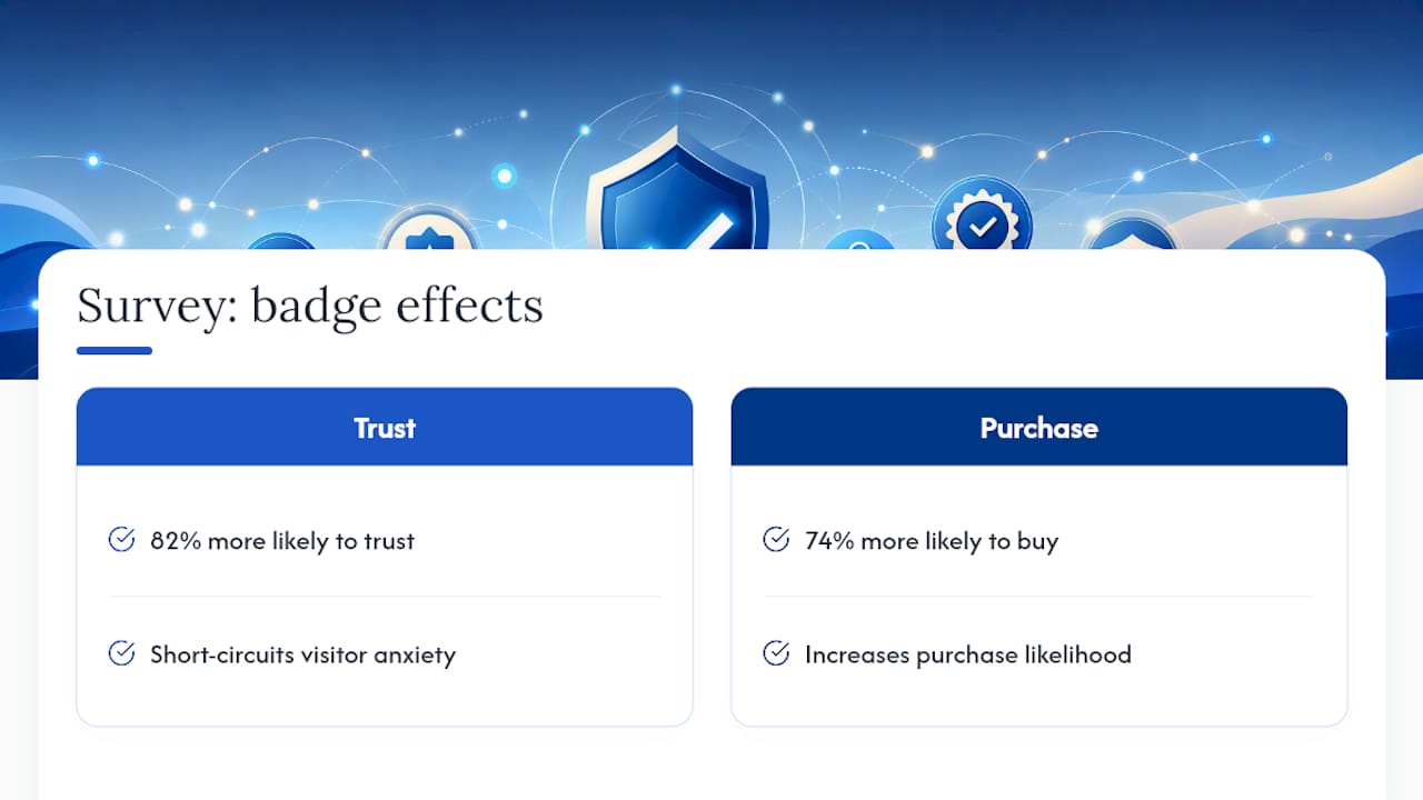
The scale of this effect shows up in survey data too. TrustedSite's 2026 survey found 82% of shoppers said they'd be more likely to trust an unfamiliar site if it displayed a verified trust badge, and 74% said a verified badge increased their likelihood of buying from a site they didn't already know.
AI is raising the bar further. Shoppers who've been burned by fake reviews, AI-generated fluff, and bot-written testimonials are getting warier by the month. That means disclosure now works as a trust signal in its own right. Telling visitors when content is AI-assisted, and making it easy to reach an actual human, addresses a skepticism that didn't exist at this scale five years ago, a shift documented in recent guidance on building online customer trust. Authority and social proof still work as cognitive shortcuts, but they only work when the visitor believes the proof is real.
Where Should Trust Signals Go on Your Site?
Placement determines whether a trust signal gets seen at all, and most site owners bury their best proof below the fold where nobody scrolls.
- Above the fold on the homepage. A phone number, a physical address or service area, and one credibility marker (a review count, a years-in-business note) should be visible without scrolling.
- Directly beside every CTA and checkout form. This is the highest-leverage placement on the entire site. A security badge, a guarantee line, or a "no card required" note next to the button reduces the exact hesitation that kills conversions at the moment of decision.
- On product and service pages, near the price. Reviews specific to that item beat a generic homepage testimonial every time, because specificity is what the buyer's brain is checking for.
- In the footer, site-wide. Business registration details, privacy policy links, and contact information belong here as a baseline, even if they're repeated elsewhere.
- On mobile, compressed but not cut. Mobile screens force hard choices. Keep the phone number tappable, keep one badge visible, and cut the rest before you cut the CTA itself.
Distrust around payment security is one of the most common reasons shoppers abandon a cart at the last step, Baymard Institute's usability research shows, which is exactly why checkout is not the place to skip a security cue you kept everywhere else on the site.
How Do You Audit and Measure Trust Signal Impact?
Start with a blunt test: open your homepage on your phone, give yourself 30 seconds, and ask whether a total stranger could tell who you are, whether you're real, and what happens if they're unhappy with a purchase. If you can't answer all three, you've found your first fix.
A working audit checklist covers:
- Is every badge clickable, leading to a real verification page?
- Are reviews dated, named, and specific, not generic five-star blurbs?
- Does the footer show a real address, phone number, and policy links?
- Is there a guarantee stated in specific terms near the CTA?
- Are security icons paired with actual HTTPS, not just decoration?
- Does the copyright year or "last updated" date look current?
Forge Web Studio's own website review checklist walks through this same logic in more detail if you want a structured version to run against your own pages.
For measurement, watch conversion rate, cart abandonment rate, and micro-conversions (email signups, quote requests) before and after you change a signal. Run a simple A/B test: same page, one version with an earned badge near the CTA, one without, split evenly for at least two full weeks to smooth out day-of-week noise. Pair the numbers with qualitative feedback. A five-minute user testing session often reveals exactly which missing signal made someone hesitate, in their own words.

Pro Tip: Track scroll depth alongside conversion rate. If visitors are bailing before they ever reach your testimonials or guarantee, the problem isn't the signal, it's the placement.
The most common audit mistake is measuring nothing and just adding badges on instinct. The second most common is stacking decorative graphics that don't link anywhere, which research on trust signal frameworks flags as actively counterproductive rather than neutral.
What Trust Signals Work Best by Industry?
Priorities shift depending on what you sell and how the buyer is deciding.
Ecommerce needs product-specific reviews near the price, a verified security badge at checkout, a clearly stated returns policy, and recognizable payment logos on the payment form itself, not just the homepage.
SaaS businesses lean on a different mix: a free trial with no card required, compliance badges (SOC 2, GDPR) where they're genuinely earned, a live uptime or status page link, and short case studies placed next to the signup CTA rather than buried on a separate page.
Service businesses (contractors, clinics, salons, consultants) get the most mileage from Google Business Profile reviews, named testimonials with real photos, a visible portfolio of past work, and a stated response time commitment ("we return calls within one business hour").
Across all three, the same rule holds: a signal borrowed from a different industry usually feels off. A SaaS company boasting a "30-day money back guarantee" in giant letters looks fine; a local roofer doing the same thing next to a Google review score just clutters the page.
What's the Fastest Path to Fixing Trust Signal Gaps?
Work in three tiers, starting with the changes that take an afternoon, not a quarter.
- Quick wins (this week): Add a real phone number and address above the fold, state your guarantee in specific terms near the CTA, and fix any broken or missing footer links. Low effort, immediate impact on hesitation at the decision point.
- Medium term (this month): Set up a verified third-party badge with a live verification page, restructure your reviews to show dates and verified-purchase labels, and add basic schema markup so search engines surface your ratings.
- Long term (this quarter and beyond): Build out named case studies, pursue relevant industry certifications or press mentions, and document compliance where it's genuinely earned rather than claimed.
Each tier compounds on the last. Quick wins stop the bleeding on your worst-converting pages; the medium and long-term work is what turns a decent site into one visitor actively recommend.
How We Prioritize Trust Signals in Client Projects
Trust signals are treated as a layout decision, not decoration added after launch. Mobile clarity comes first because most local business traffic arrives on phones. That means the phone number stays tappable in the header, the CTA stays above the fold, and any guarantee or credential sits close enough to the button that a visitor doesn't have to scroll to find a reason to trust you.
Client work across service industries has shown the same pattern again and again: a specific, verifiable claim placed next to the CTA outperforms a vague trust statement buried in an "About" page nobody reads. If you want a second opinion on where your own site is leaking trust, our website review checklist is a good place to start before a full redesign conversation.
— Dylan
Get Trust-First Web Design Without the Guesswork
Trust signals are built into the layout from day one, rather than treated as an afterthought added after launch, which is the mistake that costs most small business sites their conversions. The service includes rapid builds with mobile-first layouts, clear contact paths, and local search optimization baked into every page structure.
If you're a restaurant, roofing company, or service provider losing leads to a site that looks fine but doesn't actually earn trust at the moment it counts, a review of your current pages will show you exactly where the gaps are. Our web design services cover everything from a full rebuild to targeted fixes on your existing checkout, contact forms, or homepage. For businesses specifically worried about mobile visitors bouncing before they call, our responsive website development work is built around exactly the placement rules covered above. Reach out for a project quote and we'll tell you straight where your site is losing trust.
Sources
- The Ultimate Guide to Trust Badges in 2026 | TrustedSite
- Journal of Interactive Marketing (2019) — study on seals of approval and trust
- Trust Signals for Websites: The Complete Guide | TeardownHQ