
Every text and interface color pair on your site needs to hit a contrast ratio of at least 4.5:1 for normal text or 3:1 for large text and interactive UI elements, per the W3C's WCAG standard. Contrast is a fixed luminance calculation, not a visual guess, so a pairing that "looks close enough" at 4.3:1 still fails. Open a contrast checker right now and test your body text against its background before reading further.
TL;DR:
- Contrast ratios must meet specific thresholds: 4.5:1 for normal text and 3:1 for large text or UI components, with no exceptions for visual guesses.
- Testing should be done on actual rendered colors, including transparency, gradients, or overlays, for accurate contrast assessment.
- Tools like contrast checkers, browser extensions, and design plugins simplify testing, but must measure against the final CSS colors, not design files.
- Fixes include darkening or lightening colors or increasing font size and weight, preferably using perceptually uniform color scales like OKLCH or LCH.
- Contrast should be retested after any brand change, new components, or dark mode implementation to prevent regressions and ensure ongoing accessibility compliance.
Table of Contents
- Quick Pass/Fail Checklist for Accessible Color Contrast
- How Is Color Contrast Actually Measured?
- What Tools Actually Test Contrast Well?
- How Do You Fix Failing Color Contrast?
- When Should You Retest Color Contrast?
- What Accessible Color Systems Look Like in Practice
- Get an Accessible Color System Built Once, Not Fixed Repeatedly
- Sources
Quick Pass/Fail Checklist for Accessible Color Contrast
Run this before shipping any page or component. It won't catch everything, but it catches most of what breaks accessible color contrast in production.
- Normal text: needs 4.5:1 minimum against its background.
- Large text: needs 3:1. That means regular weight text large enough to meet the large text threshold, or bold text at a size considered large enough to qualify.
- UI components and icons: buttons, form borders, and toggle states need 3:1, per WCAG's non-text contrast rule.
- Check every state: default, hover, focus, and active — not just the resting color.
- Don't forget images of text: a logo with a tagline baked into a PNG still needs to pass.
If something fails, the fastest fixes are usually: darken the foreground, lighten the background, bump the font weight or size past the large text threshold, or add an underline or outline so the shape carries meaning independent of color.
How Is Color Contrast Actually Measured?
Contrast ratio runs on a scale from 1:1 (identical colors, no contrast) to 21:1 (pure black on pure white). The math behind it isn't about hue or saturation. It's about relative luminance, a calculation of how much light a color reflects, according to WebAIM's breakdown of contrast accessibility. Two colors can look wildly different and still produce a weak ratio if their luminance values sit close together, which is why eyeballing a palette is unreliable.
Where you measure matters as much as how. Test the actual rendered text against its actual rendered background, including any transparency, gradients, or background images sitting underneath. A checker reading a hex value from your design file won't catch a semi-transparent overlay that shifts the real, composited color once it hits the browser. For UI components, measure against the colors immediately adjacent to the element, not just the page background. An icon with a two-color border sitting inside a colored card needs its own check against each neighboring color, since WCAG's 1.4.11 requirement treats adjacent contrast separately from body text contrast.
Hover and focus states get skipped constantly. A button that passes at rest but shifts to a lighter fill on hover can silently drop below 3:1, and nobody notices until a user with low vision loses track of where their cursor landed.

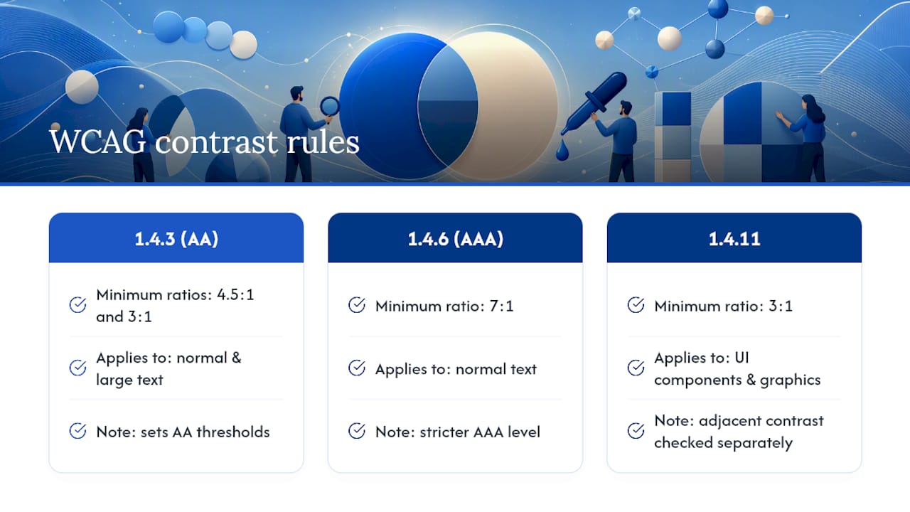
There's no rounding up. WebAIM's own reference examples show medium gray text at #777777 on white landing at 4.47:1, just under the 4.5:1 line, and that's a fail regardless of how negligible the gap looks on screen. Three WCAG success criteria govern this territory: 1.4.3 sets the 4.5:1 and 3:1 minimums, 1.4.6 raises normal text to 7:1 for the stricter AAA level, and 1.4.11 covers UI components and graphical objects. Decorative elements and logotypes are exempt from all three.
What Tools Actually Test Contrast Well?
You don't need to calculate luminance by hand. A handful of tools cover nearly every workflow.
- Standalone contrast checkers. Enter or paste two hex values and get an instant ratio plus a pass/fail flag for AA and AAA. This is the fastest way to validate a single pairing before it goes into a design file.
- Browser extensions and eyedroppers. Pick colors directly off a live page, then run a page scanner to flag every failing text and UI element at once, including states you might not think to test manually.
- Design-tool plugins. Check swatches against their exported hex values, preview components on both light and dark backgrounds, and flag accessibility issues before the component ever ships.
Tools like Section508 and third-party QA suites such as those listed in this roundup of website QA tools both work well for catching contrast failures during a broader site audit rather than checking one pair at a time.
Test in this order for the best return on your time: body copy first, then buttons, then form field borders, then icons and any images containing text, then hover and focus states last.
Pro Tip: Run your contrast checker on the exact hex value your CSS ships, not the color swatch in your design file. Opacity, blend modes, and CSS variables often shift the final rendered color just enough to fail.
How Do You Fix Failing Color Contrast?
Start by deciding your baseline. Most teams target AA (4.5:1 / 3:1) across the board and reserve AAA (7:1) for critical reading content like legal text or long-form articles. Write that decision down somewhere your whole team can see it, because "close enough" arguments disappear once there's a documented standard.
The remediation workflow itself is straightforward:
- Identify every failing element with a contrast checker or page scanner.
- Generate lighter or darker variants of the offending color.
- Retest each variant until it clears the threshold.
- Push the fix into your design tokens and component library, not just the one page where you found it.
That third step is where most teams go wrong. Adjusting lightness in HSL feels intuitive, but HSL's lightness value isn't perceptually consistent across hues, so a "20% lighter" blue and a "20% lighter" yellow won't shift contrast by anywhere close to the same amount. Perceptually uniform spaces like OKLCH and LCH solve this by keeping perceived lightness consistent as you move through shades, which makes contrast far more predictable when you're generating a full tone scale. Tools like Accessible Palette build entire color systems this way, holding lightness steady across every step so a "700" shade behaves the same relative to its background no matter which hue you started from.
If recoloring an element would break brand guidelines, you're not out of options. Increasing font size or weight, adding an outline or underline, or changing the background context behind a problematic element can all satisfy the requirement without touching the brand palette itself.

Pro Tip: Once you land on an accessible shade scale, publish it as approved design tokens with plain-language notes for content editors, like "never pair light gray on white for body copy." That one sentence prevents more contrast regressions than any QA tool.
When Should You Retest Color Contrast?
Contrast isn't a one-time fix. It regresses quietly, usually right after someone tweaks a brand color or ships a new component without checking it against the existing palette.
- Retest after any theme update, new component, or new page template goes live.
- Retest after a content migration, since imported text often inherits inline styles that bypass your design tokens entirely.
- Retest immediately after adding dark mode. Colors that pass comfortably in light mode frequently fail once the background flips.
- Add automated color scans to your CI pipeline for anything programmatic, and schedule manual spot checks for images and complex components that scanners tend to miss.
Keep your approved tokens under version control alongside the rest of your codebase, and give developers a one-page handoff checklist so contrast verification happens before merge, not after a user complaint.
What Accessible Color Systems Look Like in Practice
Building color systems that actually hold up under contrast testing is something Forge-web-studio handles as part of every project, not as an afterthought bolted on at launch. Getting a palette right the first time means fewer support emails, fewer redesign cycles, and a site that reads clearly for every visitor, including the older customer squinting at a phone screen in bright sunlight.
Forge-web-studio's own demo gallery shows the kind of mobile-first, high-contrast layouts that come standard on every build, and the studio's focus on clear contact paths and trust signals only works if the underlying colors are actually legible. If you're evaluating your current site, the website review checklist is a solid place to start spotting contrast problems before a redesign conversation even begins.
— Dylan
Get an Accessible Color System Built Once, Not Fixed Repeatedly
Fixing contrast after launch means retesting dozens of pages by hand. Forge-web-studio builds accessible color systems into the design token stage of every project, so buttons, form borders, and body text pass WCAG AA before the site ever goes live.
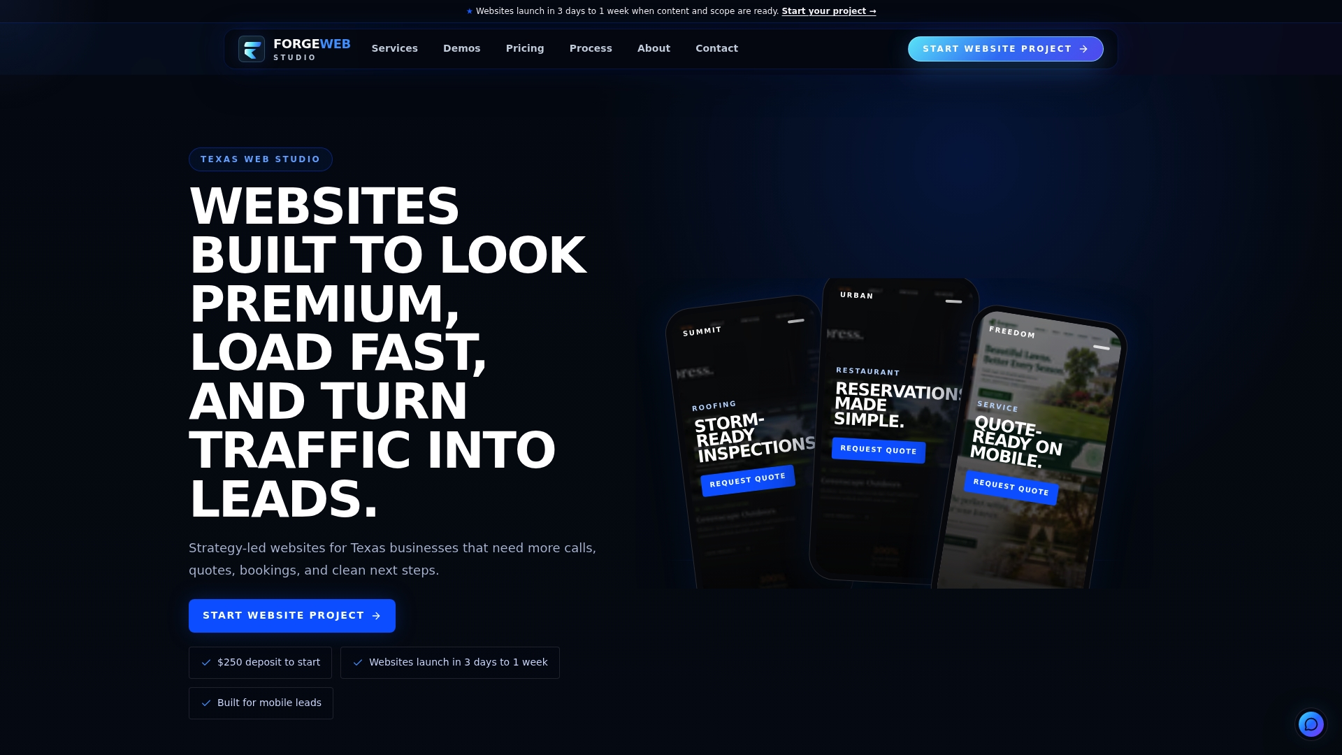
That means no separate accessibility pass, no guesswork about which gray shade fails, and no follow-up invoice to fix what should have worked the first time. Whether you need a full website redesign with a rebuilt color system or a new responsive build with accessible components from day one, the contrast checking happens during development, not after a customer complains they can't read your pricing page. If you're ready to see what an accessible, fast-loading site looks like for your business, start with the demo gallery or request a quote directly.
Sources
The W3C's WCAG 2.2 guidelines remain the definitive standard for every ratio cited here. WebAIM's contrast article explains relative luminance in plain terms with real examples. Accessible Palette generates perceptually consistent shade scales. UNC's Digital Accessibility Office offers a practical institutional walkthrough for teams new to testing.
- Contrast and color accessibility — WebAIM