
Optimize three things first: convert to WebP or AVIF, resize images to their actual display dimensions, and set loading="lazy" on everything below the fold while marking your hero image high priority. Those three moves alone cut the most page weight and directly improve your Largest Contentful Paint score. Here is the exact checklist to run right now:
- Convert format: Replace JPEG and PNG with WebP for photos; use AVIF for hero images on high-traffic pages.
- Resize to display size: Never serve a 3000px image in a 600px slot. Match source dimensions to the largest rendered size.
- Set
loading="lazy"on all images below the fold; addfetchpriority="high"to your LCP image. - Add
widthandheightattributes to every<img>tag to prevent layout shift (CLS). - Compress before uploading: Target 75–85% quality for photos; lossless for logos and screenshots.
- Use
srcsetandsizesso mobile browsers download a smaller variant instead of the full desktop image. - Measure with Lighthouse or PageSpeed Insights before and after to confirm real gains.
Each of these actions is independent. You can apply them in any order and see measurable improvement after each one.
Key Takeaways
Proper image optimization combines format selection, compression, responsive sizing, and loading priority to cut page weight and hit a mobile LCP under 2.5 seconds.
| Point | Details |
|---|---|
| Format first | Use WebP as your default raster format; add AVIF for hero images where encoding cost is acceptable. |
| Compress to targets | Photos at 75–85% quality; hero images under 200KB, thumbnails under 50KB. |
| Prevent layout shift | Add width and height to every <img> tag so the browser reserves space before the image loads. |
| Split loading priority | Set fetchpriority="high" on your LCP image; loading="lazy" on everything below the fold. |
| Forge-web-studio | Includes image performance audit, format conversion, and Core Web Vitals measurement in every responsive website build for Texas businesses. |
Table of Contents
- What are the basics of image optimization?
- Why does image optimization matter for SEO and performance?
- Which image format should you use and when?
- How do you compress images effectively?
- How do srcset, sizes, and the picture element work?
- How do you handle lazy loading and prevent layout shift?
- How do CDNs and content negotiation help deliver images faster?
- What image SEO and accessibility practices actually matter?
- A practical 6-step workflow to implement image optimization
- When should you DIY image optimization vs. hire a specialist?
- Forge-web-studio handles image performance as part of every build
- The part most guides skip: format choice is a bigger decision than compression level
- Sources
What are the basics of image optimization?
Image optimization is the practice of reducing image file size and configuring delivery so pages load faster without visible quality loss. It covers six areas: format selection, compression, responsive sizing, delivery infrastructure, loading behavior, and SEO/accessibility metadata.
What it does not cover is deep photo editing, color grading, or retouching. This guide treats images as assets to be delivered efficiently, not as creative objects to be altered.
The scope matters because each area has its own levers. Skipping width and height attributes causes layout shift that tanks your CLS score even if the image itself is tiny. Getting all six areas right is what moves the needle on Core Web Vitals.
Why does image optimization matter for SEO and performance?
Images are typically the largest payload on a web page. According to MDN Web Docs, images and video account for the majority of bytes transferred on many pages, making format and size choices the highest-impact optimizations available for multimedia delivery.
That payload directly controls your Largest Contentful Paint. LCP measures how long it takes for the biggest visible element to render, and on most pages that element is an image. Google's Core Web Vitals threshold for a good LCP is under 2.5 seconds on mobile. Miss it and your rankings suffer; hit it and you typically see lower bounce rates and higher engagement.
Three metrics to watch:
- LCP: Driven by your hero or above-the-fold image. Reducing its file size and setting
fetchpriority="high"are the fastest fixes. - CLS (Cumulative Layout Shift): Caused by images without declared dimensions. Adding
widthandheightattributes eliminates most CLS from images. - Total page weight: Affects time-to-interactive and data costs for mobile users on slower connections.
To measure your current state, run a Lighthouse audit in Chrome DevTools (Cmd+Shift+P → "Generate Lighthouse report"), check PageSpeed Insights at pagespeed.web.dev, or use WebPageTest for a waterfall view showing exactly which images are blocking render. As Web, using srcset, modern formats, and explicit width/height reduces the largest image payload and improves Core Web Vitals directly.
Slow pages also cost you business. The relationship between page speed and customer behavior is well-documented: users abandon pages that take too long, and that abandonment shows up in your analytics as high bounce rates and low conversion.
Which image format should you use and when?
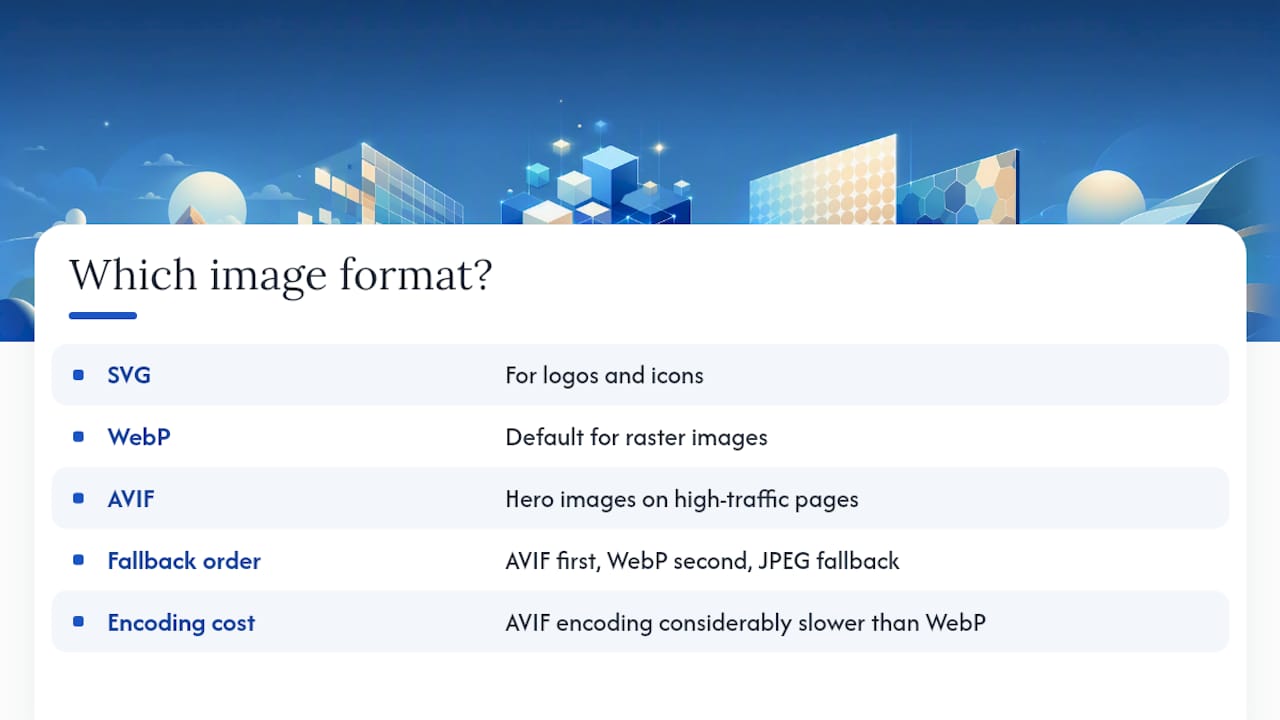
The short answer: SVG for logos and icons, WebP as your default for raster images, and AVIF selectively for hero images on high-traffic pages. WebP and AVIF outperform legacy formats at comparable quality, but AVIF carries higher encoding costs, so use it where the bandwidth savings justify the build time.
Browser support for AVIF is now broad enough for production use, but the <picture> element fallback pattern is still the safe approach:
<picture>
  <source srcset="hero.avif" type="image/avif">
  <source srcset="hero.webp" type="image/webp">
  <img src="hero.jpg" alt="Descriptive alt text" width="1200" height="630">
</picture>
The browser picks the first source it supports and ignores the rest. Order matters: AVIF first, WebP second, JPEG as the fallback.
Pro Tip: AVIF encoding is considerably slower than WebP, so it is best reserved for hero images where file size savings justify the encoding cost. Use WebP for everything else — product thumbnails, blog post images, team photos — where encoding speed and broad compatibility matter more than squeezing out the last few kilobytes.
How do you compress images effectively?
That quality range is where the file-size savings are steep and the visual difference is invisible to most users.
Tools to use right now:
- Squoosh: Browser-based, free, processes locally (nothing uploaded). Lets you compare formats side by side with a live quality slider. Best for manual experimentation and understanding encoder tradeoffs.
- TinyPNG: Perceptual compression for PNG and JPEG with a drag-and-drop interface. Offers a WordPress plugin and API for automated batch workflows. Produces WebP output as well.
- ImageOptim: Mac desktop app that strips metadata and applies lossless compression. Useful as a final pass after other tools.
- Adobe Photoshop: "Export As" (not "Save for Web") gives you precise control over quality, format, and dimensions. The right tool when you need exact output specs for a production asset.
- imgready: Browser-based batch compressor with a target-size mode and resizing. Combined with resizing to display dimensions, it can reduce images by large percentages while keeping acceptable visual quality.
Cloudinary takes a different approach: rather than compressing manually, it applies transforms on-the-fly at the CDN edge, serving the right format and quality automatically based on the requesting device.
Progressive JPEGs are worth a mention. They render in passes, so users see a blurry version immediately and it sharpens as data arrives. This improves perceived load speed on slower connections even when the file size is similar to a baseline JPEG.
A concrete example of what compression achieves: a 2.4MB PNG screenshot compressed losslessly with ImageOptim typically drops to 900KB–1.2MB. Run it through TinyPNG afterward and it often lands at 400–600KB. Same visual quality, less than a quarter of the original weight.

How do srcset, sizes, and the picture element work?
The core problem responsive images solve: a desktop browser and a mobile browser both request the same <img src="photo.jpg">, but the mobile browser only needs a 400px-wide image, not a 1600px one. srcset and sizes let the browser pick the right source.
<img
  src="photo-800.jpg"
  srcset="photo-400.jpg 400w, photo-800.jpg 800w, photo-1600.jpg 1600w"
  sizes="(max-width: 600px) 100vw, (max-width: 1200px) 50vw, 800px"
  alt="Descriptive alt text"
  width="800"
  height="533"
  loading="lazy"
>
The browser reads sizes to learn how wide the image will render at the current viewport, then picks the smallest srcset candidate that still looks sharp at that size and the device's pixel ratio (DPR).
Art direction is a different use case. When you want to show a cropped, tighter composition on mobile rather than a scaled-down version of the desktop image, use the <picture> element with media attributes:
<picture>
  <source media="(max-width: 600px)" srcset="hero-mobile.webp">
  <source media="(min-width: 601px)" srcset="hero-desktop.webp">
  <img src="hero-desktop.jpg" alt="Team working in office" width="1200" height="630">
</picture>
One caching tradeoff to keep in mind: generating many static size variants (400w, 600w, 800w, 1200w, 1600w) multiplies storage and complicates cache invalidation. An image CDN like Cloudinary sidesteps this by generating variants on-the-fly from one master asset and caching the results at the edge. For smaller sites with a manageable image catalog, static variants generated at build time (via Sharp in a Node pipeline, for example) are simpler and cheaper.
As web.dev's image performance guidance confirms, using srcset and sizes together with modern formats is one of the most direct ways to reduce the largest image payload and improve LCP.
How do you handle lazy loading and prevent layout shift?
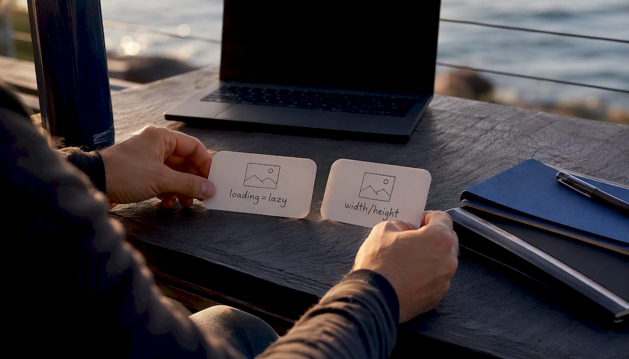
The core rule: your LCP image gets fetchpriority="high" and no loading attribute (or loading="eager"). Every image below the fold gets loading="lazy". That split alone prevents the two most common image-loading mistakes.
<!-- LCP / hero image — load immediately, high priority -->
<img
  src="hero.webp"
  alt="Hero description"
  width="1200"
  height="630"
  fetchpriority="high"
  decoding="async"
>

<!-- Below-the-fold image — defer until near viewport -->
<img
  src="team-photo.webp"
  alt="Team photo"
  width="800"
  height="533"
  loading="lazy"
  decoding="async"
>
The width and height attributes are not optional. Without them, the browser does not know the image's aspect ratio before it loads, so it allocates zero space. When the image arrives, the page reflows and everything below it jumps. That jump is CLS. MDN's multimedia performance guidance confirms that width/height attributes prevent layout shift and that lazy-loading saves initial bandwidth.
For preloading the LCP image in the <head>:
<link rel="preload" as="image" href="hero.webp" fetchpriority="high">
Do and don't checklist:
- Do:
loading="lazy"on all images that start below the fold. - Do:
fetchpriority="high"on the single LCP image. - Do:
widthandheighton every<img>tag. - Don't: lazy-load your hero image. This delays LCP and hurts your score.
- Don't: mark multiple images
fetchpriority="high". The browser deprioritizes everything when everything is high priority. - Don't: use
loading="lazy"on images within the first viewport.
Pro Tip: If you use Next.js, the <Image> component handles loading, fetchpriority, width, height, and srcset automatically when you set priority={true} on your LCP image. You get lazy loading for everything else by default. This is one of the fastest ways to implement correct loading behavior without writing the attributes manually.
How do CDNs and content negotiation help deliver images faster?
For sites with significant traffic or large image catalogs, serving images from your origin server with static files is the slowest and most expensive approach. An image CDN solves three problems at once: it caches images close to users, applies on-the-fly transforms (resize, format conversion, quality adjustment), and handles Accept header negotiation automatically.
The Accept header approach works like this: when a browser requests an image, it sends an Accept header listing the formats it supports (image/avif,image/webp,image/jpeg). A server or CDN that reads this header can respond with the best format the browser supports without any client-side <picture> markup. The URL stays the same; the format changes per request.
Cloudinary is the most widely used image CDN for this pattern. You store one master asset and Cloudinary generates the right size, format, and quality on the first request, then caches the result. A URL like image.jpg?w=800&f=auto&q=auto returns WebP to Chrome and JPEG to an older browser that does not support WebP. The Cloudinary documentation covers art direction via the <picture> element, Accept header negotiation, and CDN caching patterns in detail.
The tradeoff is cost and complexity. Cloudinary's free tier is generous for small sites, but high-traffic sites pay for transformations and bandwidth. For a site with a small, stable image catalog, build-time transforms using Sharp or a static site generator plugin are simpler and free. The CDN approach pays off when your image catalog is large, changes frequently, or needs to serve multiple device types at scale.
Cache headers matter regardless of approach. Set Cache-Control: public, max-age=31536000, immutable on versioned image URLs (those with a content hash in the filename). For images at stable URLs without versioning, use a shorter max-age and stale-while-revalidate to balance freshness and cache hit rate.
What image SEO and accessibility practices actually matter?
Descriptive filenames and meaningful alt text are the two highest-return SEO and accessibility actions for images. Google's image search indexes filenames and alt attributes; screen readers read alt text aloud to users who cannot see the image.
Filename rules:
- Use descriptive, hyphen-separated names:
red-oak-dining-table.jpg, notIMG_4823.jpg. - Keep filenames lowercase with no spaces.
- Include the primary keyword when it is genuinely descriptive of the image.
Alt text rules:
| Image type | Good alt text | Bad alt text |
|---|---|---|
| Product photo | alt="Red oak dining table with hairpin legs, 60 inches" | alt="table" or alt="" |
| Decorative divider | alt="" (empty, intentional) | alt="decorative line" |
| Team photo | alt="Sarah Chen, lead designer at Forge-web-studio" | alt="photo" |
| Chart | alt="Bar chart showing 40% increase in mobile traffic from 2023 to 2024" | alt="chart" |
WCAG 2.1 requires non-text content to have a text alternative that serves the same purpose. Decorative images get an empty alt="" so screen readers skip them. Informative images get a description that conveys the content, not just "image of."
Image sitemaps are worth adding when images are a primary content type (photography portfolios, e-commerce product pages, recipe sites). A standard XML sitemap with <image:image> extensions tells Google about images it might not discover through crawling alone.
Metadata: Strip EXIF data (GPS coordinates, camera model, shooting location) from photos before publishing for privacy. Keep copyright metadata if you need to assert ownership. Tools like ImageOptim strip EXIF by default; Photoshop's "Export As" dialog gives you a checkbox to exclude metadata.
Structured data (schema.org/ImageObject) helps Google understand the context of important images, particularly for recipes, products, and articles where image rich results appear in search.
A practical 6-step workflow to implement image optimization
This is the sequence Forge-web-studio uses when auditing and optimizing images for client sites. It is measurement-driven: you confirm gains at each step rather than assuming they happened.
-
Inventory with Chrome DevTools and Lighthouse. Open the Network tab, filter by "Img," and sort by size. Run a Lighthouse audit and check the "Opportunities" section for "Efficiently encode images," "Serve images in next-gen formats," and "Properly size images." This gives you a ranked list of the worst offenders.
-
Prioritize your LCP image. Identify which image Lighthouse flags as the LCP element. Fix it first: convert to WebP or AVIF, resize to its rendered dimensions, add
fetchpriority="high", and add a<link rel="preload">in the<head>. Measure LCP before and after with PageSpeed Insights. Target: LCP under 2.5 seconds on mobile. -
Compress the rest with Squoosh or TinyPNG. For photos, target 75–85% quality in WebP. For PNG logos and screenshots, use lossless. File-size targets: hero images under 200KB, thumbnails under 50KB, icons under 10KB. Batch PNG/JPEG compression through TinyPNG's API or WordPress plugin if you have a large catalog.
-
Add
srcsetandsizesto key images. Start with your hero and any above-the-fold images. Generate 2–3 width variants (e.g., 400w, 800w, 1600w) and write thesizesattribute to match your CSS layout. Use a build tool like Sharp or an image CDN for batch generation. -
Set
loading,fetchpriority,width, andheighton every image. Lazy-load everything below the fold. Confirm every<img>has explicit dimensions. Check CLS in Lighthouse's "Diagnostics" section to confirm layout shift is gone. -
Measure with Lighthouse and PageSpeed Insights. Run both tools again. Compare LCP, CLS, and Total Blocking Time against your baseline. Check the "Passed audits" section to confirm image-specific items are resolved. For photographer sites or image-heavy portfolios, also check WebPageTest's filmstrip view to see how images load visually over time.
For clients, Forge-web-studio runs this audit as part of every new build and redesign. The website review checklist includes image-specific checks alongside Core Web Vitals targets, so nothing gets missed before launch.
When should you DIY image optimization vs. hire a specialist?
DIY is the right call for low-traffic sites with small image catalogs. If you have fewer than 50 images, a simple blog or service site, and content that changes infrequently, running images through Squoosh or TinyPNG and adding the right HTML attributes takes a few hours and costs nothing.
Hire a specialist when the math changes. Three signals that it is time:
- Traffic and revenue are on the line. A 1-second LCP improvement on a high-traffic e-commerce page can meaningfully move conversion rates. At that point, the cost of professional optimization is a rounding error compared to the revenue impact.
- Your catalog is large or changes constantly. Managing
srcsetvariants, format conversion, and cache invalidation for hundreds or thousands of images by hand is not sustainable. You need a pipeline, a CDN integration, or both. - You are using a framework like Next.js. The
next/imagecomponent handles lazy loading, priority, and responsive sizing automatically, but configuring it correctly for your specific layout and CDN requires someone who knows the framework.
The ROI of professional help is clearest when image issues are the primary drag on Core Web Vitals scores. A site that goes from a 4-second LCP to a 2-second LCP after a professional image audit typically sees measurable improvements in both search ranking and user engagement within a few weeks of the change.
User journey analysis can also inform which pages to prioritize. Understanding where users enter your site and which pages drive conversions tells you where image performance improvements will have the most business impact. Resources on user journey mapping can help you make that prioritization decision before you start.
Forge-web-studio handles image performance as part of every build
Speed is built into every Forge-web-studio project from day one, not bolted on afterward. For Texas businesses that need a fast, lead-generating website, Forge-web-studio's responsive website development service includes a full image performance audit, format conversion, srcset implementation, and Core Web Vitals measurement as standard deliverables. You get a site that passes Lighthouse's image checks on launch day, not one you have to fix six months later.
A typical engagement starts with a Lighthouse audit to establish a baseline, followed by prioritized fixes (LCP image first, then responsive sizing, then lazy-load configuration), and closes with a before/after PageSpeed Insights report so you can see exactly what changed. If you want to see what that looks like in practice, browse the demo gallery or reach out directly through the services page to talk through your site's specific situation.
The part most guides skip: format choice is a bigger decision than compression level
Choosing AVIF over WebP on a site that regenerates images on every deploy will cost you more in build time than you save in bandwidth.
The format decision is also where most DIY implementations go wrong in a specific, predictable way. Developers convert everything to WebP, feel good about it, and stop there. But they leave the <picture> fallback out, so Safari 14 users (a non-trivial share of mobile traffic) get a broken image. Or they add AVIF to every image on the site and wonder why their CI/CD pipeline takes 20 minutes to build.
The right mental model: treat format selection as a tiered decision. SVG for anything vector. WebP for everything raster by default. AVIF only where the image is large, above the fold, and the encoding cost is paid once (either at build time with caching or via a CDN that handles it for you). Everything else is compression tuning, which matters but is secondary.
One more thing that gets underweighted: the sizes attribute. Most developers write sizes="100vw" and call it done. That tells the browser the image fills the entire viewport width, so on a 1440px desktop it downloads the 1440px source. Writing accurate sizes values is tedious but it is where a significant chunk of responsive image savings actually comes from.