
A high-converting call to action follows one formula: strong verb, clear benefit, and an optional urgency trigger. "Start your free trial" beats "Submit" because it tells the visitor what they get, not what to click. HubSpot's analysis of high-performing CTAs confirms that outcome-focused copy consistently outperforms process-focused copy, and Omniconvert's dataset of more than 70,000 experiments shows CTAs built on this pattern deliver a 23.2% average conversion uplift.
You don't need to overhaul your whole funnel to see a lift. Swap one verb, add one benefit, run one test. Here are five you can copy into a draft right now:
- Signup: "Get your free account in 30 seconds"
- Purchase: "Get 20% off your first order today"
- Lead magnet: "Send me the checklist"
- Booking: "Grab your spot this week"
- Upgrade: "Unlock unlimited projects now"
Fastest wins if you're short on time: replace vague verbs ("submit," "click here") with outcome verbs, name the benefit in five words or less, and A/B test one variable at a time.
Key Takeaways
The most effective CTA pairs a strong action verb with a named benefit, matches the visitor's funnel stage, and gets validated through single-variable A/B testing rather than guesswork.
| Point | Details |
|---|---|
| Use the core formula | Combine verb, benefit, and optional urgency instead of vague process language like "Submit." |
| Match commitment to traffic temperature | Give cold visitors low-commitment CTAs and save direct-purchase language for warm, decision-stage traffic. |
| Prioritize design alongside copy | High contrast, adequate whitespace, and 44×44 pixel mobile tap targets matter as much as the words used. |
| Test one variable at a time | Isolate copy, color, or placement changes to get a reliable read on what actually moved conversion. |
| Fix local service friction first | Visible phone numbers, outcome-focused CTAs, and trust signals near the fold matter more than clever phrasing for local pages. |
Ready to put these principles into an actual page instead of a draft? Forge-web-studio builds responsive, conversion-focused websites for Texas local businesses in as little as three days, with lead-generation flows and CTA placement built in from the first wireframe. If your current site's CTAs are guesswork rather than strategy, explore Forge-web-studio's web design services to see how a rebuild could change your conversion numbers.
Table of Contents
- What Is a Call to Action, Exactly?
- Where to Place CTAs Across Different Channels
- The Six Types of CTAs and When to Use Each
- 47 Real CTA Examples Grouped by Channel
- Why These CTAs Work: The Copy Formula Behind Them
- Designing CTAs People Can Actually See and Tap
- Matching CTAs to Where the Visitor Is in Their Journey
- Testing Your CTAs: What to Measure and How
- 40 Fill-in-the-Blank CTA Templates You Can Steal
- Common CTA Mistakes That Quietly Kill Conversions
- Your Pre-Launch CTA Checklist
- CTAs for Local Service Businesses: A Field Checklist
- What I've Learned Running CTA Tests on Local Landing Pages
- Frequently Asked Questions
- Sources
What Is a Call to Action, Exactly?
A call to action is the specific instruction, usually a button, link, or short line of text, that tells a visitor exactly what to do next and what they'll get for doing it. It's the hinge point between someone reading your content and someone becoming a lead, a customer, or a subscriber.
CTAs show up in more forms than most marketers realize:
-
Buttons — the classic clickable element on landing pages and product pages.
-
Inline text links — CTAs embedded mid-paragraph in blog posts or emails ("start tracking your spending here").
-
In-app prompts — nudges inside a product, like Figma's onboarding tooltips guiding new users toward their first design.
-
Email CTAs — a single dominant button or link near the top of the message.
-
Social CTAs — captions or bio links pushing followers toward a landing page or offer.
CTAs matter because they're the conversion point in every funnel stage. Gartner reports that only a portion of digital initiatives meet or exceed their business outcome targets, a gap that often traces back to weak or mismatched calls to action rather than weak products. Get the CTA wrong and the rest of the funnel doesn't matter.
Where to Place CTAs Across Different Channels
The right CTA format depends entirely on where your visitor is standing. A homepage visitor needs orientation. A checkout page visitor needs confirmation. Treating every page the same way is one of the fastest ways to tank conversion.
Shopify's guidance on CTA buttons recommends keeping your primary CTA above the fold, then repeating it at natural decision points as the page scrolls. For long pages, a sticky header or footer CTA keeps the offer visible without forcing the visitor to scroll back up. On mobile, tap targets need real estate; reviewing pricing page CTA placement and button sizing can guide your design decisions. Shopify's design standards recommend sufficiently large tap targets on mobile to avoid mis-taps., and anything smaller invites mis-taps and frustrated exits.
| Channel | Best default placement | Mobile consideration |
|---|---|---|
| Homepage | Above the fold, hero section | Stack CTA below headline, full-width button |
| Landing page | Above fold + after each value section | Sticky bottom bar for long scrolls |
| Pricing page | Beside each plan, repeated at page bottom | Larger tap target, avoid crowding tiers |
| Within first two screens, single dominant button | One CTA per email, thumb-friendly size | |
| Paid ads | Headline and landing page must match | Shorter copy, instant load speed |
| Social | Bio link or first line of caption | Link-in-bio tools for multiple offers |
| In-app | Contextual, tied to user action | Tooltip or modal, dismissible |
| Checkout | Single, unmissable, no distractions | Full-width button, no competing links |
A few placement rules hold across every channel: never let two CTAs compete for attention on the same screen, always repeat your primary CTA if the page requires scrolling past 1.5 screens, and keep checkout pages free of any link that isn't the purchase button itself.
The Six Types of CTAs and When to Use Each
Not every CTA is chasing the same outcome, and treating them all as interchangeable buttons is a mistake. Editorial resources like Grammarly group CTAs by intent, which is a more useful lens than grouping by format.
- Direct action CTAs push an immediate transaction: "Buy now," "Add to cart." These belong at the decision stage, where the visitor already knows what they want.
- Informational CTAs invite exploration without commitment: "See how it works," "Learn more." Best for awareness-stage traffic that isn't ready to buy yet.
- Lead-gen CTAs trade value for contact information: "Download the guide," "Get the checklist." These live in the consideration stage, bridging cold interest to warm engagement.
- Social CTAs ask for sharing, following, or engagement: "Tag a friend who needs this," "Follow for daily tips." Low commitment, high reach.
- Feedback CTAs invite input: "Rate your experience," "Tell us what you think." These build trust post-purchase and generate testimonials.
- Personalized CTAs adjust copy based on visitor behavior or segment: a returning visitor sees "Welcome back, resume your order" instead of a generic homepage prompt.
Tone and length should shift with the type. Direct action CTAs work best short and punchy ("Buy now," "Reserve today"), while informational and lead-gen CTAs can afford a few more words because they're doing more persuading ("See why 10,000 teams switched"). Personalized CTAs need to feel conversational, not robotic. A generic tone undoes the entire point of personalizing it.
47 Real CTA Examples Grouped by Channel
Here's the annotated bank. Each example includes a quick critique on why it works, what trigger it uses, and whether it fits cold or warm traffic.
Social media CTAs
- "Tag someone who needs to see this" — Low friction, taps into social proof and reciprocity. Best for cold audiences.
- "Swipe up to shop the drop" — Urgency plus curiosity; works only when the offer is genuinely time-limited.
- "Comment 'YES' and I'll send you the link" — Boosts engagement metrics the platform rewards, then delivers value via DM. Cold-friendly, but can feel gimmicky if overused.
- "Follow for the next tip in this series" — Sets an expectation of ongoing value. Works for warm audiences who've already engaged once.
Paid ad CTAs
- "Get your instant quote" — Specific and low-risk, ideal for service businesses. Cold traffic responds well because "instant" removes the wait-and-wonder friction.
- "Try it free for 14 days" — Removes financial risk entirely. A staple for SaaS ads targeting cold-to-warm prospects.
- "See plans and pricing" — Informational rather than pushy, useful for retargeting warm visitors who bounced from a pricing page.
- "Claim your spot before it's gone" — Scarcity-driven. Only credible when inventory or seats are genuinely limited; otherwise it erodes trust fast.
Email CTAs
- HelloFresh's "Get your first box for $0" — Front-loads the biggest possible incentive, removing the two hardest objections (cost, effort) in one line. Strong for cold-to-warm conversion.
- "Pick up where you left off" — Personalized re-engagement CTA for cart abandoners or lapsed users. Feels helpful rather than pushy.
- "Confirm your spot for tomorrow's webinar" — Specific and time-bound, reduces no-show rates by reinforcing commitment.
- Netflix's "Continue watching" prompts inside its re-engagement emails work because they remove decision fatigue entirely. The CTA isn't asking the user to choose anything, just to resume something they already started.
Landing page CTAs
- "Start building your website in 3 days" — Specific timeframe builds credibility and urgency without sounding fake.
- Unbounce-style value stacking, where the CTA sits directly beneath a bulleted list of benefits, gives visitors the "why" immediately before the "what." Unbounce's own landing page examples show this pattern converting well because it removes the need to scroll for justification.
- "See real results from real clients" — Social proof embedded directly into the CTA language, not just nearby testimonials.
- Dropbox's minimalist "Sign up for free" works because the product itself needs almost no explanation. Simplicity here isn't lazy, it's earned by category familiarity.
Pricing page CTAs
- "Start your free trial, no card required" — Removes the single biggest pricing-page objection in eight words.
- "Talk to sales" — Appropriate for higher-ticket B2B offers where a self-serve signup doesn't fit the deal size.
- HubSpot's "Get started free" sits on nearly every tier of its pricing page, reinforcing that the entry point is low-risk regardless of which plan a visitor eventually chooses. That repetition is deliberate: it keeps the door open even for visitors intimidated by the higher tiers.
- "Compare all features" — An informational CTA for visitors stuck comparing tiers, reducing pricing-page bounce.
In-app CTAs
- Figma's contextual prompts, like "Invite your team" appearing right after a user creates their first file, work because the timing matches intent. The user just built something worth sharing.
- Headspace's "Try a 3-minute exercise" lowers the commitment bar dramatically compared to asking for a full session. Small asks convert better when the user hasn't built a habit yet.
- "Unlock this feature" — Curiosity-driven, common in freemium products nudging toward upgrade.
- "Set a reminder for tomorrow" — A retention-focused, low-pressure CTA that keeps users returning without asking for money.
Checkout CTAs
- "Complete your order securely" — The word "securely" quietly answers an unspoken objection at the riskiest point in the funnel.
- "Get free shipping, order today" — Combines a value trigger with urgency in a single line.
- "Review your order" — A softer, confirmation-style CTA for the step just before final purchase, reducing cart abandonment anxiety.
Support and FAQ CTAs
- Grammarly's "Still have questions? Contact support" appears at the bottom of its help articles, catching users who didn't find their answer instead of letting them leave frustrated.
- "Chat with us now" — Immediate, low-friction, ideal for warm visitors hesitating at a decision point.
- "Browse the help center" — Informational, appropriate for self-service-minded users who prefer not to wait for a reply.
Pro Tip: Cold-audience CTAs should almost always ask for less. If your ad targets someone who's never heard of you, "Get a free quote" will outperform "Buy now" nine times out of ten. Save the direct-purchase language for retargeting and warm email lists.
The pattern across every strong example above: it names a specific outcome, it's sized to match the visitor's trust level, and it never makes the visitor guess what happens after they click.
Why These CTAs Work: The Copy Formula Behind Them
Every high-performing CTA in the examples above follows the same skeleton: verb + benefit + optional urgency. The verb starts the action. The benefit answers "why should I?" The urgency, when it's honest, answers "why now?"
Omniconvert's research on CTA copy found that prioritizing internal process language, "Submit," "Click here," "Enter"; consistently underperforms compared to outcome language. Visitors don't care what the button does mechanically. They care what happens to them after they press it.
A few rules follow from that formula:
- Ditch the vague verbs. "Learn more" tells the visitor nothing. "Reduce your monthly bill" tells them everything, per WordStream's copywriting guidance.
- Use personal pronouns. "Start my free trial" outperforms "Start your free trial" in many first-person tests because it mirrors the internal voice a visitor uses when they're already convinced.
- Be specific over general. "Save $50 this month" beats "Save money" because specificity signals honesty.
- Keep it short on mobile. Anything over five or six words risks wrapping awkwardly on a small screen, which visually weakens the CTA's impact.
Pro Tip: Run a simple two-variant test: one CTA with an explicit, quantified benefit ("Cut your onboarding time in half") against one without ("Get started today"). The gap between these two often reveals more about your audience's motivation than any survey could.
CXL's annotated CTA breakdowns reinforce this pattern across dozens of real campaigns. Nearly every CTA that underperforms shares one trait: it describes the mechanism ("submit form") instead of the outcome ("get my results").
Designing CTAs People Can Actually See and Tap
Great copy on a button nobody notices is wasted copy. Design carries as much weight as the words themselves, and it's usually the first thing to go wrong on a rushed website build.
Contrast is non-negotiable. A CTA button should visually separate from everything around it, not just technically pass a contrast checker, but genuinely draw the eye within the first second of landing on the page. Shopify's design guidance recommends pairing one consistent accent color for CTAs across your entire site, so visitors learn to recognize "the button that moves me forward" without thinking about it.
Size and whitespace matter just as much as color. A cramped button surrounded by competing text reads as low priority, even if it's technically the most important element on the page. Give it room to breathe. On mobile, tap targets need to hit at least 44×44 pixels to avoid frustrating mis-taps.
A placement checklist worth running on every page:
- Primary CTA sits above the fold, no exceptions.
- Repeat the CTA at each major decision point as the page scrolls.
- Use a sticky CTA bar on pages longer than two mobile screens.
- Never place two competing CTAs (e.g., "Buy now" and "Learn more") at equal visual weight on the same screen.
- Write accessible labels; a button that reads "Click here" with no aria-label tells screen reader users nothing about the outcome.
Pro Tip: If a page has more than one CTA, make sure only one carries full visual weight. Secondary actions ("Learn more," "Compare plans") should look like secondary actions, outlined buttons or text links, so visitors aren't stuck choosing between two equally loud options.
Matching CTAs to Where the Visitor Is in Their Journey
A CTA that works beautifully on a pricing page will bomb on a blog post, and the reverse is just as true. The mismatch between funnel stage and CTA commitment level is one of the most common conversion killers, and it's almost always invisible to the person who wrote the copy.
Cold, top-of-funnel traffic needs a low-commitment ask. Someone landing on a blog post from a Google search hasn't decided to trust you yet, so "Buy now" reads as presumptuous. "See how it works" or "Get the free guide" respects where they actually are.
| Funnel stage | Example CTA | Design placement |
|---|---|---|
| Awareness (cold) | "See how it works" | Inline text link within content |
| Consideration (warm) | "Download the comparison guide" | Sidebar or end-of-article button |
| Decision (hot) | "Start your free trial" | Prominent above-fold button, pricing page |
| Retention (existing customer) | "Upgrade to unlock more features" | In-app banner or account dashboard |
HubSpot's guidance on stage-specific CTAs makes the case plainly: the CTA's job isn't just to convert, it's to match the visitor's current willingness to commit. Push too hard too early and you lose them. Ask too little too late and you leave conversions on the table.
A quick rule of thumb: if you're not sure whether traffic is cold or warm, default to the lower-commitment ask. It's far easier to escalate a warmed-up visitor on a follow-up page than to recover a cold visitor who bounced because you asked for too much too soon.
Testing Your CTAs: What to Measure and How
Guessing which CTA performs better is a waste of traffic you already paid for. Omniconvert's dataset shows an average 23.2% conversion uplift across more than 70,000 experiments, proof that testing isn't optional polish, it's where the real gains live.
A simple experiment plan you can run without a dedicated CRO team:
- Write a hypothesis. "Changing 'Submit' to 'Get my free quote' will increase form completions."
- Build one variant. Change exactly one element: copy, color, or placement, never all three at once.
- Set your sample size. Smaller sites may need two to four weeks to gather enough traffic for a reliable read; higher-traffic pages can resolve in days.
- Pick your duration. Run tests for full weekly cycles to account for day-of-week traffic differences.
- Track your KPI. Decide upfront whether you're optimizing for click-through rate, conversion rate, or revenue per visitor.
Metrics worth tracking beyond the obvious click count: micro-conversions (email signups before a purchase), conversion rate as a percentage of total visitors, and revenue per visitor if the CTA leads to a paid outcome. Statistical significance matters too. A 5% lift on 40 visitors tells you nothing; the same lift on 4,000 visitors tells you a lot.
The single most common testing mistake is changing multiple variables at once, new copy, new color, and new placement in the same test, which makes it impossible to know which change drove the result. Isolate one variable per test. It takes longer, but every result actually means something.
40 Fill-in-the-Blank CTA Templates You Can Steal
Organized by goal, these templates give you a starting structure. Swap in your specific benefit, timeframe, or offer.
Lead-gen: "Get your free [resource] now." / "Send me the [guide/checklist/template]." / "Download the [report] before it's gone."
Sales: "Get [X]% off your first [product]." / "Buy [product] and get [bonus] free." / "Shop the [sale name] while it lasts."
Trial/signup: "Start your free [X]-day trial." / "Try [product] free, no card required." / "Create your free account in seconds."
Booking: "Book your [service] this week." / "Reserve your spot before [date]." / "Schedule your free consultation now."
Upgrade/retention: "Unlock [feature] with a quick upgrade." / "Upgrade to [tier] and get [benefit]." / "Renew now and keep your [benefit]."
Feedback: "Tell us what you think in 60 seconds." / "Rate your experience, it takes one minute." / "Share your feedback, help us improve."
Social sharing: "Share this with someone who'd love it." / "Tag a friend who needs to see this." / "Follow along for more [topic] tips."
Personalize the bracketed sections with a real timeframe, a named benefit, or a specific number, generic placeholders convert far worse than filled-in specifics.
Common CTA Mistakes That Quietly Kill Conversions
- Vague verbs. "Submit" and "Click here" tell visitors nothing about the outcome. Fix: replace with a specific benefit-led verb phrase.
- Too many competing CTAs. Multiple equal-weight buttons on one screen create decision paralysis. Fix: pick one primary action per page.
- Poor contrast. A CTA that blends into the background gets scrolled past unnoticed. Fix: use one dedicated accent color reserved only for CTAs.
- Wrong funnel fit. Asking cold traffic to "Buy now" scares off visitors who aren't ready. Fix: match commitment level to traffic temperature.
- Ignoring mobile sizing. Tiny buttons cause mis-taps and abandonment. Fix: keep tap targets at least 44×44 pixels.
Red flags worth checking in your analytics: high page traffic paired with low click-through on the primary CTA, and high click-through paired with low downstream conversion, both point to a mismatch between the CTA's promise and the page's follow-through.
Your Pre-Launch CTA Checklist
Run through this before any page goes live. It takes less than ten minutes:
- Confirm the button's tap target meets minimum mobile size (44×44 pixels or larger).
- Click the actual link target to verify it goes where it should, not a dead page or a placeholder.
- Check that ARIA labels or alt text describe the outcome, not just "button."
- Confirm analytics events are firing correctly on click, so the test data you gather is trustworthy.
- Verify contrast against the background meets accessibility standards.
- Read the copy aloud, does it name a benefit, or just an action?
- Run a quick sanity A/B test if traffic allows, even a small one beats no data at all.
CTAs for Local Service Businesses: A Field Checklist
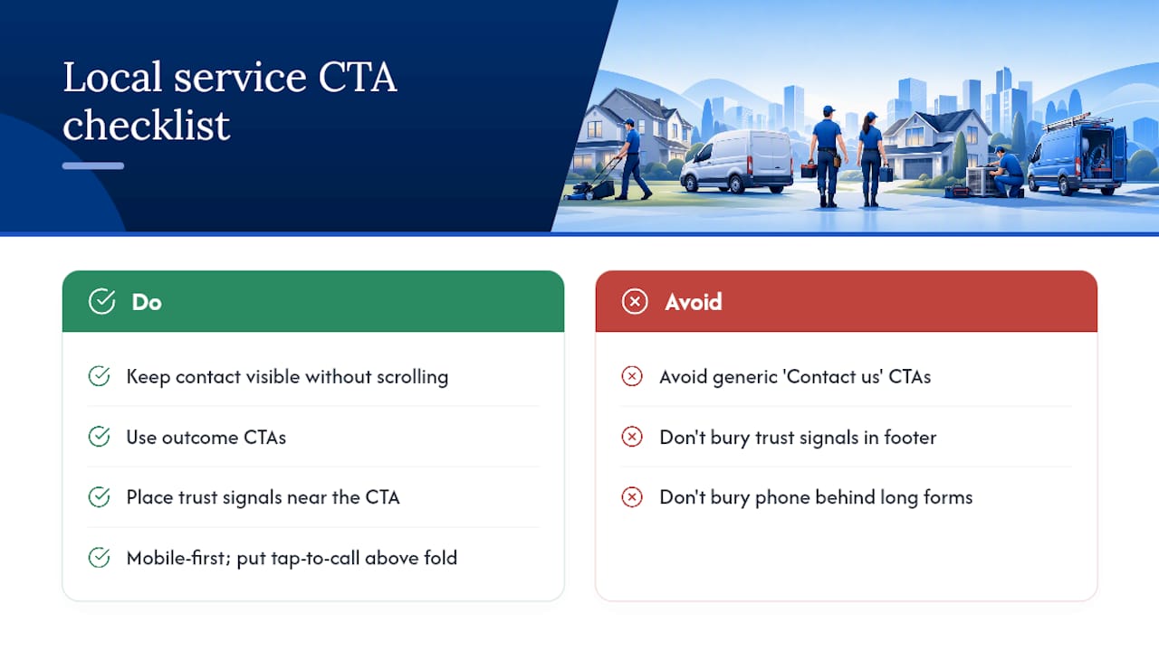
Local service pages live or die on friction. A roofing company, a mobile detailer, or a restaurant doesn't need clever copy nearly as much as it needs a visitor to find the phone number, the booking form, or the quote request in under three seconds.
The essentials for a local service landing page: contact information visible without scrolling, a CTA that names the outcome ("Get your free roof inspection" beats "Contact us"), trust signals (reviews, licensing, years in business) placed near the CTA rather than buried in a footer, and a mobile-first layout since most local searches happen on a phone.
[brand_signal: Forge Web Studio builds these pages with a 3-day to one-week turnaround, specifically because slow launches cost local businesses leads while competitors' sites stay up and running.]
Phone-first businesses, plumbers, electricians, contractors, benefit from a "tap to call" button placed above the fold rather than a form buried below three sections of copy. For booking and quote flows, specific phrasing wins: "Get your free quote today" or "Book your appointment in 60 seconds" outperforms generic "Contact us" language because it tells the visitor exactly what happens next and how long it takes.
Pro Tip: If your business takes phone calls, put the phone number in the header as a clickable link on every single page, not just the contact page. Mobile visitors rarely dig for it.
Forge-web-studio's approach to landing pages for local businesses leans on exactly this checklist: clear contact paths, trust signals near the fold, and CTAs written around outcomes rather than actions.
What I've Learned Running CTA Tests on Local Landing Pages
The biggest surprise in CTA testing isn't which words win, it's how often the "obvious" choice loses. A direct-purchase CTA on a cold traffic page almost always underperforms a lower-commitment ask, even when the product is genuinely a good fit for that visitor. People need a small yes before they'll give a big one.
The second lesson: design fixes usually beat copy fixes for local service pages specifically. Moving a phone number from the footer to the header, or making a "Get a Quote" button 20% larger, tends to move the needle faster than rewriting the button text five different ways. Copy matters, but visibility comes first.
The most common trap is testing too many things at once and drawing false conclusions from small sample sizes. A one-week test with 200 visitors and a 2% difference in conversion tells you almost nothing. Patience with the data matters more than most marketers want to admit.
Frequently Asked Questions
What is a call to action in marketing? A call to action is a prompt, usually a button or short line of text, that tells a visitor the specific next step to take and what they'll gain from taking it, like "Start your free trial" or "Get your quote."
What makes a call to action effective? An effective CTA combines a strong action verb, a clear named benefit, and, when honest, a sense of urgency. Outcome-focused language consistently outperforms vague process words like "Submit" or "Click here."
How many CTAs should one page have? One primary CTA per page or screen works best. Secondary actions can exist but should carry less visual weight so they don't compete with the main goal.
What's the difference between a CTA for cold and warm audiences? Cold audiences respond better to low-commitment CTAs like "Learn more" or "See how it works," while warm, decision-stage audiences respond to direct CTAs like "Buy now" or "Start your trial."
How do you test which CTA works best? Run a single-variable A/B test, changing only the copy, color, or placement, and measure click-through rate, conversion rate, and revenue per visitor over a full weekly cycle for a reliable sample.
What size should a CTA button be on mobile? Mobile tap targets should measure at least 44×44 pixels to prevent mis-taps and keep the button easy to hit on a small screen.
Sources
- 49 Call-to-Action Examples You Can't Help But Click
- 10 Call to Action Examples That Convert (2026)
- Call-To-Action Button Examples + Tips for Making A Great CTA (2026) - Shopify
- 15 call to action examples for 2025 (+ why they work so well) - Unbounce