
An event landing page has exactly one job: get the visitor to register or buy, right now, with zero confusion. The single highest-leverage move is a visible hero with a one-line reason to attend, a CTA that stands out on the first screen, and a checkout flow with the fewest possible steps between click and confirmation. Everything else on the page, examples included, exists to support that one decision.
TL;DR:
- Ensuring the hero section displays the event name, date, and a clear reason to attend with a prominent CTA within the first five seconds is critical.
- Keeping registration forms short, mobile-optimized, and offering guest checkout significantly increases completion rates, especially when input types and validation are well-designed.
- Presenting ticket tiers transparently with included benefits and upfront fees helps build trust and minimizes cart abandonment.
- Incorporating specific social proof elements, like attendance numbers and detailed speaker bios, influences visitor trust and decision-making.
- Building a mobile-first, accessible page that loads quickly with structured data improves discoverability and reduces bounce rates.
Table of Contents
- What Are the Core Elements of Event Landing Page Design?
- How Do You Design a Hero That Converts in Seconds?
- What Registration Form Rules Actually Reduce Drop-Off?
- How Should You Present Ticket Tiers and Fees?
- Which Social Proof Signals Actually Move the Needle?
- How Do You Build a Mobile-First, Accessible Event Page?
- What SEO and Technical Setup Helps Your Event Page Get Found?
- What Do Real Event Landing Pages Get Right?
- How Do You Test and Improve an Event Page After Launch?
- Practical Proof: How Forge Web Studio Implements These Principles
- An Editorial Take on What Most Event Pages Get Wrong
- Forge Web Studio Builds Event Pages That Convert, Not Just Look Good
- Sources
- FAQ
What Are the Core Elements of Event Landing Page Design?
Every high-converting event registration page answers the same five questions in roughly the same order: what is this, when and where, who is it for, why should I care, and how much does it cost. The WordPress Event Ticketing team's research on event pages confirms this sequence isn't arbitrary. Visitors scan for answers in that order whether they're checking on a phone during a coffee break or reviewing options on a laptop.
The anatomy breaks down into a handful of non-negotiable blocks:
- Hero section: event title, one-line value statement, date/time/format, and a CTA button visible without scrolling.
- Scannable details: what's happening, why it matters, who it's for, when and where, and the price, ideally in short bullets or a compact table rather than paragraphs.
- Ticket area: tiers, inclusions, and a clear "select ticket" action, positioned early enough that ready buyers don't have to hunt.
- Social proof: past attendance numbers, speaker names, sponsor logos, or a testimonial or two placed where doubt is most likely to creep in.
- Speakers or agenda: enough detail to signal substance, not just a name and a headshot.
- FAQ block: refund policy, dress code, parking, virtual access details, whatever your specific event generates the most support emails about.
- Logistics: venue address with a map link, parking notes, accessibility info, and time zone if it's virtual or hybrid.
- Confirmation flow: what happens the second someone completes checkout.
Skip any one of these and you create a gap the visitor has to fill by guessing, or worse, by leaving to search elsewhere. The HappeNow event registration guide frames this as answering "what, when, where, why me, how much, sign up" in that exact order, and it's a useful mental checklist to run against any draft before it goes live.
How Do You Design a Hero That Converts in Seconds?
The hero decides whether a visitor registers or bounces, and it does that job in under five seconds. That's not an exaggeration. It's the reason the HappeNow research treats the hero as the single highest-leverage section on the entire page: get the title, date, and reason to attend legible without scrolling, and you've already won half the battle.
On both mobile and desktop, four things need to be visible above the fold: the event name, the date and time (with time zone if relevant), a one-line reason someone should care, and the CTA button. Nothing else. Speaker photos, sponsor logos, and agenda previews can wait for the scroll.
Your subheadline should lead with the benefit, not a description of the event format. "Learn the three pricing models that doubled our clients' close rates" beats "A conference about SaaS pricing strategy" every time, because it answers "why me" before the visitor has to ask.
CTA design matters more than most organizers assume:
- Use high-contrast color against the background, not a shade that blends into your brand palette.
- Write action-specific copy: "Get My Ticket" or "Reserve My Seat" outperforms a generic "Register" for most events.
- Place a second CTA after the agenda or speaker section for anyone who scrolled past the first one unconvinced.
- Keep the button size large enough to tap comfortably on a phone screen, not just click on a mouse.
Pro Tip: Test your headline and CTA copy separately from your layout. A weak CTA on a great layout will underperform a strong CTA on a mediocre one almost every time.
Video works if it's short, muted by default, and doesn't delay the page load. A single strong photo of last year's crowd or venue usually beats a video that takes three seconds to buffer. If you're unsure which converts better for your event, the CTA design guidance from Baby Love Growth has useful notes on wording and placement that apply directly here.
What Registration Form Rules Actually Reduce Drop-Off?
Shorter forms convert better, full stop. The HTML Working Group's research on event registration UX found that trimming form fields down to a small core set, combined with mobile-friendly input types and guest checkout, measurably improves completion rates. That single change often outperforms everything else you could do to the page.
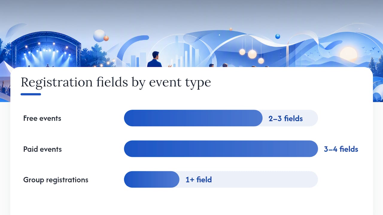
Here's a practical field count to work from:
- Free events: name, email, and maybe one qualifying question (job title, company, dietary needs). That's it. Anything beyond three or four fields adds friction with no payoff.
- Paid events: name, email, payment details, and billing address if your processor requires it. Postpone anything not essential to completing the transaction, like dietary preferences or session picks, to a post-purchase email or the confirmation page.
- Multi-attendee or group registrations: collect the buyer's info first, then offer a simple "add another attendee" flow rather than forcing every name up front.
Guest checkout should be the default, not an option buried behind an account-creation wall. Let people register or buy first, and offer account creation afterward if you want repeat visitors to save time next round. Mobile input types matter more than they get credit for: use type="email" for email fields and type="tel" for phone numbers so the correct keyboard pops up automatically. Inline validation, meaning the field flags an error the moment someone types an invalid entry rather than after they hit submit, cuts frustration and abandonment.
Statistic Callout: Reducing unnecessary form fields and designing mobile-first can dramatically improve registration completion rates, according to the HTML Working Group's UX research on event registration flows.
Accessible error states matter too. A red border alone doesn't help someone using a screen reader; pair the visual cue with text that states exactly what needs fixing. And always show the total cost, including any processing fee, before the final payment step. Nothing kills conversion faster than a number that jumps at checkout.
How Should You Present Ticket Tiers and Fees?
Ticket presentation either builds trust or erodes it in the space of one scroll. Surprise fees at the final step are one of the most reliable ways to lose a buyer who was ready to pay seconds earlier. Venue Sumo's research on booking fees is blunt about it: showing the total cost and any processing fee before the last step preserves conversion, while hiding it until checkout does the opposite.
A few rules make ticket tiers easier to trust and easier to choose from:
- Label tiers by what's included, not just by price point. "General Admission" tells a buyer nothing; "General Admission, includes lunch and slide access" tells them everything.
- Show early-bird deadlines as a specific date, not a countdown timer that resets or feels manufactured. Manipulative urgency tactics erode trust faster than they generate sales.
- Display taxes and processing fees inline with the ticket price, not buried in a tooltip or revealed only at the cart.
- Build a simple UX for group pricing and promo codes: a visible "have a code?" field, and a quantity selector that recalculates the total live rather than requiring a page reload.
If your event serves corporate buyers, a "team booking" option that lets one person register five colleagues in a single flow removes a real friction point. Forcing five separate checkouts for a company outing is the kind of detail that quietly kills bulk sales.
Which Social Proof Signals Actually Move the Needle?
Not all social proof carries equal weight. Named testimonials with a photo and a title outperform vague quotes, numbers of past attendees build credibility fast, and recognizable sponsor or partner logos do a lot of trust-building in very little space. The WordPress Event Ticketing research lists social proof as one of the core blocks a converting page needs, alongside a clear hero and simple checkout path.
Where the proof lives matters as much as what it says:
- Place attendance numbers ("Join 1,200+ marketers") near the hero or right above the first CTA.
- Put speaker bios that mention a specific accomplishment or company name near the agenda, not buried in a separate "About" page.
- Position testimonials right before or beside the ticket selection area, where doubt tends to spike just before someone commits.
- Show sponsor logos in a simple row rather than a busy grid; too many logos at once dilutes the effect.
Speaker bios work best when annotated with substance instead of adjectives. "Led product at a company that scaled from 10 to 200 employees" beats "passionate speaker and thought leader" because it gives the visitor something concrete to evaluate. Event discovery platforms like Eventbrite lean heavily on this same principle; shareability and visible social proof drive a large share of how attendees decide what's worth their time.
How Do You Build a Mobile-First, Accessible Event Page?
More than half of event traffic arrives on a phone, which means mobile isn't a secondary consideration, it's the primary design target. The HappeNow research on registration pages points to cramped form fields and poor tap targets as two of the most common causes of mobile abandonment.
Tap targets need to be large enough for a thumb, not a mouse cursor. That means CTA buttons should sit in the natural thumb zone, generally the lower half of the screen, rather than requiring an awkward stretch to the top corner. Sticky CTAs that stay visible as the visitor scrolls the agenda or FAQ section keep the action within reach at all times.
Pro Tip: Test your form on an actual phone, not just a browser's mobile emulator. Auto-zoom on small type, awkward keyboard pop-ups, and misaligned buttons rarely show up until you're holding the real device.
Performance and accessibility basics round out the checklist:
- Compress and lazy-load images below the fold so the hero loads instantly on a 4G connection.
- Reserve space for images before they load to avoid layout shift that pushes the CTA around as the page renders.
- Write descriptive alt text for every image, especially speaker photos and venue shots.
- Respect reduced-motion preferences; don't force an animation on visitors who've disabled motion at the OS level.
- Keep focus order logical for keyboard navigation, and make sure every interactive element has a visible focus state for screen reader and keyboard users alike.
Input types matter here too: numeric keypads for phone numbers, email keyboards for email fields, and readable type sizes that don't trigger accidental auto-zoom on iOS.
What SEO and Technical Setup Helps Your Event Page Get Found?
Event pages that use structured markup show up more often in rich search results, and that visibility compounds registrations you'd otherwise have to pay for through ads. A conference landing page audited in the LOOP 2026 design and technical notes used JSON-LD Event schema to help search engines surface date, price, and availability directly in results.
The technical checklist for a discoverable event page includes:
- Event schema with start date, end date, location, price, ticket availability, and organizer name marked up in JSON-LD.
- Title tag formatted as event name, one key detail (date or city), and a clear category word like "Conference" or "Workshop."
- Meta description that repeats the value proposition in under 160 characters, written for a human clicking a search result, not just a crawler.
- Open Graph tags with a share preview image sized correctly so the link looks polished when shared on social platforms or in a Slack channel.
- Clean URL slug that includes the event name and year rather than an auto-generated string of numbers.
- Analytics and tracking placed early in the page load so you're not missing data on the visitors who bounce fastest.
Skipping schema markup doesn't break the page, but it does mean you're leaving a free visibility boost on the table.
What Do Real Event Landing Pages Get Right?
Different event types call for different priorities, even though the underlying anatomy stays the same. Here's how four common formats apply the rules differently.
- Free local meetup: The conversion lever is speed. A one-field RSVP (email only) paired with a hero showing the venue address and start time removes almost all friction. Skip the ticket tiers entirely; a single "I'm Coming" button does the job.
- Paid multi-day conference: The lever is tier clarity. Buyers need to see exactly what separates a $299 general pass from a $599 VIP pass before they'll commit, so the ticket cards should list inclusions side by side rather than in separate tabs.
- Hands-on workshop: The lever is scarcity handled honestly. Capacity limits ("24 seats, 18 remaining") work because workshops genuinely have a physical or instructional cap, unlike manufactured countdown timers.
- Virtual webinar: The lever is the confirmation flow. Since there's no physical ticket to hold onto, the calendar invite and reminder emails become the main trust-building tool, so that flow needs to be airtight.
Each pattern maps to a different starting point depending on the event you're running. A local meetup or venue-driven event benefits from a template built around location and RSVP simplicity, similar to the approach used in Forge Web Studio's event venue web design work, while a product launch or SaaS demo leans closer to the structure in the SaaS startup website launch guide.
How Do You Test and Improve an Event Page After Launch?
Launching the page is the starting line, not the finish. Three metrics tell you almost everything you need to know: registration rate (visitors who complete checkout divided by total visitors), abandonment rate at each form step, and the gap between mobile and desktop conversion. A big gap between mobile and desktop numbers almost always points back to tap targets, form length, or page speed on mobile.
Run these tests in order of expected impact:
- Headline and CTA copy: cheapest to test, often the biggest swing in conversion rate.
- Ticket presentation: test tier order, inclusion wording, or whether showing a "most popular" badge on one tier changes selection behavior.
- Form length: test removing one non-essential field at a time and watch completion rate move.
- Hero image versus no image: sometimes a clean text-only hero outperforms a photo, especially on slower connections.
Statistic Callout: Pages that keep the hero and registration form as the dominant visual elements, rather than scattering information across the page, consistently outperform cluttered layouts, based on registration page research from HappeNow.
Don't call a test early. Wait until you have enough traffic that the difference between variants isn't just noise, generally a few hundred visitors per variant at minimum for a typical event page. If your event only runs once and traffic is limited, skip formal A/B testing and instead apply the highest-confidence fixes (shorter form, visible fees, mobile CTA placement) directly.
Practical Proof: How Forge Web Studio Implements These Principles
Forge Web Studio builds event landing pages the same way it builds every client site: mobile-first, lead-flow focused, and fast to launch. A typical event page project runs on the same rapid build timeline the studio applies across its work, with a working, mobile-tested page ready in days rather than weeks, and a layout built around one clear conversion action rather than a dozen competing links.
Clients typically start with a scoped conversation about the event's audience and ticket structure, move into a mobile-first wireframe within the first few days, and launch with tracking and calendar confirmation flows already wired in. The goal each time is the same: a page a first-time visitor understands and trusts within seconds, on whatever device they're holding.
An Editorial Take on What Most Event Pages Get Wrong
Most event pages fail for a boring reason: they try to inform before they convert. Organizers add speaker bios, sponsor grids, and agenda tables before they've made the hero and the CTA impossible to miss. Fix the order. Nail the five-second answer first, then let the rest of the page build confidence for the visitors who need more convincing.
One thing worth trying immediately: read your own hero section for ten seconds and ask if a stranger would know exactly what to do next. If the answer isn't obvious, nothing else on the page matters yet.
— Dylan
Forge Web Studio Builds Event Pages That Convert, Not Just Look Good
Forge Web Studio provides founder-led builds focused on mobile clarity and lead flow, launched quickly with no templates or surprise fees.
That speed matters when an event has a fixed date and a ticking early-bird deadline. Forge Web Studio's landing page service applies the same conversion-first structure covered above: hero-first layout, short registration forms, mobile tap-target sizing, and a confirmation flow with calendar integration built in from the start. The Starter Website starts at $500, with Growth and Custom Business builds scaled for events that need ticketing integration or multi-page agendas.
If you're planning your next event and want a page built around registrations instead of guesswork, start a project request and get a scoped timeline back within days.
Sources
- Event Registration Page Best Practices (2026 Conversion Guide) | HappeNow
- Do booking fees reduce conversions? | Venue Sumo
- Event Landing Page: How to Build a Page That Actually Sells Tickets - WordPress Event Ticketing
- Best practices for designing an event registration website that converts attendees - HTML WG
FAQ
How Do I Build a Landing Page for an Event?
Start with the hero: event name, date, one-line value statement, and a visible CTA above the fold. Layer in ticket details, social proof, and a short registration form, keeping the checkout path to as few steps as the HTML Working Group's event registration research recommends.
What Makes a Good Event Landing Page?
A good event landing page answers what, when, where, why attend, and how much within the first screen, then makes registering or buying a ticket the obvious next step. The HappeNow event page checklist treats that hero clarity as the top conversion driver.
What Is the Best Layout for an Event Landing Page?
The best layout leads with the hero and CTA, followed by scannable event details, ticket options, social proof, and an FAQ, in that order. This structure mirrors how WordPress Event Ticketing's research recommends organizing high-converting event pages.
How Do You Structure a Landing Page for Registrations?
Structure it around a single goal: getting the visitor to complete one form. Keep fields to the essentials, show total costs before the final step, and confirm the flow with an immediate email and calendar file. Forge Web Studio applies this same structure across its event venue web design projects.
How Much Does an Event Landing Page From Forge Web Studio Cost?
Forge Web Studio's Starter Website begins at $500 for a one-off build, with Growth and Custom Business options priced higher for added ticketing or multi-page needs. Exact pricing depends on scope, and current details are listed on the pricing page.