Build a mobile-first hero with a visible click-to-call button and one primary call-to-action, get your mobile LCP under 2.5 seconds, and keep the form to 3 to 5 fields or skip it for a phone-first flow. That single combination drives more mobile bookings than any redesign trick or clever headline. Some web design studios build this exact configuration into every rapid landing page launch.
TL;DR:
- Ensuring your hero section loads in under 2.5 seconds and features a visible click-to-call button can significantly increase mobile bookings.
- Keeping forms to five fields or fewer, or skipping them entirely for emergency services, helps improve conversion rates on mobile.
- Using WebP images, lazy loading, and a CDN can reduce load times and improve Core Web Vitals, lowering bounce rates and boosting rankings.
- Specific, locally targeted headlines and real photos of your team or work build more trust than generic claims, increasing visitor engagement.
- Regular A/B testing of CTAs, layout elements, and speed optimizations can lead to measurable increases in inquiries, as proven by local case studies.
Table of Contents
- What Belongs Above the Fold on a SaaS Landing Page for Mobile Visitors
- Why Mobile Speed Determines Whether Visitors Ever See Your Offer
- What Local Proof Actually Convinces Skeptical Visitors
- How to Build a Testing Loop That Actually Improves Conversions
- Why Rapid Builds Beat Slow, Overbuilt Websites for Local Service Companies
- Get a Mobile-First Landing Page Built the Right Way
- Where to Go Next for Audits, Tools, and Deeper Reading
- Sources
What Belongs Above the Fold on a SaaS Landing Page for Mobile Visitors
Most local service landing pages fail before a visitor even scrolls. The hero area, the section a phone screen shows before any tap, decides whether someone calls, books, or bounces. Get this part right and the rest of the page has less work to do.
Your hero needs four things: a localized value statement, one or two supporting bullets that answer "why you," a tappable phone number, and a single primary call-to-action written in action language, not vague marketing copy. A roofer in Round Rock should not write "Quality Roofing Solutions." Write "24-Hour Emergency Roof Repair in Round Rock, TX" instead, paired with a phone number a thumb can hit without hunting for it.
Button sizing matters more than most designers admit. Keep every tappable CTA a minimum size recommended by mobile interface guidelines to ensure usability, and place it inside the bottom two-thirds of the screen where thumbs naturally rest. A CTA stranded in the top corner of a phone screen gets ignored no matter how good the copy is.
Match the CTA to the urgency behind the visit:
- Emergency plumbing, HVAC failure, lockouts: lead with "Call Now" and make the phone number the biggest tap target on the page.
- Scheduled services like landscaping or house cleaning: use "Book Your Free Estimate" with a short form as the secondary option.
- High-ticket or research-heavy services: offer "Get a Free Quote" and accept that some visitors will fill a form before they'll dial a stranger.
On forms, shorter wins. Cap fields at name, phone or email, service type, and an optional zip code. Every field beyond five adds friction that costs completions, according to guidance compiled across multiple local landing page studies.
Pro Tip: If your business handles same-day or emergency work, skip the form entirely on mobile and make the phone number the only CTA above the fold. Forms slow down someone standing in a flooded kitchen.
Why Mobile Speed Determines Whether Visitors Ever See Your Offer
A beautiful hero section means nothing if it loads after the visitor has already left. Core Web Vitals set the technical floor every landing page needs to clear: Largest Contentful Paint under 2.5 seconds, Interaction to Next Paint under 200 milliseconds, and Cumulative Layout Shift under 0.1. Miss any of these on mobile and bounce rates climb fast, since more than half your traffic is arriving on a phone with an unpredictable connection.
The cost of slow pages: Each additional second of load time can cut conversions by roughly 7%, and Google treats speed as a tiebreaker in local search rankings once your Google Business Profile and reviews are comparable to competitors.
Fixing this rarely means stripping the page down to nothing useful. It means cutting the fat that doesn't serve the visitor:
- Convert every hero image to WebP or AVIF, which shrink file sizes without visible quality loss.
- Lazy load everything below the fold, including testimonial photos and service galleries.
- Defer non-critical JavaScript such as chat widgets and analytics scripts until after the main content paints.
- Serve assets through a CDN so a visitor in Amarillo isn't waiting on a server response from across the country.
- Skip embedded Google Maps on the landing page itself; link to directions instead, since map embeds are notorious LCP killers.
- Set explicit width and height on every image and video element to stop layout shift as the page loads.
Run PageSpeed Insights and Lighthouse's mobile mode before and after any redesign, and take actual phone screenshots at 375 pixels wide. A responsive build that passes Core Web Vitals on a real mid-range Android phone, not just a fast office laptop, is the only test that matters.
What Local Proof Actually Convinces Skeptical Visitors
A generic headline like "Trusted Local Experts" convinces no one, because every competitor's site says the same thing. Specificity builds trust; vagueness kills it. Write headlines around the exact problem you solve: "Same-Day AC Repair for San Antonio Homes Built Before 1990" tells a visitor you understand their situation better than a rival who just says "HVAC Services."
Pair that headline with two or three bullets that name outcomes, not features: response time, service radius, or a guarantee you can actually back up. Then place trust signals close to the call-to-action, not buried in a footer nobody scrolls to:
- A star rating pulled from Google reviews, shown as actual stars, not a text description.
- One or two short local testimonial snippets with a first name and neighborhood.
- A license or insurance badge if your trade requires one.
- A "serving [neighborhood] since [year]" line that signals longevity without a paragraph of company history.
Real photos beat stock photography every time a local visitor is deciding whether to trust a stranger with their home or business. A photo of your actual crew on an actual job in a named neighborhood does more for conversion than a polished stock image of a smiling technician who's never set foot in Texas. BrightLocal data cited in a 2026 guide found that properly localized landing pages generate about 37% more leads than businesses relying on a single generic service page, and that gap traces directly back to specificity: named neighborhoods, real photos, and testimonials tied to actual jobs rather than vague praise.
Avoid guarantee language you can't back up. "100% satisfaction guaranteed" with no explanation of what that means is worse than no guarantee at all. If you offer a specific turnaround time or a written warranty, state the exact terms.
How to Build a Testing Loop That Actually Improves Conversions
Guessing which version of a page converts better wastes months. Track five numbers from day one: mobile conversion rate, phone-call conversions (use call tracking, not guesswork), form completion rate, your Core Web Vitals scores, and bounce rate broken out by device.
- Set a baseline. Tag every button and form in GA4 as an event before you change anything.
- Install a heatmap tool like Microsoft Clarity or Hotjar to see where thumbs actually tap and where they stall out.
- Run one experiment at a time: CTA wording, a sticky mobile call bar versus a static button, or a short form versus a phone-first layout. A proper A/B test design accounts for sample size so you're not calling a winner after 40 visits.
- Give each test roughly two to four weeks depending on traffic, then implement the winner and move to the next variable.
One documented example: a local service business added a sticky mobile call bar and saw mobile inquiries jump 129% over 90 days. That's the kind of change worth testing before you touch anything else.
Pro Tip: Test one variable per cycle. Changing the headline, the CTA, and the form length all at once tells you nothing about which change actually moved the number.
Why Rapid Builds Beat Slow, Overbuilt Websites for Local Service Companies
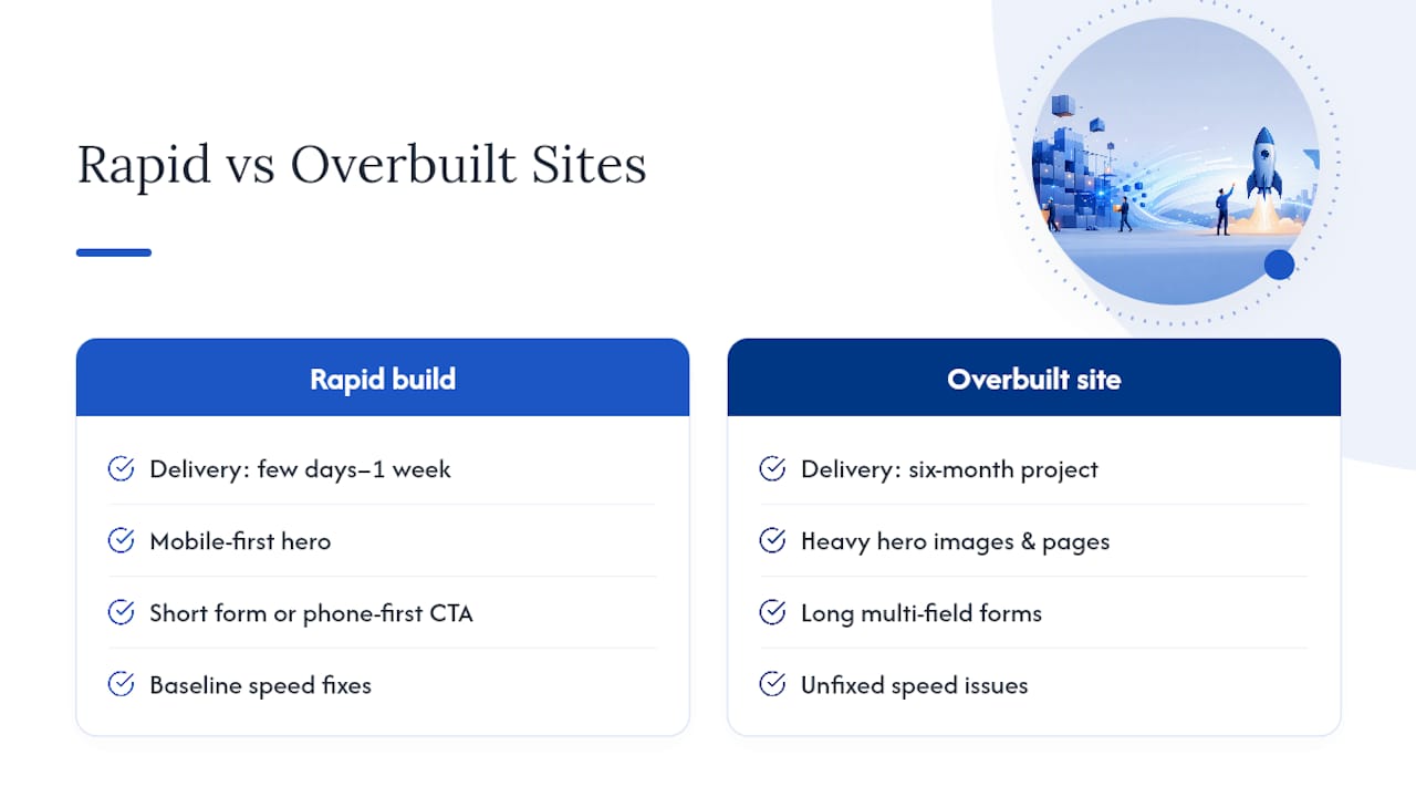
Most local businesses don't need a six-month website project. They need a page that captures leads by next week. A rapid build delivered in a few days to a week typically covers the mobile-first hero, a short form or phone-first CTA, baseline speed fixes, and local SEO fundamentals: exactly the stack this guide covers.
DIY works fine for a business owner comfortable editing a page builder and willing to test speed themselves. It stops working once the site has five unclickable phone numbers, an eight-field form, and a hero image that takes four seconds to load on a phone in a driveway with two bars of signal. Those are the three problems that show up in nearly every landing page in need of a fix: mobile clutter, long forms, and missing trust signals.
— Dylan
Get a Mobile-First Landing Page Built the Right Way
You've read the checklist: fast hero, short form, real proof, tested CTAs. Building it correctly the first time, instead of patching a slow WordPress template for six months, is where some studios earn their keep. Some Texas-focused studios launch a mobile-first landing page, built around click-to-call, Core Web Vitals targets, and local trust signals, in a matter of days rather than several weeks.
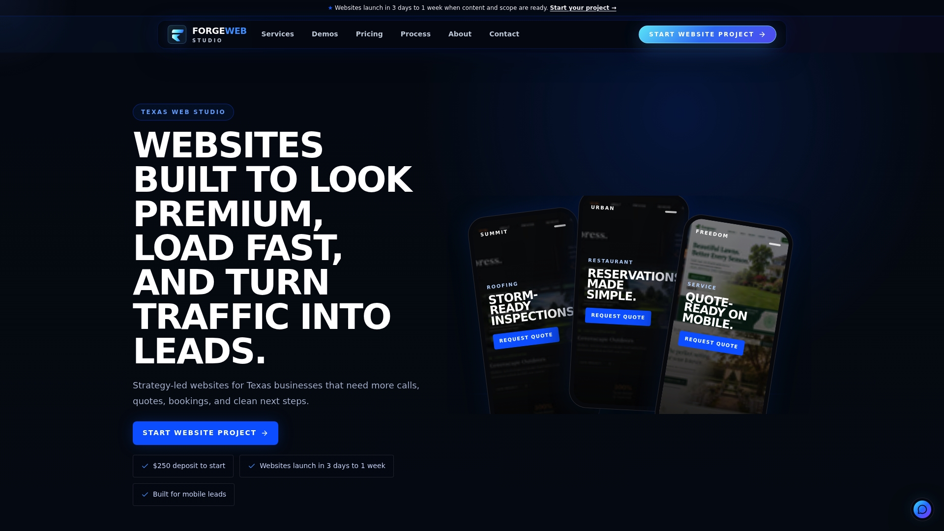
When you reach out, expect a short scoping call, a fixed-scope build timeline, and a page designed around your actual service area and phone-first conversion path rather than a generic template. You can browse real examples first in the demo gallery or go straight to the services overview to see what's included at each tier. If your current site is close but underperforming, the website redesign service covers a rebuild without starting from zero. Request a quick review of your current page and get a straight answer on what's costing you conversions.
Where to Go Next for Audits, Tools, and Deeper Reading
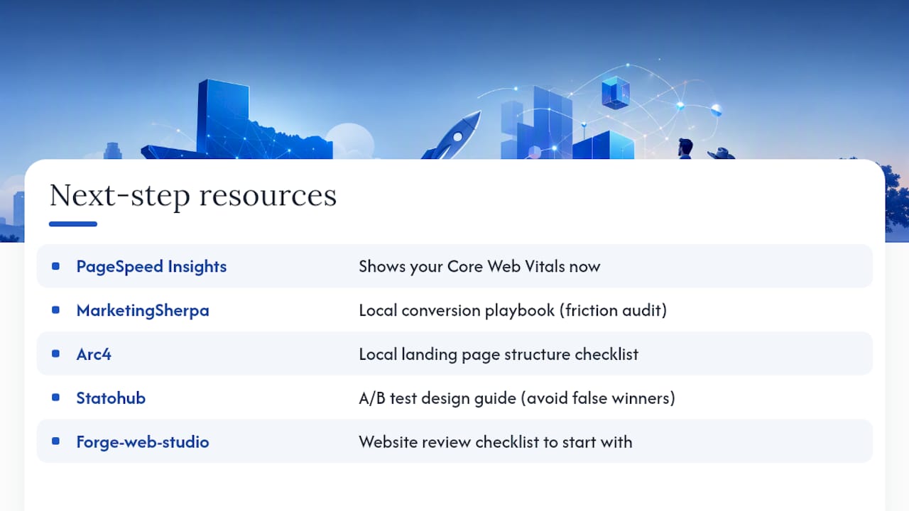
Run your own numbers before you change anything. PageSpeed Insights shows exactly where your Core Web Vitals stand right now. The MarketingSherpa local conversion playbook walks through the friction and anxiety audit framework referenced above in more depth. Arc4's local landing page guide offers a fuller page-structure checklist if you're building section by section. For testing discipline once your page is live, Statohub's A/B test design guide prevents you from calling a winner too early. Use Forge-web-studio's own website review checklist as a starting audit before deciding what to fix first.