
A fast diagnostic will tell you whether the problem is traffic or the page. Fix the identified bottleneck with targeted conversion rate optimization (CRO) tests before you even think about redesigning.
Your conversion rate is simply conversions divided by total visitors, multiplied by 100. A local service site getting 500 visitors and 10 form submissions converts at a low single-digit percentage. For context, many B2B and service websites have conversion rates in the low single digits, while top performers in competitive niches may convert at noticeably higher rates. If you're notably below these ranges, something specific is broken. The question is what.
Here's the three-step action plan you can start within the hour:
- Step 1: Open GA4, segment traffic by channel, and compare engagement rates. If organic traffic bounces at 80% while paid traffic bounces at 30%, the problem is targeting, not the page.
- Step 2: Open Google Search Console and compare your top queries to your homepage headline. If the words don't match, visitors are landing on the wrong page for their intent.
- Step 3: If traffic quality looks fine, audit the page itself: headline clarity, CTA visibility, trust signals above the fold, and form length.
With AI Overviews reducing organic click-through rates, squeezing more value from the visitors you already have is now more economically sound than simply buying more traffic.
Key Takeaways
Diagnosing whether your website isn't converting due to traffic quality or page performance is the single most important step before changing anything on your site.
| Point | Details |
|---|---|
| Diagnose traffic vs. page first | Use GA4 channel segmentation and GSC intent checks before touching copy or design. |
| Quick wins beat redesigns | Headline clarity, CTA specificity, and trust proof placement typically produce faster lifts than a full site overhaul. |
| Test one variable at a time | A structured hypothesis and a single variant per test produce reliable, repeatable learning. |
| Technical issues are silent killers | Core Web Vitals failures and mobile friction drain conversions without triggering obvious error signals. |
| Forge-web-studio builds for conversion | Texas businesses get mobile-first, fast-loading sites with lead flow and GA4 tracking built in from launch. |
Table of Contents
- Is your website not converting because of traffic or the page itself?
- Common psychological and UX reasons your website isn't converting
- High-impact quick wins to try before you redesign
- Technical conversion killers: mobile UX, page speed, and checkout friction
- A practical A/B testing methodology you can run quickly
- Landing pages and funnels: lead generation vs. ecommerce
- When should you redesign your site, and when should you hire a pro?
- The Forge-web-studio compact website review checklist
- How segmentation and personalization can improve your conversion rate
- How to map the customer journey to find where visitors drop off
- How pricing and offers affect conversion rates
- What heatmaps and session recordings reveal that analytics can't
- Why trust signals beyond badges actually convert visitors
- Strategies to reduce cart abandonment for ecommerce
- What most conversion advice gets wrong
- What to do in the next 7 days
- Forge-web-studio builds sites that convert from day one
- Sources
Is your website not converting because of traffic or the page itself?
This is the single most important question to answer before you change anything. Fixing a headline when the real problem is irrelevant traffic is wasted effort. Buying more ads when the page itself is broken just accelerates the bleeding.
The GA4 channel check
In GA4, go to Reports > Acquisition > Traffic Acquisition and segment by Default Channel Group. Look at two columns: engagement rate and session duration.
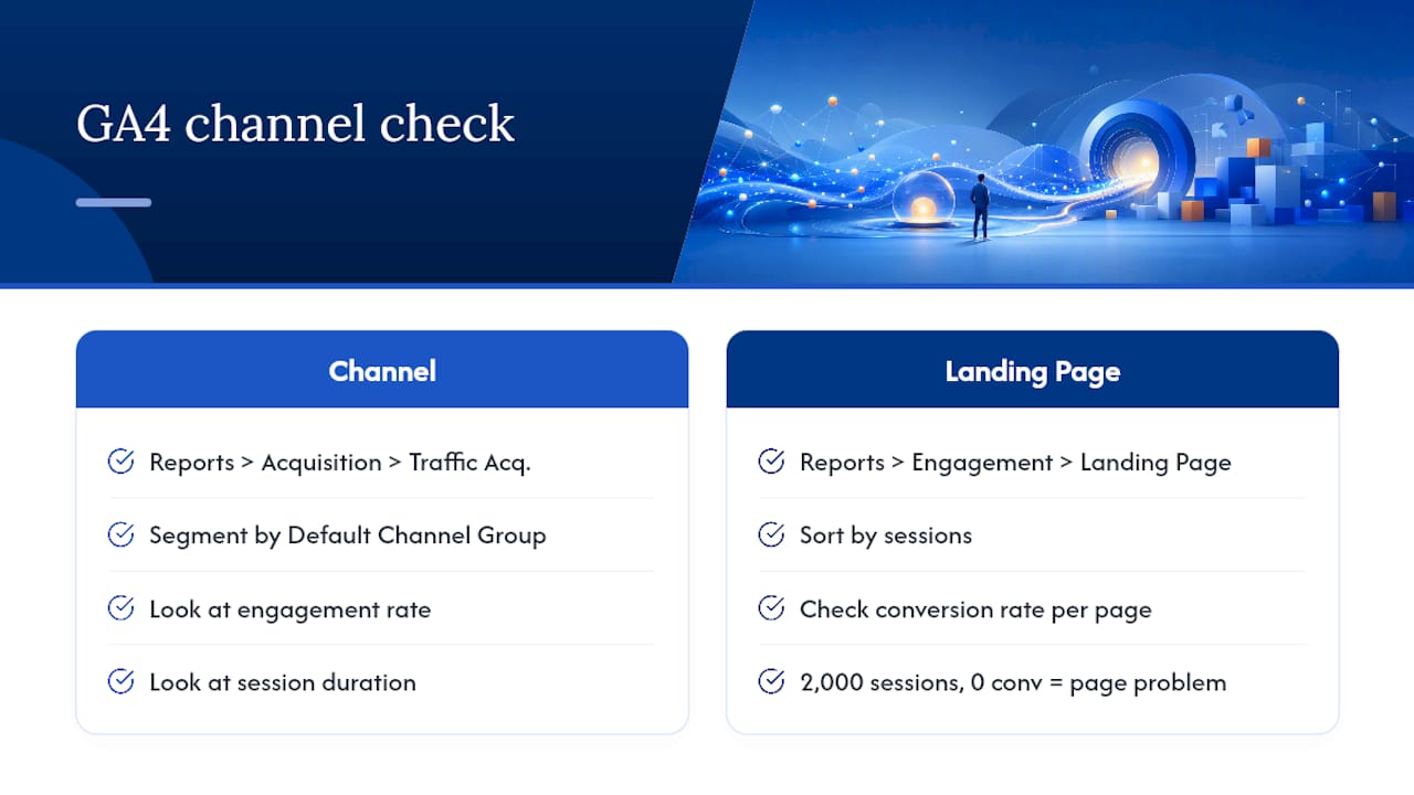
Then pull your top landing pages under Reports > Engagement > Landing Page. Sort by sessions and check conversion rate per page. A page with 2,000 sessions and zero conversions is a page problem. A page with 200 sessions and 1 conversion is a traffic volume problem.
The Google Search Console intent check
Open GSC, go to Search Results, and filter by your homepage URL. Look at the top 10 queries driving clicks. Now read your homepage headline. If your headline says "Full-Service Digital Agency" and your top queries are "affordable website design for plumbers," you have an intent mismatch. Visitors arrive expecting something specific and find something generic. They leave.
Diagnosing whether the issue is traffic or the page starts with these two checks. If two or more signals point to traffic quality (high bounce from one channel, irrelevant queries, low session duration), fix targeting first. If two or more signals point to the page (decent engagement but no conversions, high exit rate on a form page, low click-through on a CTA), the page needs work.
Pro Tip: Before you trust your conversion data at all, verify your GA4 events are firing correctly. Consent mode misconfiguration can suppress conversion events and make a healthy page look broken.
Common psychological and UX reasons your website isn't converting
Most sites that struggle with low conversion rates have two to four of these problems simultaneously. Fixing one and ignoring the others produces a partial lift at best.
-
Unclear value proposition. Symptom: visitors spend under 15 seconds on the page. Your headline describes what you do, not what the visitor gets. Test: rewrite the headline as an outcome ("Get a mobile-ready website live in 3 days") and measure time-on-page against the original.
-
Weak or vague CTA. "Learn More" and "Submit" are not calls to action. They're placeholders. Test: change "Submit" to "Get My Free Quote" and watch form completion rates move. The specificity of the verb matters.
-
Self-focused copy. Every sentence starts with "We" or "Our." Visitors don't care about your company; they care about their problem. Before: "We build beautiful websites." After: "You get a site that loads fast, looks sharp on mobile, and turns visitors into calls."
-
Cognitive overload. Too many navigation links, competing CTAs, and sidebar widgets all fight for attention. Hick's Law is blunt: more choices slow decisions. Test: remove secondary navigation from a landing page and measure conversion rate against the full-nav version.
-
Missing trust signals. No reviews, no client logos, no case studies, no phone number visible above the fold. Visitors who don't trust you don't convert. Quick test: add a specific testimonial ("Booked 3 new clients in the first week") directly beneath the CTA.
-
No urgency or relevance. A generic page with no time-sensitive offer and no local relevance feels like a brochure. A page that says "Serving Austin businesses since 2019, with availability this week" feels like a real business.
-
Poor mobile usability. Tap targets too small, text that requires pinching, forms that break on iOS. More than half of web traffic is mobile. A page that works on desktop but frustrates on a phone loses those visitors entirely.
-
Form friction. Every extra field you add reduces completions. A 7-field form asking for company size, annual revenue, and "how did you hear about us" before the visitor even knows if you're right for them is a conversion killer. Cut to the minimum: name, email or phone, and one qualifying question.
A structured CRO process prioritizes headlines, above-the-fold clarity, and form friction first, precisely because these are the highest-leverage levers. Start there.
High-impact quick wins to try before you redesign
A full redesign takes weeks and costs money. These fixes take hours and often produce measurable lifts within days, especially for ecommerce sites where small UX and copy changes can move conversion rates quickly.
-
Rewrite the headline for outcome clarity. Pull your current headline, identify the visitor's primary goal, and restate it as a direct benefit. One sentence, above the fold, no jargon.
-
Make the CTA the only obvious next step. One primary CTA per page, high contrast, positioned above the fold and again after the main value section. Remove competing links from the hero area.
-
Move your best social proof above the fold. A specific result ("Increased leads by 40% in 60 days") beats a generic five-star rating. Place it within 300 pixels of the CTA.
-
Reduce form fields to three or fewer. Name and contact method are enough to start a conversation. You can qualify later.
-
Run a speed check and fix the obvious. Open PageSpeed Insights, look at the largest image on the page, compress it with Squoosh or ShortPixel, and re-test. A one-second improvement in load time has a measurable effect on bounce rate.
-
Create a campaign-specific landing page for any paid traffic. Sending Google Ads clicks to your homepage is one of the most common and expensive mistakes in digital marketing. A dedicated landing page aligned to the ad's message converts at a significantly higher rate.
Pro Tip: Score each quick win with an ICE framework before you start: Impact (how much will this move the needle?), Confidence (how sure are you it will work?), Ease (how fast can you ship it?). Score each 1–3 and run the highest total first. This prevents you from spending two days on a low-impact font change while a broken CTA sits unfixed.
Technical conversion killers: mobile UX, page speed, and checkout friction
Technical problems are silent. They don't announce themselves with error messages. They just quietly drain conversions while you keep tweaking copy.
The technical checklist
- Core Web Vitals: Run PageSpeed Insights on your top landing page. Largest Contentful Paint (LCP) should be under 2.5 seconds. Cumulative Layout Shift (CLS) should be under 0.1. Interaction to Next Paint (INP) under 200ms. Failing any of these signals a poor user experience to both visitors and Google.
- Time to Interactive: If your page takes more than 5 seconds to become interactive on a mid-range Android device, a significant portion of mobile visitors will leave before it loads.
- Mobile tap targets: Buttons and links should be at least 48x48 pixels with adequate spacing. Run Chrome DevTools in mobile emulation and try tapping every CTA with a simulated finger. If you miss on the first tap, visitors will too.
- Third-party script bloat: Every chat widget, analytics tag, and social share button adds load time. Run Lighthouse and check the "Reduce JavaScript execution time" opportunity. Defer anything noncritical.
- Form validation errors: Test your contact form on mobile. Does it show clear inline error messages? Does it auto-fill correctly? A form that silently fails on iOS is a conversion killer you'd never catch from a desktop.
- Checkout friction (ecommerce): Count the steps from "add to cart" to "order confirmed." Every unnecessary step loses a percentage of buyers. Guest checkout, address autofill, and saved payment methods are not luxuries.
Tools to run right now
PageSpeed Insights gives you a scored report with specific fix recommendations. Google Lighthouse (built into Chrome DevTools) audits performance, accessibility, and best practices in one run. For real-device testing, use BrowserStack or simply test on a physical Android and iPhone you have access to.
The fixes with the highest return are usually image optimization (convert to WebP, compress before upload), deferring noncritical JavaScript, and removing unused CSS. These are developer tasks that take hours, not weeks.
A practical A/B testing methodology you can run quickly
Testing without a framework produces noise. Here's a process that actually works.
-
Identify the metric. Pick one primary metric per test: form submission rate, CTA click rate, or checkout completion. Testing everything at once tells you nothing.
-
Form a hypothesis. Use this template: "Because [observation], changing [element] to [variant] will increase [metric] by [expected direction] for [audience]." Example: "Because visitors exit the contact page at 78% without submitting, changing the CTA from 'Submit' to 'Get My Free Quote' will increase form submissions for first-time visitors."
-
Build one variant. Change one thing. Not the headline AND the CTA AND the image. One variable per test.
-
Set a sample size before you start. Use a sample size calculator (Evan Miller's is free and widely used). For a 5% baseline conversion rate, detecting a 20% relative improvement requires roughly 2,000 visitors per variant. If you don't have that traffic, run qualitative testing first.
-
Run for at least two full business cycles. A "business cycle" is typically one week. Running a test from Tuesday to Thursday and calling it done introduces day-of-week bias.
-
Measure with statistical significance in mind. Aim for 95% confidence before declaring a winner. Most A/B testing tools (VWO, Google Optimize's successor tools, or Optimizely) calculate this automatically.
The priority order for testing: headlines first, then CTAs, then forms, then layout. This follows the structured CRO prioritization approach that consistently produces the fastest measurable lifts.
Pro Tip: Document every test, including the ones that lose. A losing test tells you what your audience doesn't respond to, which is just as valuable as knowing what works. Build a simple log: hypothesis, variant, result, date, traffic volume. After 10 tests, patterns emerge.
For low-traffic sites, skip A/B testing entirely until you have volume. Use session recordings and user testing to generate hypotheses, then validate them once traffic grows.
Landing pages and funnels: lead generation vs. ecommerce
The word "conversion" means something different depending on your business model, and the optimization priorities shift accordingly.
Lead generation
A conversion is a form submission, a phone call, or a booked appointment. The page's job is to establish enough trust and clarity that a stranger is willing to hand over their contact information. The top priorities: a specific headline, a short form (three fields maximum), and a trust signal placed directly adjacent to the form.
Micro-conversions matter here too. A visitor who clicks your phone number but doesn't call is a signal. Track call-click events in GA4. A visitor who starts filling out the form and abandons on field 4 is telling you the form is too long.
For paid campaigns, send traffic to campaign-specific landing pages, not your homepage. The message match between ad and page is one of the strongest predictors of conversion rate.
Ecommerce
A conversion is a completed purchase. The funnel has more steps: product page → cart → checkout → confirmation. Drop-off can happen at any stage, and each stage needs its own optimization. Product pages need specific imagery, clear pricing, and social proof (reviews with photos outperform star ratings alone). Cart pages need urgency and reassurance (free shipping threshold, easy returns). Checkout needs speed and minimal friction.
Funnel mapping checklist:
- Identify the top three pages where visitors exit before converting (GA4 > Funnel Exploration).
- For each exit page, check: Is the next step obvious? Is there a trust signal visible? Is the page fast on mobile?
- Set up micro-conversion events (add-to-cart, initiate-checkout, begin-form) so you can see exactly where the funnel breaks.
When should you redesign your site, and when should you hire a pro?
Not every conversion problem requires a redesign. In fact, most don't. A redesign makes sense when the site's structure itself prevents optimization: the information architecture is wrong, the brand no longer reflects the business, or the technical foundation is too slow to fix incrementally.
Decision criteria
- Keep optimizing yourself if traffic is growing, the site loads in under 3 seconds on mobile, and you haven't yet tested the top five quick wins.
- Run a targeted redesign if the site is more than 4 years old, fails Core Web Vitals on mobile, or has a navigation structure that confuses visitors (high exit rates on pages that should be low-friction).
- Hire a pro if you've run tests, made fixes, and conversion rate is still below 1% with qualified traffic, or if a rebrand or new service line requires a structural overhaul.
Hiring checklist
When evaluating a web design partner, ask:
- Can you show me before/after conversion data from a comparable project?
- What does your mobile-first process look like specifically?
- How do you handle speed optimization at launch?
- What's the timeline from deposit to live site?
- Do you set up GA4 conversion tracking as part of the build?
Red flags: a proposal that jumps straight to a full redesign without auditing your current data, no mention of testing or measurement, and vague deliverables like "modern design" with no performance benchmarks attached.
For a website redesign project with a focused scope, expect 2–6 weeks from kickoff to launch for a small business site. The first 30 days after launch should focus on data collection, not more changes. The first 90 days should produce at least one completed A/B test with documented results.
The Forge-web-studio compact website review checklist
Run this audit in 15–45 minutes. Score each category 0–3 using the rubric below, then total your score to find your priority action.
The audit steps
- Above-the-fold clarity: Read your headline aloud. Does it state who you help and what they get, in one sentence? Score 3 if yes, 2 if partially, 1 if vague, 0 if it describes your company instead of the visitor's outcome.
- CTA visibility: Is there a single, high-contrast CTA button visible without scrolling on both desktop and mobile? Score 3 if yes on both, 2 if desktop only, 1 if buried below the fold, 0 if absent.
- Trust proof placement: Is there a specific testimonial, client logo, or result metric visible above the fold or within the first scroll? Score 3 if specific and near the CTA, 2 if present but generic, 1 if only on a separate page, 0 if absent.
- Form friction: Count your form fields. Score 3 for three or fewer, 2 for four to five, 1 for six to seven, 0 for eight or more.
- Core speed check: Run PageSpeed Insights on your homepage. Score 3 for 90+, 2 for 70–89, 1 for 50–69, 0 for under 50.
- Mobile thumb-zone test: Open your site on a phone and try to tap the CTA with your thumb without adjusting your grip. Score 3 if it's easy, 2 if reachable with a stretch, 1 if requires two hands, 0 if the button is too small to tap accurately.
Scoring rubric
| Score band | What it means | First action |
|---|---|---|
| 0–4 | Multiple structural problems | Fix CTA visibility and headline clarity before anything else |
| 5–8 | Moderate issues with clear priorities | Run the quick wins in order: headline, CTA, trust proof |
| 12 | Solid foundation | Move to A/B testing and funnel optimization |
Use the Website Review Checklist from Forge-web-studio to run a more detailed version of this audit with guided prompts for each category.
How segmentation and personalization can improve your conversion rate
Showing the same page to every visitor is a blunt instrument. A roofing company owner in Austin and a homeowner in Dallas have different concerns, different urgency levels, and different trust thresholds. Personalization addresses that gap.
The simplest segmentation you can run today: separate landing pages by traffic source. Visitors from a Google Ads campaign for "emergency roof repair Austin" should land on a page that mirrors that exact language, not a generic homepage. Visitors from an organic search for "how much does a new roof cost" are in research mode and need different content than someone ready to book.
Beyond traffic source, segment by geography (city-specific service pages), device type (mobile visitors often need a click-to-call CTA more than a long form), and returning vs. new visitors (returning visitors already know who you are; skip the brand introduction and show them the offer).
Tools like Google Optimize's successors, VWO, and Mutiny allow you to serve different headlines or CTAs based on UTM parameters, location, or behavior. Start with the simplest version: two landing page variants for your top paid campaign, one for cold traffic and one for retargeting. The difference in conversion rate between a generic page and a message-matched page is typically significant enough to justify the hour it takes to build the second version.
How to map the customer journey to find where visitors drop off
A customer journey map is not a marketing exercise. It's a diagnostic tool. The goal is to identify the exact moment a visitor stops moving toward a conversion and understand why.
Start with your GA4 Funnel Exploration report. Define the funnel steps that match your actual conversion path: homepage → service page → contact page → thank-you page. GA4 will show you the percentage of visitors who move from each step to the next and where the largest drop-offs occur.
It usually means one of three things: the service page didn't answer the visitor's key objection, the CTA wasn't visible, or the contact page itself created friction. Each of these has a different fix.
Pair the quantitative funnel data with session recordings. Watch five to ten recordings of visitors who reached the service page but didn't click through to contact. Where do they scroll? Where do they stop? What do they click that isn't the CTA? This combination of funnel data and behavioral observation is the fastest way to form a credible hypothesis for your next test. CRO is a continuous loop of data collection, behavioral analysis, hypothesis formation, and testing.
How pricing and offers affect conversion rates
Pricing presentation is one of the most underused conversion levers. The way you display a price changes how visitors perceive value, even when the number is identical.
Anchoring works: showing a higher-priced option first makes the middle option feel reasonable. A three-tier pricing table where the middle tier is visually highlighted ("Most Popular") consistently outperforms a single-price page for service businesses. This isn't manipulation; it's giving visitors a frame of reference.
Offers create urgency without requiring a discount. "Free consultation this week" or "3 spots remaining for April builds" moves people who were on the fence. The key is specificity. "Limited availability" is vague. "2 project slots open for May" is concrete and credible.
For service businesses, removing price friction entirely by offering a free audit, a free call, or a free checklist as the first conversion step lowers the barrier significantly. The visitor commits to a low-risk action, and you earn the chance to demonstrate value before asking for money. This is the logic behind lead magnets, and it works because it respects the visitor's decision-making process.
What heatmaps and session recordings reveal that analytics can't
GA4 tells you that visitors leave a page. Heatmaps and session recordings tell you why.
A heatmap shows where visitors click, how far they scroll, and where their attention concentrates. The most common finding: visitors click on elements that aren't links (images, section headers, decorative icons) because they expect them to be interactive. Every non-clickable element that gets clicks is a missed conversion opportunity or a source of frustration.
Scroll maps reveal something equally useful: most visitors never see content below the fold. The fix is obvious once you see the data.
Session recordings add the behavioral layer. Watch a visitor land on your contact page, start filling out the form, then stop at the "How did you hear about us?" field and leave. That's a specific, fixable problem you'd never find in a bounce rate report.
Tools like Hotjar, Microsoft Clarity (free), and FullStory each offer heatmaps and session recordings. Microsoft Clarity is a practical starting point for small businesses because it's free and integrates directly with GA4. Run it for two weeks before making any page changes, and you'll have enough behavioral data to prioritize your first three tests with confidence.
Why trust signals beyond badges actually convert visitors
A padlock icon and an SSL badge are table stakes. They tell visitors your site is technically secure, which is the minimum expectation in 2026, not a differentiator.
The trust signals that actually move conversion rates are specific and human. A review that says "Dylan responded within 2 hours and the site was live in 4 days" is worth more than a generic five-star rating because it answers a specific objection (will they be responsive? how long will this take?). Case studies with before/after metrics ("went from 0 to 12 inbound leads per month") answer the question every visitor is silently asking: "Has this worked for someone like me?"
Named clients, real photos of your team, a physical address, and a visible phone number all reduce perceived risk. For local service businesses, a Google Business profile with recent reviews and a consistent NAP (name, address, phone) across the site and Google Business listing builds the kind of local credibility that converts searchers into callers.
The placement matters as much as the content. Trust signals buried on a testimonials page don't help visitors who never scroll that far. Put the most specific, relevant proof directly adjacent to your primary CTA.
Strategies to reduce cart abandonment for ecommerce
Cart abandonment is a conversion problem with a specific set of causes, and most of them are fixable without a redesign.
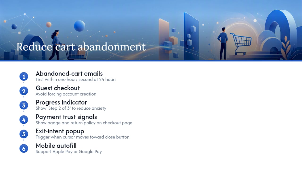
The most effective recovery tactic is a well-timed abandoned cart email sequence. Send the first email within one hour of abandonment, referencing the specific product left behind. A second email at 24 hours with a specific reason to return (free shipping, a limited-time offer, or simply a reminder) recovers a meaningful percentage of abandoned carts. The sequence works because most abandonment is not a rejection; it's a delay.
On the checkout page itself, the highest-impact fixes are: guest checkout (forcing account creation before purchase is a significant drop-off point), progress indicators (showing "Step 2 of 3" reduces anxiety about how long this will take), and trust signals at the payment step (a security badge and a clear return policy directly on the checkout page, not linked away from it).
Exit-intent popups on the cart page, triggered when a visitor moves their cursor toward the browser's close button, can recover visitors who are about to leave. The goal is to give the visitor one concrete reason to complete the purchase now rather than later.
For mobile checkout specifically, autofill support for address and payment fields is not optional. A checkout that requires a mobile visitor to manually type a 16-digit card number will lose a significant portion of those buyers to a competitor whose checkout supports Apple Pay or Google Pay.
What most conversion advice gets wrong
The standard CRO playbook tells you to run A/B tests, add trust badges, and simplify your forms. That's all true. But the advice almost always skips the most important step: figuring out whether the problem is even on the page.
The majority of "website not converting" diagnoses I see skip the traffic quality check entirely. A business owner spends three weeks rewriting headlines and testing CTA colors while their Google Ads campaign is sending clicks from the wrong city, the wrong intent, or the wrong device. The page was never the problem.
The second pattern: businesses treat trust signals as a checklist item. Add a badge, add a testimonial, done. But a testimonial that says "Great service, highly recommend!" is almost worthless. A testimonial that says "We had our new site live in 5 days and booked two new clients the first week" answers the exact question a prospective buyer is asking. Specificity is what converts, not the presence of a quote.
The third pattern is the most expensive: jumping to a full redesign before running a single test. A redesign resets your data, introduces new variables, and takes weeks. In most cases, five targeted tests on the existing site will tell you more about what your visitors actually need than any amount of design speculation.
Diagnose first. Test fast. Redesign only when the data demands it.
What to do in the next 7 days
A fast diagnostic will tell you whether your conversion problem is traffic quality or page performance. Fix the identified bottleneck with targeted tests before committing to a redesign.
Days 1–2: Diagnose
- Run the GA4 channel check and identify the highest-bounce traffic source.
- Run the GSC intent check and compare top queries to your headline.
- Run PageSpeed Insights on your top landing page and note your LCP score.
Days 3–4: One quick win
- Pick the single highest-ICE fix from the quick wins list (usually headline clarity or CTA copy).
- Implement it and set up a GA4 event to track the specific conversion you're targeting.
Days 5–7: Set up one test
- Write a hypothesis using the template from the testing methodology section.
- Set up a simple A/B test using your chosen tool (VWO, Optimizely, or a native platform feature).
- Define your success metric and the minimum run duration before you'll read results.
If you only have one day: Fix the CTA. Change vague button text to a specific outcome ("Get My Free Quote," "Book a Call," "See Pricing"). It's the fastest change with the most consistent lift across site types.
What to track: Form submissions, CTA click rate, and session duration on the page you changed. If all three improve after the fix, you've confirmed the diagnosis. If session duration improves but conversions don't, the page is engaging but the offer or form still needs work.
Forge-web-studio builds sites that convert from day one
If you've run the audit and the diagnosis points to structural problems, a site that's slow on mobile, a lead flow that's unclear, or a foundation that can't support the tests you need to run, that's where Forge-web-studio comes in.
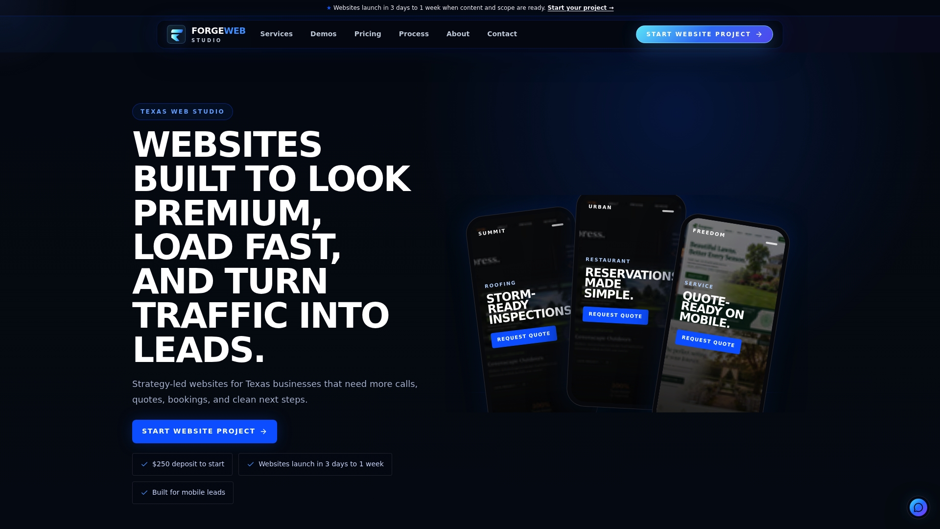
Forge-web-studio builds strategy-led websites for Texas businesses, with a focus on mobile clarity, lead flow, and local search performance. Projects launch in 3 days to a week, not months. Every build includes GA4 conversion tracking setup, mobile-first layouts with proper tap targets, and clear contact paths designed to turn visitors into calls and form submissions.
The difference from a generic agency: Forge-web-studio starts with your conversion goal, not a design mood board. You get a site built around the specific fixes this article covers, speed, mobile usability, trust signals above the fold, and a CTA structure that actually works, without the 12-week timeline or the open-ended retainer.
Ready to stop guessing what's broken? See Forge-web-studio's services and get a clear picture of what a conversion-focused build looks like for your business.
Sources
Recommended tools:
- Why Your Website Isn't Converting (Fix These 5 Issues Fast) — WhyNotConverting
- How to improve your website conversion rate — CROForce
Authoritative reads:
A note on tracking accuracy: If your conversion numbers look suspiciously low, check your GA4 consent mode setup before making any page changes. A misconfigured consent banner can suppress conversion events for a large portion of visitors, making a healthy page look broken. Verify that your key events (form submission, phone click, checkout complete) are firing in GA4's DebugView before you trust the data.