
Alt text is a short written description of an image that stands in for it when the picture cannot be seen or loaded. The rule that matters more than any other: describe the image's actual purpose on that specific page, and if the image is purely decorative, leave the alt attribute empty (alt="") instead of skipping it entirely.
TL;DR:
- Proper alt text should focus on the image's purpose within the page context, not just its visual description, ensuring accessibility for screen readers.
- Use concise, relevant descriptions that highlight what the image does or conveys, skipping phrases like "image of" or "photo of."
- For complex visuals like charts, include a brief headline in alt text and provide detailed data or explanations in nearby text or tables.
- Automated AI tools can help generate initial alt text but require careful review to ensure context accuracy and purpose alignment.
- Always verify that decorative images use empty alt attributes and that linked images describe their destination, improving both accessibility and SEO.
Table of Contents
- What Counts as Good Alt Text for Images?
- Alt Text Examples for Photos, Logos, Headshots, and Icons
- How Do You Write Alt Text for Charts and Complex Images?
- Which Tools Help You Write and Check Alt Text?
- How Do You Add and Audit Alt Text in a CMS?
- A Practice Note From the Studio Floor
- Why Alt Text Deserves More Than a Compliance Checkbox
- Want This Handled for You?
- Where to Read the Official Guidance
- Sources
- FAQ
What Counts as Good Alt Text for Images?
Good alt text answers one question: why is this image on the page? Not what does it show in general, but what job is it doing right here. A photo of a hairstylist mid-cut means something different on a salon's homepage ("Stylist trimming a client's layered bob") than it does on a job-listing page ("Stylist position now hiring at downtown salon"). That context dependency is the whole game, and it's the same point Harvard's accessibility team makes about writing to purpose rather than to the picture itself.
A few rules cover most of what you'll ever need to write:
- Lead with what matters. Screen readers read in order, so put the important word first. "Red clearance sale banner, 40% off" beats "A banner that is red and advertises a clearance sale."
- Keep it tight. Usability research from the Nielsen Norman Group recommends staying under roughly 150 characters so listeners can decide fast whether to keep listening.
- Skip "image of" and "photo of." Screen readers already announce that it's an image; adding the phrase just wastes the listener's time, a point Kansas's CMS guidance makes directly.
- End with a period. It gives screen readers a pause cue, which helps pacing when alt text runs into the next element.
- Every image needs an alt attribute, even if it's empty. A missing attribute can cause some screen readers to announce the filename instead, which is worse than silence.
- Functional images get action text. A magnifying-glass search icon should read "Search," not "Magnifying glass icon."
- Don't repeat the caption or body text word for word. If a caption already says "Golden Gate Bridge at sunset," the alt text should add something the caption doesn't, like the vantage point or what's happening in the shot.
Pro Tip: Turn on your screen reader (VoiceOver on Mac, Narrator on Windows) and listen to your own page for five minutes. You'll catch clunky alt text faster than any checklist will.
Alt Text Examples for Photos, Logos, Headshots, and Icons
Seeing the difference between weak and strong alt text side by side makes the rules click faster than any explanation.
- A photograph on a service page. Weak: "Image of a plumber." Strong: "Plumber replacing a corroded pipe under a kitchen sink." The strong version tells the reader (and Google) what specific service is being shown.
- A headshot on a team page. Include the name and role when the page already identifies who's who: "Maria Chen, lead landscape designer." On a generic "our team" grid without individual bios, a role-only description works fine: "Landscape designer reviewing a site plan."
- A logo used as a homepage link. Describe the destination, not the artwork: "ExampleCo home" rather than "Blue swirl logo." The visitor needs to know where clicking takes them.
- A decorative icon next to a heading, like a small checkmark graphic that repeats what the text already says. Use
alt=""and move on. It adds nothing a screen reader needs to hear twice. - A stock photo on a blog post. The same image of two people shaking hands could be "Two business owners finalizing a partnership agreement" on a legal blog, or "Recruiter greeting a new hire on their first day" on an HR blog. The picture never changes; the alt text should, based entirely on what the surrounding article is about.
How Do You Write Alt Text for Charts and Complex Images?
Charts, infographics, and data visuals need two layers: a short alt that states the headline finding, and a longer, visible description or data table nearby for anyone who needs the full picture. That's the pattern Google's technical writing guidelines recommend, and it works because no screen reader listener wants forty data points read aloud through one alt attribute.
A sales chart is a good test case. The alt text should read something like "Quarterly sales chart showing revenue rising 20% from Q1 to Q4," not a robotic list of every bar's value. Put the actual numbers in a table right below the chart so sighted and non-sighted readers both get the detail.
| Image type | Alt text pattern | Where the detail lives |
|---|---|---|
| Bar or line chart | Headline trend in one sentence | Data table beneath the chart |
| Infographic | Main takeaway summarized | Linked full-text version or transcript |
| Group of related photos | One alt covering the shared message | Redundant images get alt="" |
| Linked image or button | The destination or action | N/A, no separate description needed |
| Image of text (a quote graphic, a scanned flyer) | The exact text, verbatim | N/A if the text is short enough to fit |
A few extra patterns worth knowing:
- When several images repeat the same visual idea (a row of five identical "verified" badges), write one meaningful alt text for the first and set the rest to
alt="". - Linked images should describe where the click leads, not what the picture looks like. If a product photo links to checkout, the alt text is "Add to cart," not "Blue running shoe."
- Images that ARE text, like a hand-lettered promotional graphic, need the exact wording transcribed so nobody misses the offer.
Which Tools Help You Write and Check Alt Text?
Most modern CMS platforms, including WordPress, Shopify, and Webflow, now offer auto-generated alt text at upload, and some layer in AI suggestions. Browser extensions and built-in checkers can flag missing alt attributes across a whole site in minutes.
The catch: AI-generated alt text describes what's visually in the frame, not why the image is on that page. It can't tell that the same stock photo of a handshake needs different wording on a legal page versus an HR page, a gap the University of South Carolina's accessibility team flags as the core limitation of automated tools. Treat any AI output as a draft, not a final answer.
Before you accept an AI suggestion, run it against this checklist:
- Does it stay under the character limit?
- Does it match the page's actual context, not just the image's contents?
- Does it capture the image's purpose, not just its appearance?
- Does it avoid repeating the caption or nearby copy?
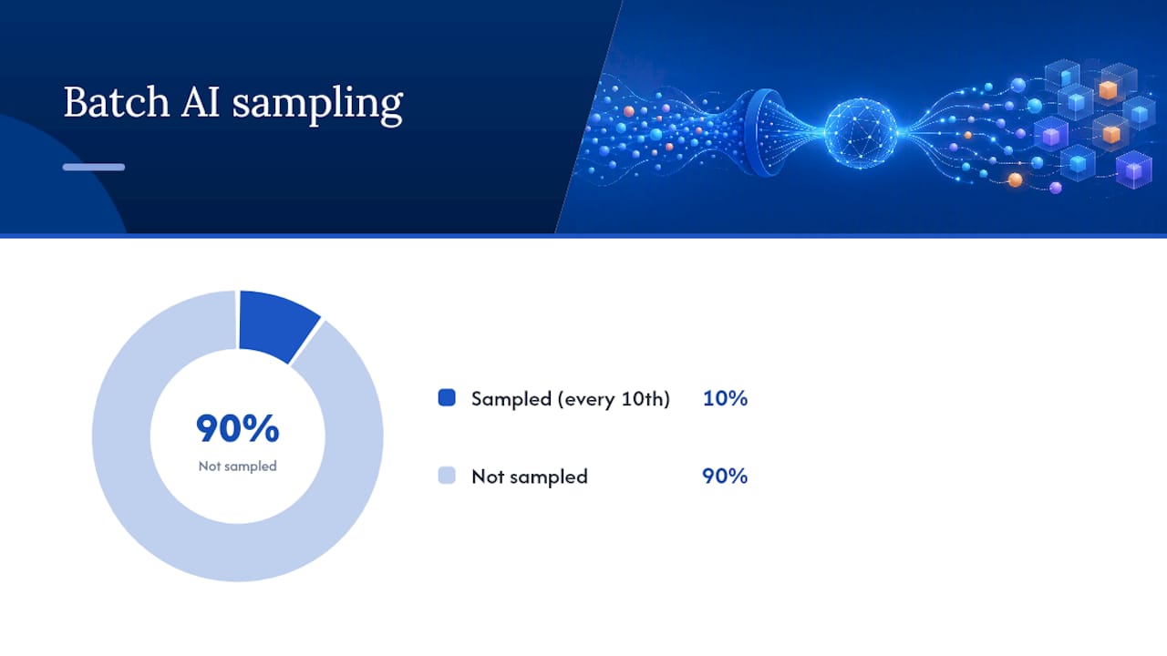
Pro Tip: If you're batch-generating alt text with AI across dozens of product photos, use it responsibly by sampling every tenth result and reading it with a screen reader before you publish the batch.
How Do You Add and Audit Alt Text in a CMS?
Most content editors, from WordPress's media library to Shopify's product image panel, have a dedicated "alt text" or "alt description" field right next to the image upload button. If you don't see one, right click the image in your browser and choose "Inspect" to find the img tag and check whether an alt attribute exists at all.
- Open the image settings in your CMS and locate the alt text field.
- Write context specific text following the rules above, or refine an AI draft.
- Run a site-wide accessibility checker (many browser extensions do this free) to catch images with no alt attribute.
- Confirm decorative images use
alt=""and linked images describe their destination. - For large sites, export a list of flagged images and fix them in priority order, starting with your highest-traffic pages.
A Practice Note From the Studio Floor
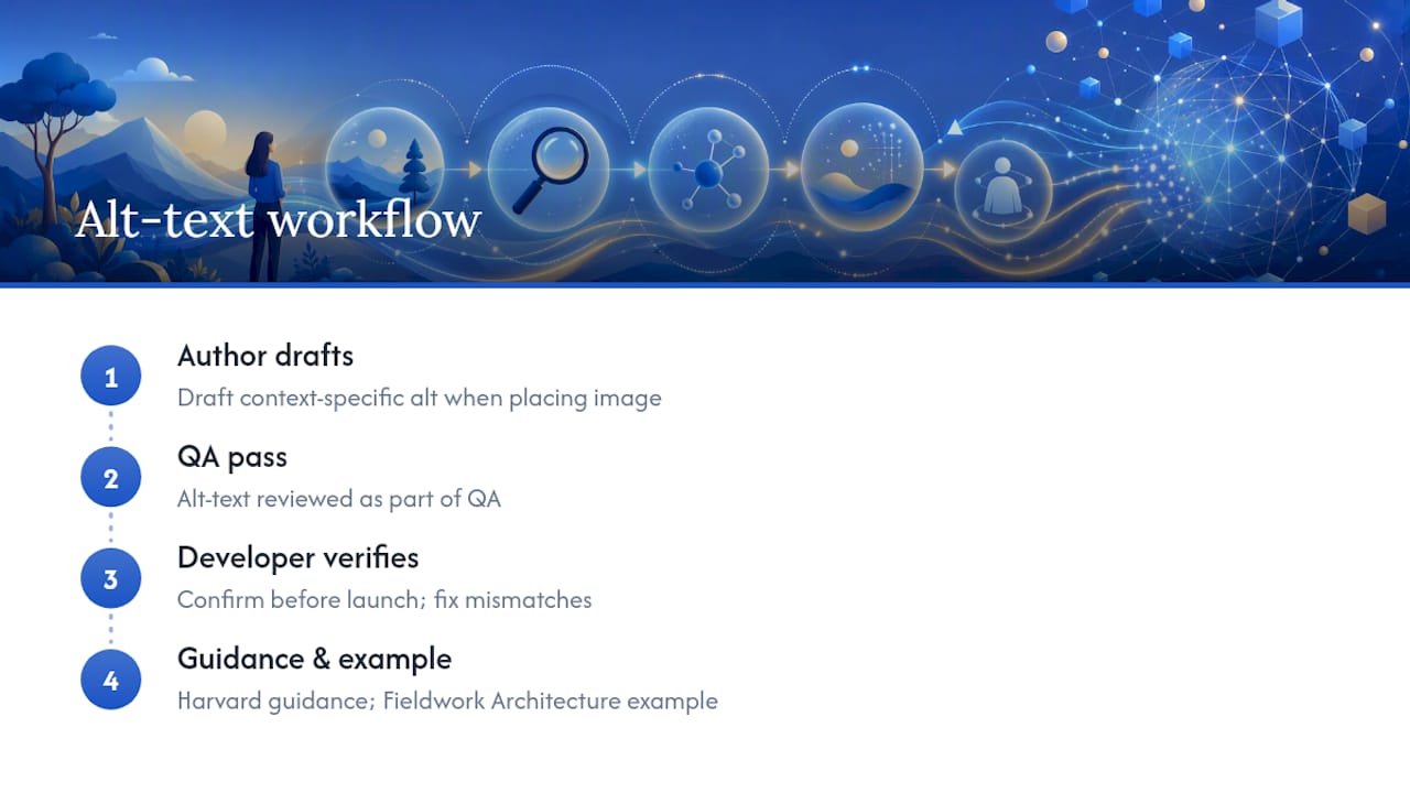
I'm Dylan, and every site build here runs an alt-text pass during QA, not as an afterthought. Writers draft context-specific text when the image goes in, developers verify it before launch. That workflow mirrors what Harvard's accessibility team recommends: catch context mismatches early, not after a client complains. If you want to see accessibility-minded design in practice, the Fieldwork Architecture concept site shows how it looks built in from day one.
Why Alt Text Deserves More Than a Compliance Checkbox
Accessibility and good user experience are the same goal wearing different names. A page that works for a screen reader user tends to load faster, structure content more clearly, and rank better in image search, too. Alt text is a small line of work with an outsized return.
— Dylan
Want This Handled for You?
Writing solid alt text for twelve images is manageable. Writing it for the 200 images across a multi-location service business, consistently, on every new page you publish, is a different job entirely. The studio builds sites with accessibility checks baked into the launch process, not bolted on after a complaint or an audit, and most projects go from kickoff to live site quickly.
If your current site has years of unlabeled images piling up, start with a website audit example to see what a real fix list looks like before you commit to anything. For a full rebuild with alt text, mobile clarity, and lead flow handled from the first sprint, look at responsive website development or browse the demo gallery to see the design style. Either way, the next step is simple: request a quote and tell us what's live now.
Where to Read the Official Guidance
For the source material behind these rules, start with the W3C WAI images tutorial for the full decision tree, Section508 for government-standard authoring instructions, and Google's image SEO guidance for how alt text feeds search visibility.
Sources
- Write helpful Alt Text to describe images — Harvard Digital Accessibility
- Alternative text (CMS guidance) — University of Kansas
- Alt text: What to write — Nielsen Norman Group
FAQ
What Is Alt Text for an Image Used For?
Alt text describes an image's content or function to screen reader users, and it displays in place of the image if it fails to load, while also giving search engines context about what the image shows.
How Do You Add Alt Text to an Image?
In most CMS platforms, click the image, find the alt text or image description field in the settings panel, and type a short, context-specific description; in raw HTML, add it as alt="your description" inside the img tag.
How Do You Check the Alt Text on an Existing Image?
Right click the image in a browser and select "Inspect" to view the img tag's alt attribute directly, or run a browser accessibility extension that lists every image on a page along with its alt text status.
Can AI Write Alt Text for Images?
AI tools can draft alt text quickly, but they typically describe only what's visible, not why the image is on that specific page, so every AI suggestion needs a human check against the surrounding content before publishing.
What's the Difference Between Alt Text and a Caption?
Alt text is read by screen readers and search engines and usually invisible to sighted visitors, while a caption displays on the page for everyone and often adds context the alt text shouldn't repeat.