
The best contact forms are short, single-column, and store every submission server-side before anything else happens. Do that, and completion rates and qualified-lead rates both climb, often within the first week of launch. If you fix nothing else today, fix these five things:
- Drop phone number from required fields unless your sales process genuinely needs it to respond.
- Add a one-line reply-time promise next to the submit button ("We reply within 1 business day").
- Confirm every submission writes to a database or storage layer before your notification email fires.
- Add a honeypot field to catch bots without forcing real people through a CAPTCHA.
- Move every label above its input field, not inside it as a placeholder.
None of these require a redesign. They're edits you can make to an existing form in an afternoon, and they target the two places most forms leak leads: fields that ask for too much, and backend plumbing nobody tested after launch.
Key Takeaways
Short single-column forms with minimal required fields, server-side storage, and clear trust copy consistently produce higher completion and better lead quality.
| Point | Details |
|---|---|
| Minimize required fields | Ask only for name, email, and message on general inquiries; add fields only when routing requires them. |
| Labels go above inputs | Persistent labels outperform placeholder-only labels for usability and accessibility. |
| Store before you notify | Write every submission to durable storage first, then trigger the notification email separately. |
| Test one variable at a time | Optimize field count first, then CTA text, then headline, then placement, in that order. |
| Forge-web-studio builds this in | Rapid launches include mobile-first, minimal-field contact forms with verified server-side storage from day one. |
Table of Contents
- Contact Form Best Practices Ranked by Impact
- What Fields Should a Contact Form Actually Ask For?
- Building a Contact Form That Doesn't Break in Production
- Does Your CTA Copy Actually Convert Better Than "Submit"?
- Making Contact Forms Work for Every Visitor and Every Device
- How Do You Know Which Part of Your Form Is Losing Leads?
- Contact Form Templates Worth Copying Directly
- Real-World Contact Form Fixes from Rapid Website Launches
- Balancing Form Length Against Abandonment Risk
- HTTPS, Encryption, and Other Security Basics Beyond Spam Filters
- Connecting Your Contact Form to a CRM or Email Tool
- Author Perspective: The One Fix That Comes First
- How Forge-web-studio Fixes Contact Forms During a Rapid Launch
- Sources
Contact Form Best Practices Ranked by Impact
Not every fix matters equally. Some changes move completion rates by double digits; others clean up edge cases that affect a handful of users. Here's the order to work through them, starting with the highest-leverage changes.
-
Go single-column, mobile-first. Multi-column layouts force the eye to jump around and confuse the tab order on mobile keyboards. A single-column layout with large tap targets around 44 pixels reduces mis-taps and speeds up form completion on phones, which is where most inbound traffic to a local business site actually lands.
-
Cut required fields to the minimum you can route on. Every additional required field is a decision point where someone can bail. Name, email, and message cover most cold-contact scenarios. Anything past that should be optional or collected later through progressive profiling, where you gather the essentials up front and enrich the lead with a follow-up call or a second short form rather than front-loading every question.
-
Put labels above the field, always. Placeholder text that doubles as a label disappears the moment someone starts typing, and then they forget what they entered. Persistent labels placed above inputs outperform placeholder-only labels for both usability and accessibility, and they cost you nothing in design complexity.
-
Write microcopy that does real work. A vague "we'll be in touch" tells the visitor nothing. State what happens next: how fast, through what channel, and what to expect. This single sentence often does more to reduce hesitation at the submit button than any color or button-size change.
-
Put a privacy line and a reply-time promise near the CTA. These two lines sit right where the visitor is deciding whether to trust you with their contact information. They belong close to the button, not buried in a footer link to a privacy policy page.
-
Store first, notify second. Treat every submission as data you cannot afford to lose. Write it to storage, then trigger the email. If the notification fails, the lead still exists somewhere you can find it.
-
Filter spam without punishing real visitors. A honeypot field and basic rate limiting catch the overwhelming majority of bot traffic without adding a single click of friction for a real person filling out the form.
Work down that list in order. Most businesses jump straight to CTA button color or font choices when the actual leak is three unnecessary required fields sitting above the button they're trying to optimize.
What Fields Should a Contact Form Actually Ask For?
A cold-contact form and a qualified-request form aren't the same document, and treating them identically is where most field bloat comes from.
For a general "get in touch" form, three fields cover it: name, email, and message. That's the floor. Anyone visiting a contact page with no prior relationship to your business is doing you a favor by filling out anything at all, and every field past those three is a tax on that favor.
For a qualified request, like a quote form for a roofing job or a service estimate, you can justify more: phone number, service type, property address, or a rough budget range. The difference is intent. Someone requesting a quote has already decided they want a specific outcome, so a slightly longer form doesn't cost you the same conversion rate it would on a general inquiry page.
A few rules on how to mark and phrase fields:
- Mark phone as optional unless your business genuinely can't function without a callback number; label it clearly as "Phone (optional)" rather than leaving the reader to guess.
- Only ask for company name or role when you're routing enterprise or B2B leads differently from consumer leads.
- Skip hint text unless a field format is genuinely ambiguous, like a project budget range or a preferred appointment window. Hint text under every field just adds visual clutter.
- Use the correct HTML input type for every field. Setting
type="email"andtype="tel"triggers the right mobile keyboard and unlocks autofill, which shaves real seconds off completion time on a phone.
Pro Tip: Test your form on an actual phone with autofill turned on. If your email field doesn't pop the "@" keyboard or your name field doesn't offer to fill in a saved contact, you're losing completions to a one-line code fix nobody noticed.
Labels above fields matter here too. UX research on form structure consistently shows persistent labels reduce the cognitive load of remembering what a field wants once you've started typing into it, which is exactly the moment placeholder-only labels fail.
Building a Contact Form That Doesn't Break in Production
A form that looks clean on the front end can still lose leads on the back end, and that failure is invisible until a client tells you they never heard back after submitting.
Client-side validation is a convenience, not a security measure. It stops obvious typos before submission, but a bot or a motivated bad actor can bypass it entirely, so server-side validation has to be the real enforcement point for every field, every time.
The sequencing of what happens after someone hits submit matters more than most teams realize:
- Write the submission to durable storage, a database or equivalent, first.
- Send the notification email second, as a separate step that can fail without losing the underlying data.
- Log a routing owner for every submission so nothing lands in a shared inbox nobody checks.
- Use a transactional email service rather than a basic SMTP script, and actually test deliverability, not just that the email sends but that it lands in an inbox instead of spam.
On spam, honeypot fields and rate limiting stop the majority of bot traffic with zero added friction for a human visitor. Save CAPTCHAs for forms getting hammered by sophisticated bot traffic that honeypots alone don't catch. A CAPTCHA on every contact form is a blunt instrument that costs you real completions to stop a problem a simpler defense usually solves.
Pro Tip: After submission, show a clear loading state, then a distinct success or error message. A form with no loading indicator gets double-clicked, and a double-click without duplicate protection creates two leads, two notification emails, and one very confused sales rep.
Teams building on frontend frameworks with server-side rendering have an easier time enforcing this sequence cleanly, since the validation and storage logic live closer to the request itself instead of bolted on through a third-party form plugin.
Does Your CTA Copy Actually Convert Better Than "Submit"?
Yes, in most cases. "Submit" tells the visitor nothing about what happens next, and vague outcomes create hesitation right at the moment you need commitment. Swap it for outcome language tied to what the person actually gets: "Get My Free Quote," "Request a Callback," or "Send My Project Details."
A single sentence near that button does more work than most designers give it credit for. Pair the CTA with two things: a privacy line and a reply-time promise. A short trust note near the submit button tends to reduce abandonment more effectively than a lengthy legal disclosure linked from the footer, because it answers the visitor's actual question in the moment they're asking it: what happens to this information, and how fast will someone respond?
A few lines worth stealing:
- "We reply within one business day, no spam, ever."
- "Your info goes straight to our team, not a mailing list."
- "Takes less than a minute. We'll follow up by phone or email, your choice."
The thank-you page after submission is where a lot of forms quietly waste an opportunity. A generic "Thanks, we got it" page is a dead end. A better version confirms the reply-time promise again, links to a relevant resource like a portfolio page or a pricing guide, and gives the visitor something to do while they wait instead of just closing the tab.
Making Contact Forms Work for Every Visitor and Every Device
Accessibility and mobile usability overlap more than most teams assume, since a form that works cleanly for a screen reader user also tends to work better for someone thumb-typing on a cracked phone screen in bad lighting.

Start with structure. WCAG standards call for labels tied explicitly to their inputs, ARIA attributes on custom form elements, and error messaging that's announced to assistive technology, not just displayed as a red border with no text explanation. A red outline with no accompanying message tells a sighted user something's wrong and tells a screen reader user nothing at all.
Practical rules that cover both accessibility and mobile at once:
- Keep every tap target, buttons, checkboxes, dropdowns, at a minimum of 44 pixels so it's reliably tappable with a thumb.
- Use single-column layouts on every viewport under tablet width; side-by-side fields on mobile force horizontal scrolling or awkward wrapping.
- Maintain color contrast ratios that meet WCAG AA at minimum, especially on error text, which is often styled in a red that fails contrast checks against a white background.
- Write success and error messages as actual sentences a screen reader can announce clearly, not icon-only feedback.
- Test the entire form using only a keyboard, tab through every field, submit with Enter, and confirm focus moves logically after an error.
Run this test on the three or four devices your actual visitors use most, not just whatever's on your desk. A form that behaves perfectly in Chrome on a laptop can still misbehave in Safari on an older iPhone, and that gap is invisible until someone complains.
How Do You Know Which Part of Your Form Is Losing Leads?
Aggregate completion rate tells you almost nothing useful on its own. A form with a 40% completion rate could be losing people at the phone number field, at the CTA, or at a broken submit button, and you can't tell which without breaking the data down further.
Field-level analytics show you exactly where visitors start typing and where they stop, which turns a vague "our form isn't converting" problem into a specific one: "37% of people who start the form abandon at the phone number field." That's a fixable, concrete target instead of a guess.
Once you have that data, test changes in this order:
- Number of fields first. This has the biggest single effect on completion, so test it before anything else.
- CTA text second. Once field count is settled, swap "Submit" for outcome-based language and measure the difference.
- Headline and surrounding copy third. Test the sentence above the form, not just the button.
- Placement last. Above the fold versus mid-page, sticky sidebar versus inline, these matter, but only after the form itself is optimized.
Testing one variable at a time is the part teams skip most often, changing the CTA and the field count in the same release and then having no idea which change actually moved the number.
Pro Tip: Set a recurring monthly reminder to manually submit your own contact form from a phone. Plugin updates, theme changes, and email migrations break forms silently more often than any other cause, and nobody notices until a lead complains that they never heard back.
Track qualified-submission rate alongside raw volume. A change that doubles submissions but fills your inbox with spam or mismatched leads isn't a win, it's a filtering problem you've just moved downstream.
Contact Form Templates Worth Copying Directly
Three patterns cover most use cases. A short contact template, name, email, message, works for general inquiries and should be your default unless you have a specific reason to ask for more.
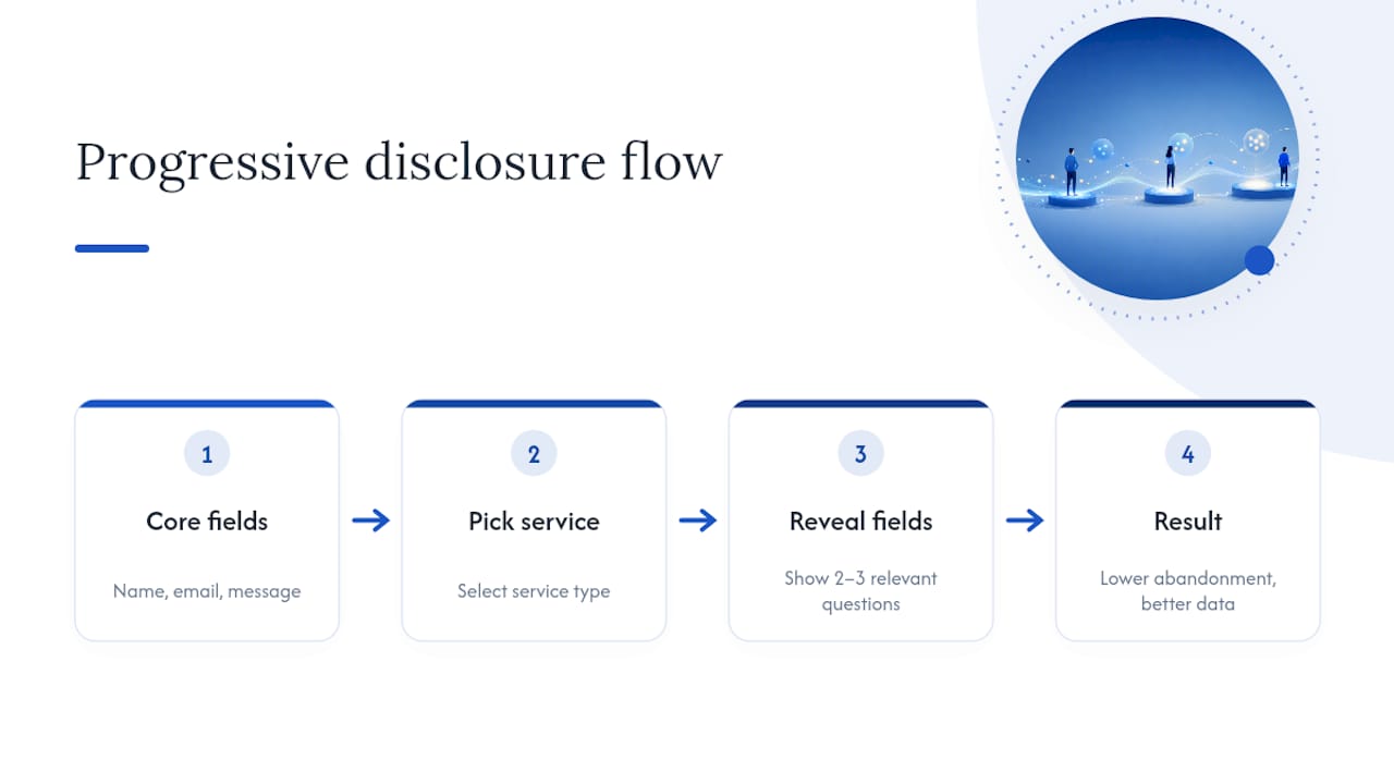
A quote or estimate template benefits from conditional logic: ask the service type first, then reveal only the follow-up fields relevant to that choice. A roofing estimate needs a property address; a consulting inquiry doesn't.
Multi-step forms make sense once you're past six or seven fields total, breaking the form into two or three short screens with a visible progress indicator. Below that threshold, a multi-step form adds friction rather than removing it.
On placement, a landing page form belongs above the fold or immediately visible without scrolling. On a longer content page, like a service description, a sticky form in the sidebar or a strategically placed inline form after the key selling points tends to outperform one buried at the very bottom.
Real-World Contact Form Fixes from Rapid Website Launches
Forge-web-studio builds and launches sites for Texas local businesses in three days to a week, and the contact form is one of the first things checked before a site goes live, not an afterthought bolted on at the end.
The pattern shows up constantly: a business had a contact form live for months, sometimes years, and nobody had tested it end-to-end since the last theme update. We changed the required fields down to three, added server-side storage, and verified the notification path with a real test submission before calling the launch done.
Every rapid launch runs through the same operational checks:
- Submit a real test message and confirm it lands both in storage and in the inbox that's supposed to receive it.
- Verify the reply-time promise on the page matches what the business can actually deliver.
- Confirm the form renders correctly and stays single-column on the three most common mobile viewports.
Balancing Form Length Against Abandonment Risk
Every field you add past the essentials is a tradeoff, not a free upgrade. More fields mean more qualified data on the lead that does convert, but they also mean fewer leads convert at all. There's no universal right answer here, it depends on what you're actually going to do with the extra data.
If a sales rep needs a budget range to prioritize follow-ups, that field earns its place. If it's collected because "it might be useful someday," cut it. The test worth applying to every field on your form: would you personally call and ask this question on a first phone call with a stranger? If the answer is no, it probably shouldn't be a required field on a first contact form either.
Progressive disclosure solves a lot of this tension without forcing a binary choice. Show the core three fields immediately. Once someone picks a service type or a specific inquiry reason, reveal the two or three fields relevant to that path. The visitor only ever sees questions that apply to them, and the perceived form length stays short even though you're collecting more targeted information overall.
Watch abandonment by field, not just overall. A form that loses 5% of visitors at name and email but 30% at a required phone number field is telling you exactly which field to make optional first. That's a data problem with an obvious fix, not a design problem requiring a rebuild.
HTTPS, Encryption, and Other Security Basics Beyond Spam Filters
Spam protection gets most of the attention, but it's only one layer of a form's security. If your site isn't served over HTTPS, every field a visitor fills in, name, email, project details, travels in plain text across the network, visible to anyone positioned to intercept it. Every modern browser now flags non-HTTPS forms as "not secure" directly in the address bar, which alone is enough to tank completion rates before anyone even reaches the submit button.
Beyond the transport layer, think about where submitted data lands once it's stored. A database holding names, emails, and phone numbers is a target, and it deserves the same access controls as any other sensitive system: limited admin access, strong authentication for anyone who can view submissions, and encryption at rest if your hosting or database provider offers it.
A few practical steps that matter more than they get credit for:
- Confirm your SSL certificate auto-renews and doesn't lapse silently, a common cause of forms suddenly breaking.
- Never email raw form data to a personal inbox as the only record, that's an unencrypted copy sitting outside your controlled storage.
- Limit who on your team has access to exported submission data, especially if it includes phone numbers or addresses.
- If you use a third-party form service, check what data retention and encryption policies actually apply, not just what the marketing page claims.
None of this needs to be complicated. It needs to be checked once at launch and revisited whenever you change hosting or form providers.
Connecting Your Contact Form to a CRM or Email Tool
A contact form that only sends an email notification is doing the bare minimum. The real value comes from what happens to that lead in the minutes and days after submission, and that's a job for a CRM or email marketing platform, not a static inbox.
Most modern form tools and website platforms support direct integrations, or at minimum a webhook, that pushes each submission straight into a CRM as a new contact or lead record. That single connection eliminates the manual copy-paste that causes leads to sit untouched for days while someone gets around to entering them into the system by hand.
Beyond the CRM, connecting the form to an email marketing tool lets you trigger an automated follow-up sequence immediately, a confirmation email, then a case study or FAQ two days later if the lead hasn't responded to outreach. This matters most for businesses with a longer sales cycle, where the first form submission is the start of a relationship, not the end of one.
A few integration points worth setting up from day one:
- Route form submissions directly into your CRM's lead pipeline, tagged by the service or inquiry type selected.
- Trigger an immediate confirmation email through a transactional email service, separate from any marketing automation sequence.
- Set up a Slack or email alert to the right team member the moment a high-value inquiry, like a quote request, comes through.
Get this wired up once, and every future lead benefits automatically without anyone remembering to do it manually.
Author Perspective: The One Fix That Comes First
If a form is underperforming and I can only change one thing, it's removing the required phone number and adding a reply-time promise next to the button. That single pair of changes touches both sides of the completion problem: less friction going in, more trust going out. On a rapid launch, we run that fix before touching color, layout, or copy, because it's the cheapest change with the most measurable effect on qualified submissions in the first two weeks.
— Dylan
How Forge-web-studio Fixes Contact Forms During a Rapid Launch
Forge-web-studio builds mobile-first sites with clear contact paths baked in from the start, not bolted on after launch. That means single-column forms, minimal required fields, server-side storage verified before go-live, and a reply-time promise that matches what the business can actually deliver, all handled as part of the responsive website build rather than a separate cleanup project months later.
If your current site has a form you're not confident is capturing every lead, that's worth checking before it costs you another missed inquiry with expert Webflow development. Forge-web-studio's full service lineup covers exactly this kind of audit and rebuild, and the fastest way to see where your site stands is to request a project review and get a straight answer on what's working and what's quietly leaking leads.
Sources
- The complete guide to contact forms for developers — Formtorch Blog
- Designing more efficient forms: structure, inputs, labels and actions