
A lead generation website is a site built with one job: turn anonymous visitors into named contacts your sales team can follow up with, through forms, calls, or booking links. Not a blog. Not a digital brochure. A machine for collecting names, emails, and phone numbers, with every page pointed at that same outcome.
The single most important thing to fix first: pick your top-performing page and add one clear call-to-action paired with a short form. That change alone often outperforms a full redesign, because tightening the headline, simplifying the form, and placing a visible CTA tends to deliver outsized gains compared to starting from scratch.
If you do nothing else this week, work through this list:
- Write a headline that states who you help and what result you deliver, in one sentence.
- Cut every page down to one primary CTA. Kill the competing buttons.
- Shorten your form to name, email, and phone. Add fields later only if you truly need them.
- Build a thank-you page and connect it to your analytics so every submission gets counted.
- Route new leads straight into a CRM or inbox so follow-up happens within hours, not days.
Key Takeaways
A lead generation website converts visitors into contacts through clear CTAs, short forms, and tracked follow-up, and small fixes often outperform full redesigns.
| Point | Details |
|---|---|
| One CTA per page | Remove competing buttons so every page asks for exactly one action. |
| Shorten every form | Cut to name, email, and phone; use multi-step forms for anything longer. |
| Track every submission | Wire thank-you pages to fire conversion events for accurate reporting. |
| Follow up within minutes | Route leads into a CRM workflow or nurture sequence the moment they submit. |
| Launch fast, then iterate | Forge-web-studio builds conversion-focused sites in three days to a week, then refines based on real lead data. |
Table of Contents
- What Makes a Site a Lead Generation Website, Exactly?
- The Core Elements Every Lead Generation Website Needs
- Design and UX Choices That Actually Lift Conversions
- What Should Your Website Actually Say to Convert Visitors?
- Lead Capture Tactics and the Tools That Run Them
- How Do You Measure and Improve Lead Generation Performance?
- Where to Find High-Converting Page Patterns to Copy
- Your Step-by-Step Rollout Plan and What It Costs
- A Quick Audit You Can Run on Your Own Site Today
- Staying Compliant While You Collect Lead Data
- What Happens After Someone Fills Out Your Form?
- How Forge-Web-Studio Builds Sites That Actually Capture Leads
- Frequently Asked Questions
- Sources
What Makes a Site a Lead Generation Website, Exactly?
A lead generation website differs from a landing page in scope. A landing page is one page built for one campaign, usually with paid traffic driving to it and nothing else on the page to click. A lead generation website is the whole property, homepage, service pages, blog, all architected so every page feeds the same conversion funnel instead of just informing visitors.
A brochure site, by contrast, exists to describe a business. It lists services, shows photos, maybe includes a phone number in the footer. Nobody designed it to capture anything. That's the gap most small business sites fall into: they read well, they look fine, and they generate almost nothing in the way of actual contacts.
What should you expect once a site is actually built for lead capture?
- A visible, trackable lead flow from every major page, not just one landing page.
- A conversion rate you can name and monitor, rather than guessing from vague traffic numbers.
- Faster sales follow-up, because leads land in a CRM the moment they submit instead of sitting in an inbox.
- A site that keeps working while priced-out traffic sources (ads, referrals) come and go.
The Core Elements Every Lead Generation Website Needs
Most sites fail at capture because they try to do too much on one page. Every page should have exactly one primary CTA. Not three. Not a "Contact Us," a "Get a Quote," and a "Learn More" all fighting for the same click. Pick one action per page and repeat that same language in the hero, mid-page, and sticky header or footer, so a visitor never has to guess what happens next.

Forms are where most conversions die quietly. A five-field form asking for company size, budget, and timeline before someone has even decided to trust you will bleed submissions. Start with the minimum: name, email, phone. If you need qualifying information, use a multi-step form so the ask feels smaller, or gate the deeper questions until after the first submission.
Trust signals belong near the form, not buried in a separate "About" page. A testimonial with a specific result, a client logo strip, a security badge next to the submit button, these all reduce the hesitation that kills form completions. A conversion-centered design approach treats trust signals as part of the conversion mechanics, not decoration.
And the job isn't done once someone hits submit. A thank-you page confirms the action, sets expectations for next steps, and gives you a clean event to track. Without it, you're often guessing at your real lead count.
- One CTA per page, repeated in consistent language across hero, mid-page, and footer.
- Forms trimmed to essential fields, with multi-step capture for anything more.
- Testimonials, case study numbers, and security cues placed near the form itself.
- A dedicated thank-you page wired into your analytics.
Pro Tip: Audit your homepage right now and count the buttons. If you find more than one distinct action being asked of a first-time visitor, you've found your first fix.
Design and UX Choices That Actually Lift Conversions
Design decisions on a lead generation website aren't about looking modern. They're about reducing the number of decisions a visitor has to make before they submit a form. Conversion-centered design calls for clear visual hierarchy: the headline is the biggest thing on the page, the CTA button has the most contrast, and everything else recedes.

White space matters more than most business owners assume. A cramped page with five competing sections reads as noise. A page with breathing room around the CTA reads as confident, which is exactly the impression you want a form to carry.
Mobile is not a secondary consideration anymore. If your site loads slowly or your tap targets are too small on a phone, you lose leads before they ever see your offer. Slow load times and cramped buttons cost conversions directly, and mobile traffic now makes up the majority of visits for most local service businesses, which means your mobile experience is effectively your primary experience, not a fallback.
Navigation should guide, not distract. A ten-item menu with dropdowns invites wandering. A focused menu with three or four options keeps visitors on the path toward your CTA.
- Make the CTA the highest-contrast element on every page.
- Use white space deliberately around forms and buttons, not just at page margins.
- Compress your mobile navigation to the essentials.
- Remove any secondary CTA that competes visually with your primary one.
Pro Tip: Turn your monitor to grayscale for thirty seconds and look at your homepage. If your CTA button doesn't jump out even without color, your contrast isn't strong enough.
What Should Your Website Actually Say to Convert Visitors?
Your headline has one job: name your audience and name the outcome, in a single sentence a stranger can understand in three seconds. "We build custom software" says nothing. "Websites for Texas roofers that turn storm-season traffic into booked estimates" says everything a visitor needs to know before they scroll further.
Persona-focused messaging beats generic copy every time. Instead of "Contact us for a consultation," try "Get a quote for your roof in 24 hours." Instead of "Our services," try "Roofing websites built for lead flow." The difference is specificity: one speaks to anyone, the other speaks to your exact buyer.
Lead magnets work when the value clearly outweighs the ask. A free five-minute consult call is a low-friction offer that fits early-stage visitors. A detailed pricing guide or downloadable checklist works for visitors further along, ready to compare options. Match the magnet's depth to how much trust you've already built on that page.
Copy templates worth adapting:
- Headline: "[Service] for [audience] that [specific outcome]."
- Subhead: "No [common friction point]. Just [the simple result]."
- CTA button: "Get My [Outcome]" instead of a flat "Submit."
- Trust line under the form: "No spam. One call, no obligation."
Lead Capture Tactics and the Tools That Run Them
Capture happens in more places than a contact form. On-page forms remain the backbone, but popups triggered by exit intent, embedded chat widgets, and gated downloads all add capture points without cluttering the main layout. Multi-step forms work well when you need more than three fields, since breaking the ask into stages keeps completion rates higher than one long form ever will.
The tool stack matters less than how well it connects. HubSpot remains one of the most widely used platforms for combining forms, CRM, and email nurture in one system, which matters if you want lead data flowing into follow-up automatically rather than sitting in a spreadsheet. Webflow is a common choice for the design and build layer itself, especially when a business wants custom layouts without hand-coding every page. Chat widgets and scheduling tools plug into either, adding a lower-friction path for visitors who'd rather ask a question than fill out a form.
Qualification can happen right at the point of capture. Conditional form fields (asking about budget only after someone selects "commercial" instead of "residential," for instance) keep the form short for most visitors while still collecting what your sales team needs for the ones who matter most.
Before you call your capture system done, confirm this chain works end to end:
- Form submission fires a confirmation to the visitor and a notification to your team.
- The submission lands in your CRM automatically, not through manual entry.
- A conversion event fires on the thank-you page so your analytics count it correctly.
- A follow-up sequence or task gets created without anyone having to remember to start it.
How Do You Measure and Improve Lead Generation Performance?
Three numbers matter more than the rest: conversion rate per page, lead velocity (how fast leads come in over time), and cost per lead if you're running ads. Everything else is supporting detail. Watch time on page, scroll depth, CTA click-through rate, and form abandonment rate as secondary signals that explain why your primary numbers move the way they do.
A/B testing turns opinion into evidence. Conversion-centered design treats testing as the mechanism that separates a good-looking page from a page that actually performs, and the practice is straightforward if you keep the discipline tight.
- Write down one hypothesis at a time: "Shortening the form to three fields increases submissions."
- Test a single variable. Don't change the headline and the button color in the same test.
- Let the test run long enough to gather a meaningful sample. Ending early on a lucky run wastes the whole exercise.
- Roll the winner into your default page, then move to the next hypothesis.
None of this works without accurate tracking. Reliable A/B testing depends on firing conversion events through a tag management system, triggered on the thank-you page or through a dataLayer event, so your reporting reflects real leads instead of estimated ones. Skip this step and every optimization decision downstream rests on bad data. Practical, low-effort wins still matter here too: adding forms to your highest-traffic pages and measuring each lead source separately will often surface an easy win before you even get to formal testing.
Where to Find High-Converting Page Patterns to Copy
Three page types carry most of the weight on a lead generation site. Your homepage needs a headline naming the outcome, one CTA above the fold, and proof (a testimonial or client count) within the first scroll. Your pricing or offer page needs transparent tiers or a clear "starting at" figure, since vague pricing pages quietly kill trust before a form ever loads. Your booking or demo page needs the shortest form on the entire site, because visitors who reach that page have already decided, and friction here is pure loss.
Studying published examples of high-converting landing pages is worth the hour it takes. Look at what they share: a single conversion goal, a form with almost no friction, and proof placed where hesitation would otherwise creep in. Don't copy layouts wholesale, since your audience and offer are different, but the underlying pattern (clear offer, low-friction ask, visible proof) transfers across nearly every industry. Forge-web-studio's demo gallery shows this same anatomy applied to service businesses if you want a closer reference point before you start building.
- Homepage: headline plus outcome, one CTA, proof above the fold.
- Pricing page: transparent tiers or a clear starting price, no vague "contact us for pricing" wall.
- Booking page: the shortest form on the site, reserved for visitors who've already decided.
Your Step-by-Step Rollout Plan and What It Costs
Start with quick wins you can finish this week: rewrite your headline, cut your form fields, and fix your CTA labeling. Move next to medium-effort work like rebuilding your thank-you page flow and adding trust signals near your forms. Save the full rebuild, new architecture, custom design, CRM integration, for when the quick fixes have already been squeezed dry.
| Phase | Typical Time |
|---|---|
| Audit existing pages | 1 to 2 days |
| Copywriting and design | 3 days |
| Build and integrations | 2 to 4 days |
| QA and testing | 1 to 2 days |
| Launch and initial tracking review | 1 day |
Cost ranges vary widely depending on whether you're working from a template or building custom, and how many integrations (CRM, scheduling, payment) you need wired in. Custom content writing adds time and cost beyond a template with placeholder copy swapped in.
The practical move for most small businesses: don't wait for the perfect twelve-page site. A focused four-page lead site, home, services, about, and contact, launched fast and refined from real submissions, beats a stalled six-month project every time. Live data on what visitors actually click beats any amount of internal debate about what they might click.
A Quick Audit You Can Run on Your Own Site Today
Forge-web-studio runs the same short checklist on every site we touch, and most owners can run it themselves in under thirty minutes: headline clarity, CTA visibility, form friction, mobile load speed, working analytics, and a visible privacy notice near any form collecting personal data.
A handful of fixes tend to move the needle within hours, not weeks. Rewrite a vague headline. Relabel a flat "Submit" button to something specific like "Get My Quote." Remove one unnecessary form field. Turn on image compression to cut load time. None of these require a developer.
For businesses that need a faster overhaul than a self-audit allows, rapid rebuilds are realistic. Forge-web-studio typically launches new sites in three days to a week, which matters when a slow site is actively costing leads every day it stays live. Run through the full Website Review Checklist if you want the longer version of this audit before deciding whether a quick fix or a rebuild makes more sense.
- Headline clarity: does it name the audience and the outcome?
- CTA visibility: is there exactly one, and is it the highest-contrast element?
- Form friction: how many fields, and can any be cut?
- Mobile speed: does the page load fast on a phone connection?
- Privacy notice: is it visible near any form collecting contact details?
Pro Tip: Ask someone outside your business to find your phone number on your site in under five seconds. If they can't, neither can your visitors.
Staying Compliant While You Collect Lead Data
Collecting names, emails, and phone numbers on a lead generation website puts you inside privacy law territory, even for a small local business. The General Data Protection Regulation (GDPR) applies if you have visitors in the European Union, requiring clear consent before you collect personal data and a straightforward way for people to request deletion. The California Consumer Privacy Act (CCPA) applies to businesses meeting certain size or revenue thresholds that collect data from California residents, giving those visitors rights to know what's collected and to opt out of its sale.
Most small businesses outside those specific triggers won't face the full weight of either law, but the baseline habits are worth adopting regardless: post a privacy policy, state clearly what you do with submitted information, and never pre-check a marketing opt-in box for the visitor. A simple statement like "We'll only use this to respond to your inquiry" next to a form does more for trust than any badge or icon.
Cookie consent matters too if you're running analytics or ad tracking scripts, since many of those tools count as data collection under GDPR even before someone fills out a form. If your business operates only within the United States and doesn't meet CCPA's thresholds, the legal exposure is lower, but the trust benefit of transparent data practices remains the same either way. When in doubt about your specific exposure, a conversation with a lawyer familiar with your state and industry beats guessing.
What Happens After Someone Fills Out Your Form?
Capturing a lead is half the job. What happens in the next ten minutes decides whether that lead becomes a customer or goes cold. Speed matters more than most businesses assume, a fast response signals competence before you've said a single word about your service.
An email nurture sequence handles the leads who aren't ready to buy today. A short series, three to five emails spaced over a week or two, that answers common objections, shows a relevant case study, and repeats a low-friction next step (a call, a quote request) keeps your business top of mind without feeling pushy. Automating this inside a CRM means it runs whether or not anyone on your team remembers to send it.
For leads that are ready now, a CRM workflow should assign the lead to a person, set a follow-up task, and log every touchpoint so nothing falls through the cracks. This is where a platform like HubSpot earns its keep, since the same system that captured the lead can trigger the internal task, send the nurture email, and track the eventual close, all without manual handoffs between tools.
The mechanics matter less than the discipline: every lead needs a defined next step the moment it lands, whether that's an automated email or a phone call from a real person.
An Agency Note on What Actually Works
Most clients think their site needs more content or a fresher look. What it usually needs is one clear action and a shorter form. We've watched a cluttered five-CTA homepage get replaced with a single offer and a three-field form, and submissions doubled within weeks, not because the design got prettier, but because visitors finally knew what to do.
How Forge-Web-Studio Builds Sites That Actually Capture Leads
Forge-web-studio builds lead generation websites for Texas businesses in three days to a week, not three months, with mobile clarity and a single lead flow built into every page from day one. Where a traditional agency timeline stretches into a quarter of back-and-forth revisions, our process gets a working, trackable site in front of your visitors fast enough that you're gathering real submission data while competitors are still in the design review phase.
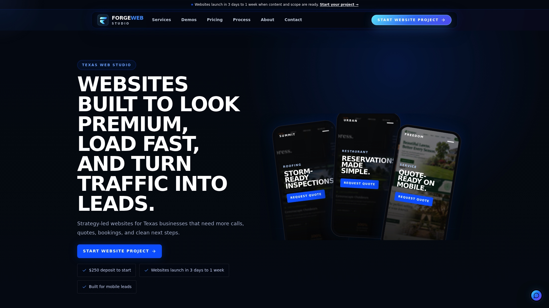
Every build includes the elements covered here: one CTA per page, short forms, thank-you pages wired for tracking, and trust signals placed where hesitation happens. If your current site is quietly costing you leads every day it stays untouched, start with a project request through our website services page or begin a website project directly and get a working, conversion-focused site launched within the week.
Frequently Asked Questions
What is a lead generation website, in one sentence? It's a website architected so every page, not just one landing page, guides visitors toward giving you their contact information through a form, call, or booking.
How is a lead generation website different from a regular business website? A regular or "brochure" site describes your business; a lead generation website is built specifically to capture contact details and route them into a follow-up process.
What's the fastest way to improve an existing site's lead flow? Cut your form to the essential fields, make your CTA the highest-contrast element on the page, and confirm your thank-you page is actually tracking submissions.
Do I need a CRM to run a lead generation website? You don't strictly need one, but without a system like HubSpot connecting your forms to a workflow, leads tend to sit unanswered longer than they should.
How long does it take to launch a working lead generation website? A focused, four-page site can launch in a matter of days when the scope stays tight; Forge-web-studio typically delivers full builds within three days to a week.
Sources
- Lead generation website definition — ActiveCampaign
- Conversion-centered design — Mailchimp
- What is a lead generation website? Examples and how to build one — Base44
- How to Create a Lead Generation Website: 9 Simple Optimizations — HubSpot
- Google Tag Manager help — Google Support