
Start with a compact launcher in the lower right corner on desktop, and a small tappable icon on mobile that expands to fill the screen. That single choice matches two decades of user habit, so visitors find it without thinking. The main exception: B2B sites and high-touch sales funnels often do better folding chat into the top navigation instead of a floating bubble, especially when the bottom corner is already busy with a cart icon or sticky button.
TL;DR:
- Placing the chat launcher in the lower right corner on desktop aligns with two decades of user habits, ensuring high visibility without blocking key actions.
- On mobile, the chat icon should respect safe areas, stay out of thumb reach, and be tested at a 375-pixel viewport to avoid overlap and usability issues.
- Using contextual prompts next to specific decision points, like size selectors or pricing tables, increases the likelihood of meaningful conversations.
- Avoid conflicts on small screens by assigning fixed corners to floating elements and verifying their placement on real devices during site audits.
- Testing chat triggers, positions, and labels with A/B experiments over several weeks helps optimize lead capture and conversion rates based on actual user behavior.
Table of Contents
- Why Live Chat Placement Matters for Conversion and UX
- Where Should the Live Chat Button Go by Default?
- How Should Live Chat Work on Mobile?
- Should You Use Contextual Chat Prompts on Product Pages?
- What Makes a Live Chat Button Easy to Notice?
- How Do You Avoid Chat Widget Conflicts on a Page?
- When Should Live Chat Open Automatically?
- How Do You Test and Measure Chat Placement?
- How Forge Web Studio Handles Live Chat Placement in a Build
- A Pragmatic Take on Chat Placement Trade-Offs
- Get Your Live Chat Placement Right the First Time
- Sources
- FAQ
Why Live Chat Placement Matters for Conversion and UX
Placement decides whether a visitor notices your chat option at all. Bury it in a sidebar or footer and most people never see it, no matter how good your support team is behind it.
The lower right corner works because it is what people already expect. Two decades of consistent web design have trained visitors to glance there first, and a creative repositioning usually just means fewer people find the button at all. That is the core tension in live chat placement: you want visibility, but you cannot let the widget block a "Buy Now" button, a form field, or a menu icon.
Here is where teams go wrong most often:
- They treat chat placement as a one-time setting instead of a per-template decision.
- They copy a competitor's layout without checking their own page structure for conflicts.
- They never separate desktop rules from mobile rules, even though the two devices behave completely differently.
Get the position right and chat becomes a low-friction way to rescue an almost-lost sale. Get it wrong and it is just visual clutter competing with your real calls to action.
Where Should the Live Chat Button Go by Default?
Lower right stays the safe, standard answer for most sites, and most platforms confirm it as the industry default. It sits in a visitor's natural scan path without crowding the main content area, and almost every user expects it there.
That said, right is not sacred. Switch to bottom left when your right side already carries a sticky cart, a scroll-to-top arrow, or a floating discount banner. Two elements fighting for the same eight square inches of screen is worse than picking either corner alone.
For B2B software, consulting firms, or anyone selling a high-consideration service, consider skipping the floating bubble entirely. Placing a chat link inside the global utility navigation performs well in these contexts, treating chat as a real piece of your site's information architecture rather than an add-on gimmick. It also frees up the bottom corner for other fixed elements.
A few rules to apply once you have picked a corner:
- Use your chat platform's built-in offset controls rather than fighting the default with custom code.
- Set offsets per template, not globally, since a blog post and a checkout page have different obstacles.
- Reconfirm placement any time you add a new sticky element to a page.
How Should Live Chat Work on Mobile?
Mobile is where most placement mistakes actually cost you leads. A launcher sized for a mouse cursor is often too small or too close to the edge for a thumb, and an expanded chat window clipped by the mobile viewport frequently becomes unusable, pushing visitors to abandon the conversation before they finish typing.
Follow these four rules for live chat on mobile:
- Respect safe-area insets so the launcher never sits under a phone's home indicator or notch.
- Keep the icon out of the thumb's natural reach zone for the primary action, usually the lower center of the screen.
- Use a small, compact circle for the closed state. Save the bigger interface for after a visitor taps in.
- Force the expanded chat to go full-screen or clamp it to the viewport. Never let it render as a shrunken desktop panel.
Pro Tip: Test your live chat widget at a 375-pixel viewport width, the size of a standard iPhone, not just your laptop's browser resized smaller. It surfaces overlap issues a desktop preview never shows you.
Run that same test on your slowest-loading page. If chat pops in before the primary content finishes rendering, it competes for attention it has not earned yet.
Should You Use Contextual Chat Prompts on Product Pages?
Yes, and this is the part most sites skip entirely. A floating bubble in the corner answers "is help available anywhere on this site?" An inline prompt next to a size chart or a pricing table answers a much sharper question: "can someone help me right now, with this exact decision?"
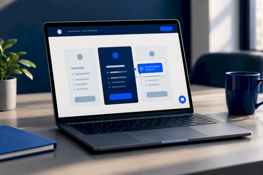
Inline prompts placed next to relevant interface elements, like size selectors or pricing tables, are a higher-intent placement pattern that often outperforms a generic floating bubble, because they show up exactly when a visitor is stuck on a specific choice rather than browsing generally.
Good candidates for contextual placement:
- Beside size or variant selectors on product pages, where sizing confusion kills a lot of orders.
- Next to pricing tables, with copy like "Need help choosing a plan?" instead of a generic greeting.
- Inside booking or quote forms, right where a visitor pauses to think.
Keep these prompts lightweight. A one-line text link or small inline card works better than a second full chat window competing with your corner bubble. If you use both, make sure the inline prompt opens the same conversation thread instead of starting a separate, confusing one. Reviewing your product page layout alongside your chat strategy tends to surface these overlaps fast.
What Makes a Live Chat Button Easy to Notice?
Labeling matters more than most teams assume. A bare speech-bubble icon leaves visitors guessing whether they will reach a human, a bot, or nobody at all outside business hours. Labeled buttons test better than icon-only bubbles because the text sets an honest expectation before anyone clicks.
A few concrete rules for the button itself:
- Use short, specific label copy like "Chat with us" or "Talk to sales," not just an icon.
- Meet a 4.5:1 contrast ratio between the button and its background so it reads clearly in bright sunlight on a phone.
- Limit motion to a single attention animation on page load.
That last point is not a minor style preference. One attention animation on first load is enough; repeated motion trains visitors to tune the launcher out entirely, the same way people learn to ignore a blinking banner ad. Use unread-message badges sparingly too. A badge that never clears feels broken, not busy.
How Do You Avoid Chat Widget Conflicts on a Page?
Every added floating element is a potential collision. Cookie consent banners, sticky "add to cart" bars, and back-to-top arrows all compete for the same screen real estate as your chat launcher, and on a small phone screen there simply is not room for all of them stacked at once.
Run this quick audit on your three most important pages:
- Load each page on an actual phone, not just a resized browser window, and check whether the chat launcher overlaps a cookie banner or sticky CTA.
- Confirm the primary action on the page, like "Add to Cart" or "Book Now," stays fully visible and tappable with chat present.
- Open the chat window and verify it does not push the primary CTA off screen or clip important content.
- If more than one floating element exists, assign each a fixed corner deliberately, or route them through a single script that manages priority so they never stack on top of each other.
Most chat platforms include position offset settings built for exactly this problem, and checking your platform's customization options usually solves the conflict faster than writing custom CSS.
When Should Live Chat Open Automatically?
Timing is as much a placement decision as position is. A chat window that pops open the instant someone lands on your homepage feels like a pushy salesperson, and most visitors close it on reflex before reading a word.
Better triggers depend on the page:
- On long-form content or pricing pages, wait 20 to 40 seconds or trigger after a visitor scrolls a meaningful distance down the page.
- On a shopping cart or checkout page, an exit-intent trigger can recover a visitor who is about to leave, but skip this trick on short pages where visitors have not engaged with much yet.
- Match greeting copy to page purpose. A pricing page prompt should reference plans; a support page prompt should reference troubleshooting.
Instant popups almost always backfire. Give the page time to earn the interruption first.
How Do You Test and Measure Chat Placement?
Placement decisions should not rest on a hunch, even a well-informed one. Track four numbers before and after any change: widget opens, conversation starts, qualified leads generated through chat, and conversion rate for visitors who actually chatted versus those who did not.
A/B testing placement, label copy, and trigger timing is standard practice for measuring real impact rather than guessing which version performs better. Structure the test simply:
- Run one variable at a time. Test position alone, then label copy, then trigger timing, in separate rounds.
- Give each test 2 to 4 weeks depending on your traffic volume, long enough to smooth out day-of-week noise.
- Normalize results using conversation starts per 1,000 sessions so a low-traffic landing page and your homepage compare fairly.
- Watch mobile-specific friction signals too, like rage clicks on a launcher that will not open or high abandonment mid-conversation.
- Break results out by page type. Chat that lifts conversion on a pricing page may do nothing on a blog post.
A placement change that looks flat in aggregate data can be hiding a real win on one page type and a real loss on another.
How Forge Web Studio Handles Live Chat Placement in a Build
Every site Forge Web Studio ships gets chat placement treated as a template-level decision, not an afterthought bolted on after launch. Because Forge builds sites in days rather than months, placement testing happens early, while a redesign or new build is still cheap to adjust.
The audit a Forge project runs before launch typically covers:
- Testing the chat launcher and expanded window on every core page template, not just the homepage.
- Checking mobile safe areas and thumb reach on real device widths, including the slowest-loading page on the site.
- Confirming analytics events fire correctly for widget opens, conversation starts, and post-chat conversions.
- Reviewing offset settings against cookie banners, sticky carts, and any other fixed page elements.
This same attention to lead flow and mobile clarity carries through Forge's broader website redesign process, where fixing a poorly placed chat widget is often one small piece of a larger conversion audit.
A Pragmatic Take on Chat Placement Trade-Offs
When a launcher and a primary CTA fight for the same space, the CTA wins every time. Chat is a support channel, not the reason someone came to your page, and treating it otherwise costs you sales you were already about to close.
The simplest test plan I'd recommend: measure your current baseline for two weeks, ship one variant, run it another two to four weeks, then decide. Start with the defaults covered here, then optimize by page type once real data tells you where the friction actually lives.
— Dylan
Get Your Live Chat Placement Right the First Time
Placement testing is typically integrated into projects rather than charged as an extra service later. Many local small businesses do not require a long-term agency retainer to implement effective chat placement. They benefit from a rapid website build process that includes mobile testing and focuses on optimizing lead flow.
If your current site already has chat but leads still are not showing up, that usually points to a bigger placement or conflict issue worth a full look. Forge's website redesign service starts with exactly the audit outlined above, checking every page template on real phone widths before touching a single line of code. For a new build, the Starter Website and Growth Website packages both include mobile-first layouts with lead capture built in from day one.
Ready to see how your site should actually work? Start your website project and get a build that treats chat placement, and everything else on the page, as part of one connected conversion plan.
Sources
The placement rules above draw on guidance from MyLiveChat's design documentation, NoForm AI's positioning guide, and Velaro's conversion research. For A/B testing frameworks and platform comparisons, Zapier's support chat roundup is a solid next stop, alongside Forge's own guide to choosing live chat software.
- Contextual search and commerce guidance — Zoovu
- Maximize conversions: Strategic live chat button placement on your site — Velaro
- Chat widget placement and design: Visible without being in the way — MyLiveChat
- Chatbot widget positioning — NoForm AI
- Mobile chat window guidance — Zoho help community
FAQ
What Is Live Chat Used for on a Website?
Live chat lets a visitor message your team directly from your site instead of calling or emailing, usually to ask about pricing, availability, or a product detail before buying. It works best when placed near the exact decision the visitor is stuck on, like a pricing table or checkout page, rather than as a generic floating icon alone.
How Do I Set up Live Chat on My Website?
Most platforms provide an embed script or plugin you add to your site's template, along with a settings panel to control position, offsets, and mobile behavior. If you want it handled correctly the first time, including offset and mobile testing, Forge Web Studio builds this into new site projects starting with the Starter Website package.
What Is the Best Position for a Live Chat Button?
The bottom right corner is the standard default on desktop because it matches two decades of user expectation. On mobile, use a small tappable launcher that expands to full screen, and consider a navigation link instead of a floating bubble for B2B or high-touch sales sites.
How Do I Start a Live Chat Conversation on a Site?
A visitor typically taps or clicks the chat launcher, types a message, and a support agent or bot responds in the same window. Sites that place contextual prompts next to specific decision points, like a size selector or pricing table, tend to start more qualified conversations than a generic bubble alone.
Should Live Chat Open Automatically When Someone Visits?
Generally no. Instant popups on page load usually get closed immediately; a delayed trigger after 20 to 40 seconds or after meaningful scroll performs better on long content and pricing pages, while exit-intent works well specifically for cart recovery.