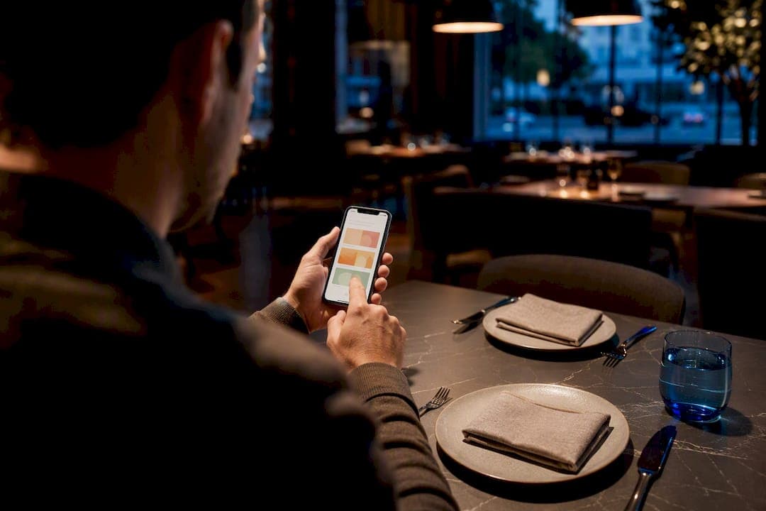
A great menu page is digital-first, built in responsive HTML instead of a PDF, and organized so the eye lands on your best dishes first. The single highest-impact fix you can make today: kill the PDF menu, rebuild it as a scrollable web page, and spotlight 3 to 5 hero items with real photos. Everything else, from typography to pricing, supports that one move.
TL;DR:
- Effective menu pages should prioritize 3 to 5 hero dishes with professional photos placed in high-visibility areas to boost sales by setting clear expectations.
- Menus should be designed as responsive HTML pages, not PDFs, to support mobile browsing, enable searchability, and integrate seamlessly with POS systems and dayparting.
- Organizing items into categories like Stars, Puzzles, and Dogs and using strategic placement and pricing techniques can significantly influence customer choices and order value.
- Typography must be scaled appropriately for each medium, with minimum 16 pixels on mobile and large, readable headlines for printed menus and digital boards.
- Shooting consistent, high-quality photos of selected hero items and compressing images for web improves visual appeal and load times, especially on screens 50 inches and larger.
Table of Contents
- What Makes Effective Menu Page Design?
- How Should Menu Typography Be Sized for Mobile and Print?
- Where Should You Use Photography on a Menu Page?
- What Layout Pattern Fits Your Menu Concept?
- Why Should Your Menu Page Be Digital-First Instead of a PDF?
- How Do You Build a Menu Page Step by Step?
- How Does Forge Web Studio Approach Menu Page Builds?
- DIY Templates or a Custom Build?
- Get a Mobile-First Menu Page Built for Your Restaurant
- Sources
- FAQ
What Makes Effective Menu Page Design?
Menu design isn't decoration. It's a sales tool disguised as a list, and the discipline behind it has a name: menu engineering. That's the industry term for arranging items, prices, and visuals to steer what people order, and it's been used by restaurant consultants for decades before anyone called it "UX."
The categories every menu engineer works with are Stars, Plowhorses, Puzzles, and Dogs. Stars are high-profit, high-popularity dishes. Puzzles are profitable but underordered. Plowhorses sell well but barely make money. Dogs do neither, and they shouldn't be taking up space on your page.
- Put Stars in the Golden Triangle, the zone where eyes land first, usually center, then top right, then top left.
- Use the serial-position effect: items placed first or last in a list get remembered and ordered more than items buried in the middle.
- Nest prices into the item description instead of stacking them in a right-aligned column with leader dots; that old-school format trains customers to scan for the cheapest item instead of the food itself.
- Cap categories at a moderate number of items to avoid decision fatigue, which can slow down orders instead of speeding them up.
Dropping the dollar sign in pricing is a common tactic worth testing, since some diners associate the symbol with spending friction. Anchoring works too: place one higher-priced dish near a mid-tier one so the mid-tier option looks like the smart choice.
Pro Tip: Audit your menu once a quarter and reclassify every dish as a Star, Plowhorse, Puzzle, or Dog. If something has sat in the Dog corner for two straight quarters, cut it.
How Should Menu Typography Be Sized for Mobile and Print?
Type that's comfortable on a laminated table card is often too small on a phone screen, and the reverse is true for a printed board. The rules diverge by medium, so treat them separately.
- Body text on mobile: minimum 16 pixels, with line height around 1.4 to 1.5 so descriptions don't feel cramped.
- Printed menus and in-store boards: scale headlines large enough to read from a few feet away, especially on wall-mounted boards near the counter.
- Limit yourself to one or two font families total. One for headers, one for body copy, with weight and size doing the work of hierarchy between item names, descriptions, and prices.
- Avoid long blocks of all-caps text. It reads slower and feels aggressive on a screen.
- Keep tap targets at least 44 pixels tall on touchscreens so modifiers and add-ons don't get mis-tapped on a crowded ordering screen.
- Maintain strong contrast between text and background. Light gray text on a cream background looks elegant in a mockup and unreadable in direct sunlight.
Where Should You Use Photography on a Menu Page?
Photograph 5 to 9 hero items, not your entire menu. High-quality photography of that select group can lift individual item sales by roughly 30% or more, largely because a good photo does what a description alone can't: it sets an expectation the dish then has to meet.
Consistency matters more than volume. Shoot every hero item under the same lighting, the same camera angle, and the same background, or the page starts looking like a stock photo grab bag.
- Compress images for web delivery and serve responsive sizes so mobile pages don't drag.
- For large digital boards, 4K resolution is recommended for screens 50 inches and larger; smaller screens can run on 1080p.
- Write descriptive alt text for every hero image, both for accessibility and for search visibility.
- Skip photography entirely for fine-dining menus where the visual language is minimalist. Icons for dietary tags (vegan, gluten-free, spicy) do more good there than a photo grid.
What Layout Pattern Fits Your Menu Concept?
Not every restaurant needs the same page structure. Match the pattern to how your customers actually browse.
- Single-column responsive layout. Best for mobile-first browsing. Categories stack vertically, and a sticky navigation bar lets guests jump between sections without endless scrolling.
- Card or grid layout. Works well for delivery-focused menus or any concept where individual dishes get shared on social media. Structuring menus as shareable item pages instead of one long PDF also gives each dish its own indexable page, which helps with search visibility.
- Multi-panel layout. Built for in-store digital boards, where a single large hero photo covering 15 to 25 percent of the screen outperforms a wall of small thumbnails.
Whichever pattern you choose, build in an editable image slot per item, simple category reordering, adjustable typography, and a dayparting setting so breakfast doesn't show up at dinner. A quick way to sanity-check any layout: does it still work with 40 items instead of 4? If it collapses under real menu size, it's a demo, not a template.
Why Should Your Menu Page Be Digital-First Instead of a PDF?
Roughly 73% of diners now place online orders from a mobile device, and a PDF menu fights that reality at every step: it doesn't reflow, it forces pinch-zooming, and it's invisible to search engines. Migrating a PDF into structured HTML means recreating every category and item as real page content, not an image of text.
Connecting your menu to your POS system prevents a customer from ordering a dish that sold out an hour ago, and dayparting lets the page show breakfast in the morning and dinner after 5 PM automatically, without anyone manually swapping content.
- Add search and dietary filters once you're past roughly 30 items.
- Make modifiers tappable (extra cheese, no onions) rather than buried in a footnote.
- Route the "add to order" action clearly toward checkout, with no dead ends.
- Meet WCAG 2.1 AA basics: sufficient color contrast, full keyboard navigability, alt text on images, and fonts that don't require squinting.
Pro Tip: If you can't answer "what does this menu show at 7 AM versus 7 PM" without checking a spreadsheet, your menu isn't digital-first yet, it's a PDF with extra steps.
How Do You Build a Menu Page Step by Step?
- Curate first. Cut the Dogs, pick 3 to 5 hero items, and write short, sensory descriptions instead of dry ingredient lists.
- Choose your layout pattern (single-column, grid, or multi-panel) and lock in typography, spacing, and category sizes before adding content.
- Shoot and optimize imagery. Photograph your hero items consistently, compress files, and write alt text for each one.
- Connect the technical layer. Link the page to your ordering or POS system, configure dayparting, and test the live page on an actual phone, not just a desktop browser.
- Measure and adjust. Track which items get clicked or ordered and run simple A/B tests on photo placement or hero item choice.
Before launch, run a short final pass: check mobile rendering, confirm contrast and tap-target sizes, test page load speed, and make sure analytics is actually recording clicks. Forge Web Studio's website review checklist is built around exactly this kind of pre-launch audit.
How Does Forge Web Studio Approach Menu Page Builds?
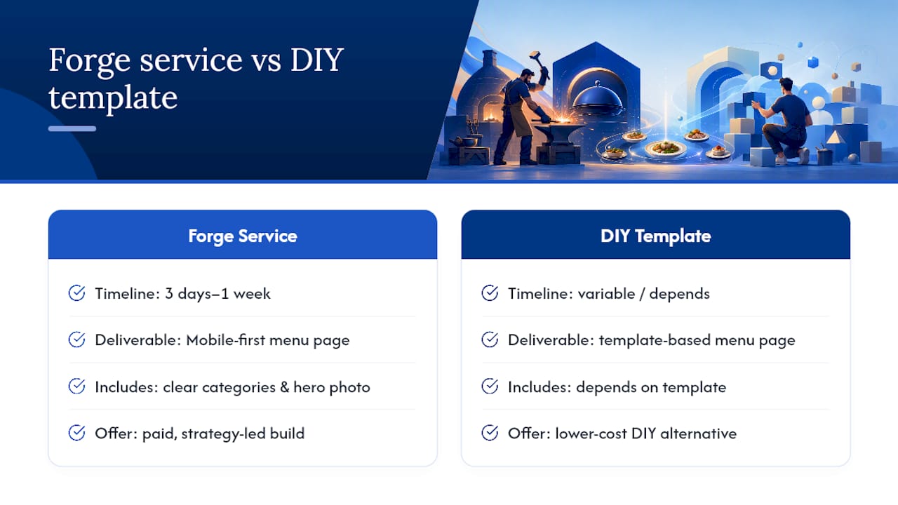
Forge Web Studio builds strategy-led websites for Texas businesses, and menu pages get the same mobile-clarity and lead-flow focus as every other page type in the restaurant web design work. Rapid development timelines of three days to a week apply to scoped builds: a mobile-first menu page with clear categories, hero photography, and a POS-ready layout, not a full custom ordering platform from scratch.
This is a paid service offer, and it's fair to weigh it against a DIY template if your budget or timeline points that way. The right call depends on how much control and speed you actually need.
DIY Templates or a Custom Build?
A template makes sense for a simple menu with fewer than 20 items and no real dayparting needs. Once you're juggling POS integration, multiple dayparts, or a menu that needs to convert on mobile at scale, a custom build usually earns back its cost through fewer workarounds and faster iteration. Run your current page against the checklist above. If it fails typography, hierarchy, or mobile sizing, that's your answer.
— Dylan
Get a Mobile-First Menu Page Built for Your Restaurant
Most restaurant owners fixing a bad menu page are choosing between a $20 template that fights their POS setup or an agency quote that takes six weeks to deliver a first draft. Forge Web Studio is the alternative to both for menu page design: a mobile-first, responsive website build that launches in days, with hero photography placement, category structure, and dayparting logic handled from the start instead of bolted on later.
Every build follows the same visual hierarchy and legibility rules covered above, paired with local search setup so the page actually gets found. If ongoing optimization matters to you beyond launch, a partner like Preferic's small business SEO services can carry that work forward. Browse the demo gallery to see real layout examples, or start a website project and request a free review of your current menu page.
Sources
- DoorDash merchant blog — online food delivery services market growth
- Snappr blog — the ROI of professional food photography for your restaurant
- Cost My Menu — menu engineering techniques
- Popmenu — best practices for food menu design
- FoodShot AI — restaurant menu board design guide
FAQ
Does Pages Have a Menu Template?
Apple's Pages app includes basic flyer and document templates that can be adapted into a menu layout, but it exports as a static document, not a responsive web page, so it won't solve mobile scrolling or dayparting.
How Do I Create a Menu Design?
Start by curating your item list down to your best sellers, choose a layout pattern like single-column or card grid, set your typography and spacing rules, then add consistent hero photography before connecting it to your ordering system.
What Is the Best Program for Menu Design?
For a print-only menu, design tools like Canva or Adobe InDesign work fine, but for a page that needs to sell online, a responsive HTML build like the ones Forge Web Studio produces performs better than any static design program because it adapts to every screen size.
What Is a Good Menu Design?
A good menu design uses clear visual hierarchy, limits categories to 7 to 10 items, nests prices into descriptions instead of a price column, and features 5 to 9 well-photographed hero dishes in prime viewing positions.