
Mobile-first design means building your smallest, narrowest layout first, then progressively enhancing it for tablets and desktops. It matters because most traffic now arrives on phones, Google indexes the mobile version of your site by default, and small screens force you to prioritize what actually matters. This guide covers the principles, the CSS patterns, the performance targets, and a checklist you can run today.
TL;DR:
- Mobile-first design starts from a narrow, small-screen layout and adds features progressively for larger devices, focusing on content prioritization.
- Using base CSS without media queries and matching HTML order to mobile reading habits are key markers of a true mobile-first approach.
- Mobile-first builds improve performance metrics like LCP and CLS more easily by reducing initial payload and reserving space for images, aiding SEO and user experience.
- Testing must include intermediate screen sizes, throttled networks, and assistive technologies to ensure layout stability and accessibility across devices.
- Common mistakes include skipping the viewport meta tag, loading large assets early, and neglecting mobile-specific interactions; these prevent effective mobile-first implementation.
Table of Contents
- What Does Mobile-First Design Actually Mean?
- Why Does Mobile-First Design Still Matter?
- Core Principles Behind Mobile-First Design
- How Do You Start a Mobile-First Project?
- Which CSS Techniques Make a Layout Mobile-First?
- What Performance Targets Should Mobile Pages Hit?
- What Accessibility Details Do Mobile Layouts Need?
- Which Mobile-First Patterns Actually Work?
- What Mistakes Break Mobile-First Layouts?
- How Forge-web-studio Applies Mobile-First Principles
- Ready to Launch a Mobile-First Site?
- Sources
- FAQ
What Does Mobile-First Design Actually Mean?
Mobile-first is a strategy. Responsive design is the implementation that carries it out. That distinction trips up a lot of teams: they build a desktop layout, squeeze it down with breakpoints, and call it mobile-first when it's really desktop-shrunk.
True mobile-first work starts at the smallest practical viewport and adds complexity as screen real estate grows. MDN's definition frames it exactly this way: design the narrowest layout first, then progressively enhance for wider screens. Responsive design is the broader technique that adapts layouts across device sizes, and it can serve a mobile-first strategy or a desktop-first one depending on where the base styles start.
Source order matters here too. Your HTML's DOM order should reflect what a phone user needs first, not what looks good on a 27-inch monitor. A few markers separate a genuinely mobile-first build from a merely responsive one:
- Base CSS targets small screens with no media query wrapping it.
- Wider breakpoints ADD layout complexity rather than remove it.
- The HTML source order matches mobile reading priority, not a desktop grid.
- Progressive enhancement introduces hover states, sidebars, and multi-column grids only at larger widths.
A responsive site that starts from a 1440px canvas and works backward is still responsive. It just isn't mobile-first.
Why Does Mobile-First Design Still Matter?
Google has used mobile-first indexing for years now, meaning the mobile version of your page is what gets crawled and ranked in most cases. If your mobile experience is thin, cluttered, or slow, that's the version search engines judge you on, not your polished desktop layout.
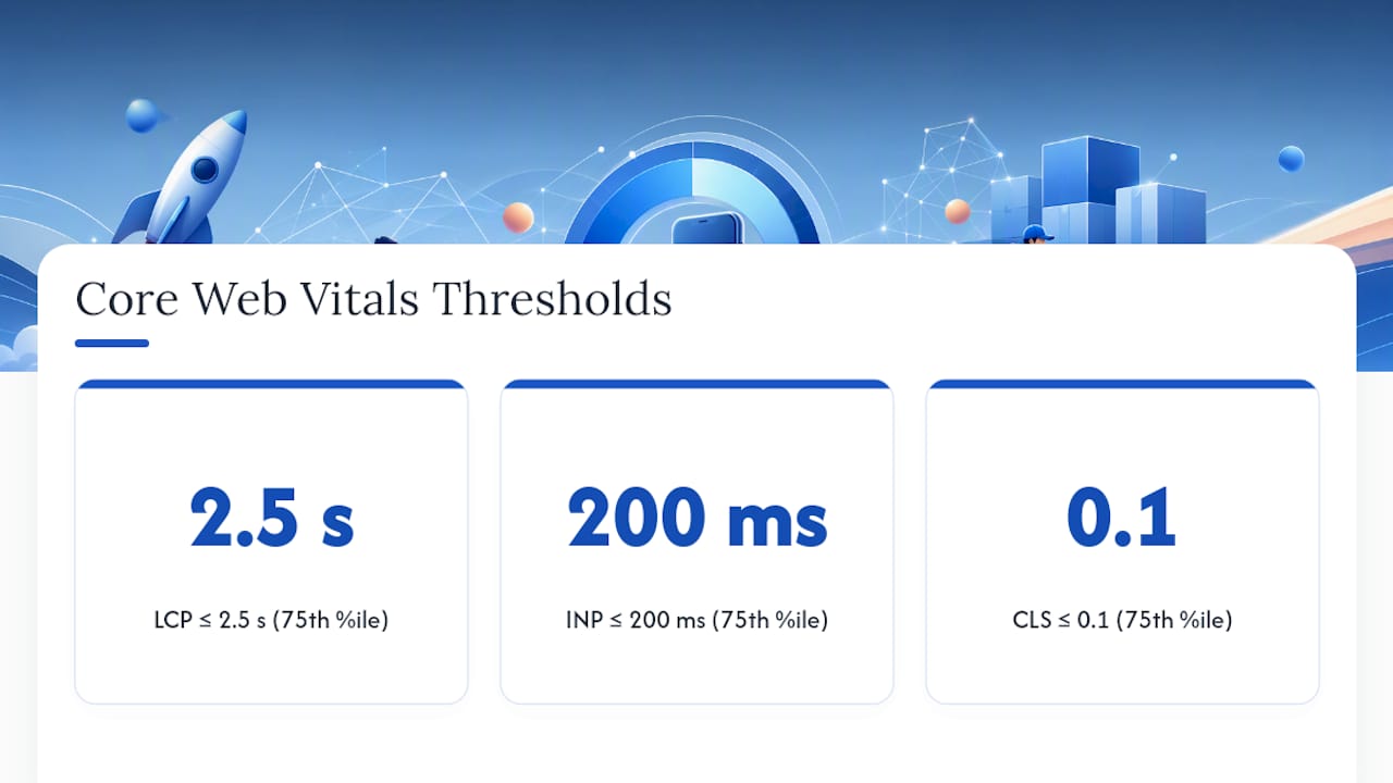
Performance ties directly into this. Web sets clear thresholds: Largest Contentful Paint (LCP) at 2.5 seconds or less, Interaction to Next Paint (INP) at 200 milliseconds or less, and Cumulative Layout Shift (CLS) at 0.1 or less, all measured at the 75th percentile of real visits. Mobile-first builds tend to hit these numbers more easily because they start lean instead of stripping down a heavy desktop page.
Accessibility and device diversity round out the case. Screens range from compact phones to foldables to budget Android devices with limited processing power, and W3C's mobile guidance treats those constraints as a design input, not an edge case.
Desktop-first still has a place for internal dashboards, data-heavy admin tools, or B2B software where the audience is verifiably desk-bound. For anything public-facing, mobile-first is the safer default.
Core Principles Behind Mobile-First Design
Good mobile-first work comes down to a handful of disciplines applied consistently, not a single clever trick.
- Prioritize content and calls to action. Decide what the visitor absolutely needs on a 375px screen, and cut or defer everything else.
- Use progressive enhancement and feature gating. Ship a working core experience first, then layer in animations, hover interactions, and secondary features for capable devices and larger viewports.
- Size touch targets generously. Interactive elements need enough size and spacing that a thumb doesn't miss or double-tap the wrong link.
- Set type for readability, not aesthetics alone. Body text below 16px on mobile forces zooming, and zooming breaks the layout you worked hard to build.
- Control resource weight. Every image, font file, and third-party script has a mobile network cost that desktop connections mask.
- Design for intermittent connectivity. W3C recommends minimizing memory, processor use, and bandwidth demand precisely because mobile networks and hardware are less predictable than a wired desktop connection.
Notice that content prioritization and resource discipline reinforce each other. A page that shows only what matters on a small screen naturally has fewer assets to load, which naturally helps your performance numbers.
Pro Tip: Write your homepage copy for the mobile viewport first, literally in a text editor at phone width. If a sentence doesn't survive at that width without wrapping awkwardly or losing punch, it probably doesn't belong above the fold anywhere.
How Do You Start a Mobile-First Project?
Treat this as a working sequence, not a checklist to skim. Each step depends on the one before it.
- Audit your content and set a linear order. List every piece of content and rank it by what a mobile visitor needs first: headline, value proposition, primary CTA, supporting detail, secondary links.
- Wireframe the smallest breakpoint first. Sketch a single-column layout at roughly 360 to 400px wide before you touch anything larger. Resist the urge to design desktop and "adapt down."
- Write your CSS mobile-first. Base styles apply with no media query. Add
min-widthqueries as the canvas grows, layering in grids, sidebars, and multi-column sections. - Add the viewport meta tag and responsive images. Without the correct viewport declaration, some mobile browsers default to a much wider layout viewport, quietly breaking every breakpoint you built.
- Test on real devices, throttled networks, and with assistive tools. A simulator catches layout bugs; it won't catch a slow 4G connection stalling your hero image or a screen reader losing focus order.
Before calling the project done, run this quick verification pass:
- Confirm the DOM order matches reading priority at the smallest width.
- Check intermediate widths (600 to 900px), not just your smallest and largest breakpoints.
- Test pinch zoom and browser text scaling up to 200%.
- Run a throttled 3G or slow 4G test on your actual hosting environment, not localhost.
- Verify keyboard navigation and screen reader flow on at least one mobile browser.
W3C's mobile web guidance specifically warns against testing only the narrowest viewport. Components that behave correctly at 375px frequently overflow or misalign at 700px, a width most teams skip entirely between their smallest and largest test cases.
Which CSS Techniques Make a Layout Mobile-First?
Start every page with the viewport meta tag: <meta name="viewport" content="width=device-width, initial-scale=1">. Skip it, and some mobile browsers render at a default desktop-style width around 980px, which silences your carefully written mobile breakpoints before they ever fire.
From there, the mobile-first media query pattern is straightforward: write unwrapped base styles for the smallest screen, then add complexity with min-width queries.

.card-list {
  display: flex;
  flex-direction: column;
  gap: 1rem;
}

@media (min-width: 48em) {
  .card-list {
    display: grid;
    grid-template-columns: repeat(3, 1fr);
  }
}
A few other patterns worth adopting immediately:
- Use
clamp(),min(), ormax()for typography so font size scales smoothly instead of jumping at fixed breakpoints. - Constrain images with
max-width: 100%and pairsrcset/sizesattributes so browsers download an appropriately sized file, not a desktop-resolution asset on a phone, as MDN's responsive design guide details. - Reserve height and width attributes (or
aspect-ratioin CSS) for every image and embed to prevent layout shift as media loads.
| Technique | What it solves |
|---|---|
min-width media queries | Adds layout complexity only when screen space allows it |
clamp() for font size | Smooth type scaling without breakpoint jumps |
srcset / sizes | Correctly sized images per device, less wasted bandwidth |
aspect-ratio / reserved dimensions | Prevents layout shift while media loads |
What Performance Targets Should Mobile Pages Hit?
Three numbers define mobile performance today: LCP at 2.5 seconds or under, INP at 200 milliseconds or under, and CLS at 0.1 or under, each measured at the 75th percentile of real visits rather than a single lab run.
By the numbers: A CLS score of 0.1 or lower is the working target for good user experience, measured at the 75th percentile and segmented by device type. Reserved image dimensions and stable ad slots are the fastest way to hit it.
Mobile-first design helps on two of these fronts almost automatically. Smaller base payloads mean less to download before the largest element paints, which helps LCP. Reserved space for images and embeds, a habit forced by mobile-first layout thinking, directly reduces CLS.
Practical levers worth pulling:
- Inline critical CSS for above-the-fold content and defer the rest.
- Lazy-load below-the-fold images and non-critical scripts.
- Serve modern formats like WebP or AVIF instead of legacy JPEG where support allows.
- Cache aggressively at the CDN level for repeat visits.
Lab tools like Lighthouse catch obvious regressions before launch, but field data from real users on real networks is what actually reflects the experience your visitors get. Run both, and trust the field data more when the two disagree.
What Accessibility Details Do Mobile Layouts Need?
Mobile-first doesn't automatically mean accessible. Small screens amplify accessibility mistakes that a desktop layout might hide.
- Keep touch targets at a comfortable minimum size with enough spacing that adjacent buttons don't compete for the same tap.
- Set body text at 16px or larger and confirm color contrast holds up in direct sunlight conditions, not just on a calibrated monitor.
- Allow pinch zoom and browser text scaling; disabling either locks out users who depend on magnification.
- Test keyboard navigation and screen reader flow specifically on mobile browsers, since focus order bugs often behave differently than on desktop.
- Respect
prefers-reduced-motionso animations and transitions don't trigger discomfort for users who've set that preference.
None of this is optional polish. A mobile-first layout that ignores these details just moves the accessibility failure from desktop to phone.
Which Mobile-First Patterns Actually Work?
A handful of UI patterns show up across almost every successful mobile-first build, and each one solves a specific small-screen constraint.
- Single-column content flow with the primary CTA placed above the fold, before any secondary content competes for attention.
- Hamburger menus for sites with deep navigation trees, or persistent bottom navigation for apps and sites where a handful of destinations get most of the traffic.
- Card lists that stack in a single column on phones and expand into a grid at wider breakpoints, a pattern that scales cleanly without separate mobile and desktop templates.
- Cropped, compressed hero images sized for the viewport rather than a single oversized asset scaled down by CSS alone.
A restaurant menu page built around three to five hero items is a clean real-world example: it keeps the mobile scroll short while still letting a diner reach the full menu in one more tap.
What Mistakes Break Mobile-First Layouts?
The same handful of errors show up repeatedly, and each one is fixable in an afternoon once you know what to check.
- Skipping the viewport meta tag, or writing desktop-first media queries with
max-widthinstead ofmin-width. - Loading a heavy hero image or web font that delays LCP and shifts content once it arrives.
- Building hover-only interactions that phones and tablets simply can't trigger.
- Setting fixed pixel font sizes that don't scale with browser zoom or
clamp(). - Testing only the smallest and largest breakpoints while skipping intermediate widths where components frequently overflow.
How Forge-web-studio Applies Mobile-First Principles
Every project starts with mobile clarity and lead flow, not desktop polish, because that's what actually drives conversions for a local business. Forge-web-studio builds around what we call Fieldwork Architecture: structuring a site's content order around the questions a mobile visitor asks first, then layering in detail for larger screens. The mobile-first menu page work for restaurant clients shows this in practice, with a handful of hero items driving the first screen instead of a cluttered full menu.
Most builds launch within a few days to a week. DIY works if you have the time and the CSS skills; hiring a studio makes sense when lead flow and speed matter more than the learning curve.
— Dylan
Ready to Launch a Mobile-First Site?
Forge-web-studio builds mobile-first sites the way this guide describes them: smallest breakpoint first, lean payloads, reserved image space, and a clear path to your phone number or booking form on the first screen. That's a sharper starting point than hiring a generalist agency that designs desktop-first and retrofits mobile afterward.
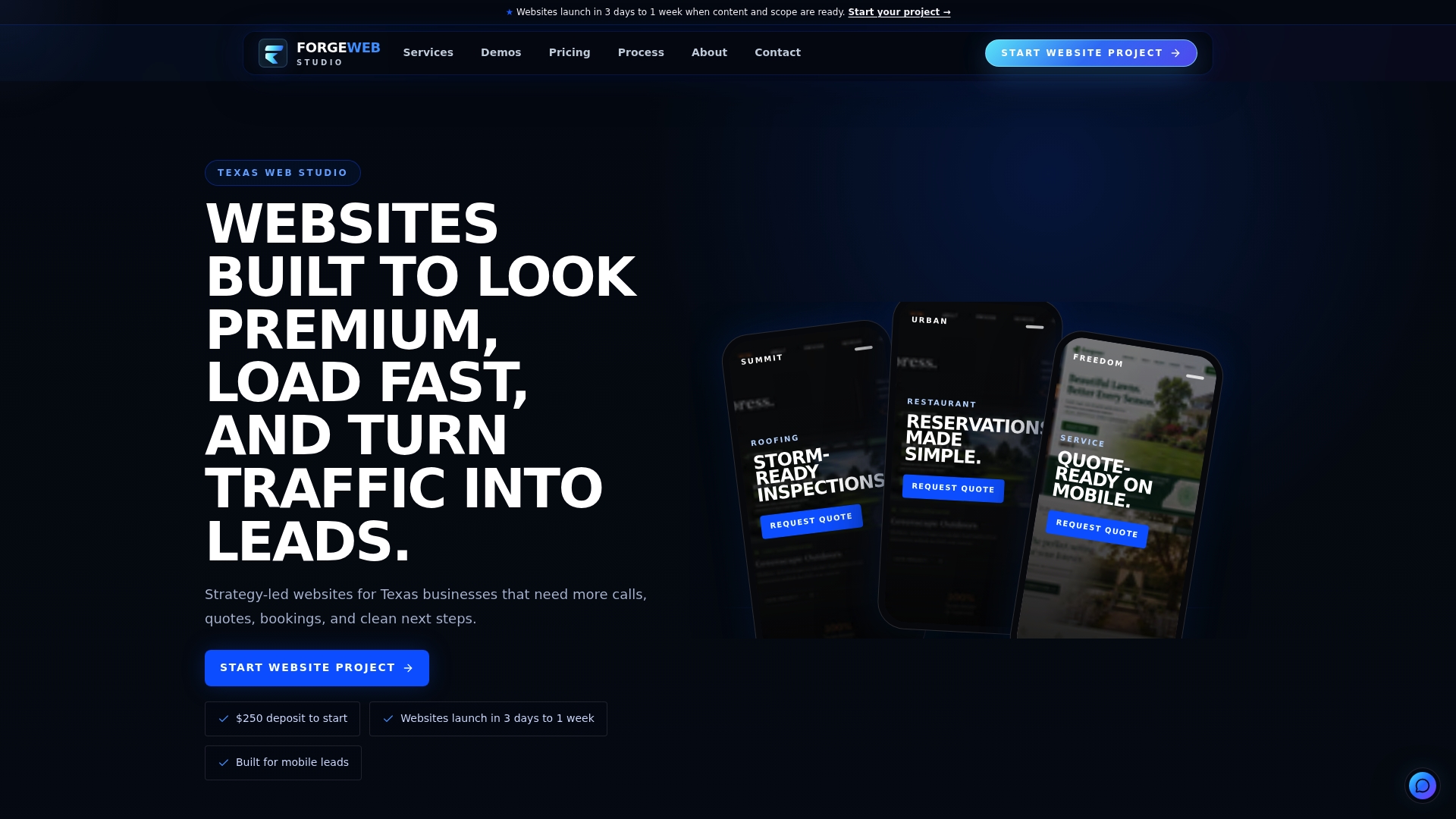
The Starter Website begins at $500 one-off, the Growth Website at $1,200, and the Custom Business Website at $2,500, all launched in three to seven days with mobile clarity and local search setup included. Redesign work and responsive website development are also on the table if your current site is desktop-first and losing mobile visitors at the door. Check current pricing and start with a $250 project deposit on the pricing page, or browse the full service list to see which build fits your business.
Sources
For technical definitions and code examples, MDN Web Docs and W3C are the standard references. For Core Web Vitals thresholds, use web.dev directly.
FAQ
What Is Mobile-First Design?
Mobile-first design means building the smallest, narrowest layout first and progressively enhancing it for tablets and desktops. It's the strategy behind MDN's mobile-first definition, which contrasts it with responsive design as the broader technique that adapts layouts across screen sizes.
Is Mobile-First Design Still Relevant?
Yes. Google's mobile-first indexing means the mobile version of your page is what typically gets crawled and ranked, and Core Web Vitals targets like LCP under 2.5 seconds are far easier to hit on lean, mobile-built pages than on stripped-down desktop ones.
What Are the Main Advantages of Mobile-First Design?
The biggest advantages are forced content prioritization, lighter page weight, and stronger performance scores, since starting small keeps unnecessary assets and layout complexity out of the base build. It also aligns naturally with mobile-first search indexing, which favors a well-built mobile experience over a bloated desktop one shrunk down.
How Do I Test a Mobile-First Website Properly?
Test on real devices at multiple widths, not just your smallest and largest breakpoints, since intermediate widths are a common failure point where components overflow or misalign. Also test on a throttled connection, with browser zoom up to 200%, and with a screen reader to catch focus-order issues.
How Much Does a Mobile-First Website Cost?
Forge-web-studio's Starter Website begins at $500, the Growth Website at $1,200, and the Custom Business Website at $2,500, each launched with mobile-first layouts built in. A $250 deposit starts the project, with current pricing always listed on the pricing page.