
If your mobile site isn't converting, the problem usually comes down to a small set of mobile-specific frictions: slow load speed, a hidden or awkward call-to-action, and checkout forms built for a desktop screen. Start with a 10-minute check: run your homepage through Google's mobile performance guidance tools, then open your own site on your phone and time how long it takes to find the "buy" or "contact" button.
TL;DR:
- Improving load speed by optimizing images, deferring scripts, and reducing render-blocking content can significantly lower bounce rates and increase conversions.
- Placing a sticky call-to-action button and redesigning the hero section for mobile-first viewing often yields quick, measurable gains in user engagement.
- Streamlining checkout and contact forms by reducing fields, enabling autofill, and showing total costs early can boost completion rates by up to 30%.
- Ensuring tap targets are at least 44 pixels wide and minimizing taps needed to access key pages enhances mobile usability and reduces user frustration.
- Regularly testing mobile site performance in isolation helps identify specific friction points and guides targeted improvements for sustained conversion growth.
Table of Contents
- Common reasons mobile sites underperform in conversion
- High-impact fixes to run, ordered by likely ROI for small businesses
- Quick mobile conversion audit: metrics and field checks
- Forge Web Studio and public case studies: what worked and expected lifts
- When to DIY vs. hire a specialist
- How Forge Web Studio helps fix mobile conversion problems
- Sources
- FAQ
Common reasons mobile sites underperform in conversion
Most mobile conversion problems trace back to a handful of repeat offenders, and matching your symptom to the right cause saves you from guessing.
High bounce rates on mobile often point to slow loading. A sluggish Largest Contentful Paint (LCP) or laggy Interaction to Next Paint (INP) makes visitors leave before they see your offer, and Google's own guidance stresses getting above-the-fold content rendered fast because minimizing render-blocking resources is what gets usable content on screen quickly.
Low add-to-cart or contact-form starts usually mean your call-to-action is buried below a big hero image or squeezed into a cramped header. Checkout or form drop-off is almost always friction: too many fields, the wrong keyboard popping up, or a total price that only appears at the very last step.
A few other patterns worth ruling out:
- Session fragmentation across devices can make mobile look worse than it is when the same visitor starts on mobile and finishes on desktop.
- Tap targets sized for a mouse cursor frustrate thumbs and cause mis-taps.
- Navigation menus that require three or four taps to reach a key page quietly bleed intent.
- Measurement gaps from cookie restrictions can undercount mobile conversions that actually happened.
High-impact fixes to run, ordered by likely ROI for small businesses
Fix these roughly in this order. Each one is testable in isolation, which matters more than trying to overhaul everything at once.
- Speed up the page. Convert images to WebP, add lazy loading below the fold, set explicit width and height on images to stop layout shift, and defer any JavaScript that isn't needed immediately. Aim for mobile LCP under three seconds and INP under 200 milliseconds, a target web.dev's INP guidance treats as the line for good responsiveness.
- Fix the call-to-action. Redesign the hero for mobile first rather than shrinking a desktop layout, or add a sticky CTA that stays at the bottom of the screen as the visitor scrolls. CustomFit.ai's mobile CRO research lists sticky CTAs and above-the-fold hero placement as the fastest tests to run with a measurable payoff.
- Cut checkout and form friction. Combine first and last name into one field where you can, set the right input type so a phone number pulls up a numeric keypad, enable autofill, and show the total cost early instead of at the final screen. Baymard Institute's checkout research has found that trimming unnecessary fields is one of the more reliable ways to lift completion.
- Make navigation thumb-friendly. Keep tap targets at least 44 by 44 pixels, put your most important pages within two taps of the homepage, and consider a persistent bottom navigation bar for the pages people visit most.
- Tighten messaging and trust signals. Write a short, specific headline instead of a vague tagline, place trust badges or reviews near the CTA rather than in a footer, and skip intrusive pop-ups that cover the screen on entry.
- Test mobile in isolation. Run A/B tests segmented specifically by device and track Relative Mobile Conversion Rate (mobile conversion rate divided by desktop conversion rate) so a seasonal traffic swing doesn't get credited to your redesign.
Pro Tip: Test one change at a time, starting with the sticky CTA or hero layout, it is usually the cheapest fix to build and the fastest to show a result.
For a broader library of tactics beyond this list, conversion rate optimization tips from a digital marketing perspective can round out your testing queue.
Quick mobile conversion audit: metrics and field checks
Before you rebuild anything, spend 30 minutes gathering evidence so you fix the right thing first.
- Pull your mobile conversion rate, mobile bounce rate, and add-to-cart or form-start rate, segmented by device, from your analytics.
- Run your homepage and top landing page through PageSpeed Insights on mobile and note your LCP and INP scores.
- Open the site on an actual phone and check CTA visibility, tap target size, which keyboard pops up on each form field, and whether error messages are clear.
- Confirm your total price or cost is visible before the final checkout step, an issue Baymard's mobile checkout benchmarks flag as a common cause of abandonment.
- Check your analytics setup for session timeout settings and consider server-side tagging, since browser privacy restrictions can undercount mobile sessions.
| Week | Test | What to measure |
|---|---|---|
| 1 | Sticky bottom CTA | Add-to-cart or contact-form starts |
| 1 | Hero CTA repositioning | Click-through rate on primary button |
| 2 | Reduced-field checkout or contact form | Form completion rate |
Use your own website review checklist to keep this process repeatable each time you make a change.
Forge Web Studio and public case studies: what worked and expected lifts
Some web studios build mobile-first layouts as part of rapid site launches, typically delivered in three days to a week, with a portfolio approach built around mobile clarity and clear lead paths. That pattern lines up with public case data: Swappie's Core Web Vitals project tracked Relative Mobile Conversion Rate alongside performance work and saw a substantial mobile revenue increase, while T-Mobile's field-data program reduced LCP and correlated with meaningfully better visit-to-order conversion rates.
Translate that into what to expect from your own fixes: a sticky CTA often produces a 10-20% add-to-cart lift according to CustomFit.ai's mobile CRO research, and trimming checkout fields can drive a 20-30% improvement in completion per Baymard's checkout research.

When to DIY vs. hire a specialist
Compressing images, tweaking your hero CTA, combining form fields, and running PageSpeed Insights are all things you can do yourself in an afternoon. Diagnosing INP problems, fixing server-side performance, integrating a complex checkout, or running a full mobile CRO program takes deeper technical work. A vendor worth hiring will show you field data before touching your layout and will prioritize the highest-impact fix first, not the flashiest one.
— Dylan
How Forge Web Studio helps fix mobile conversion problems
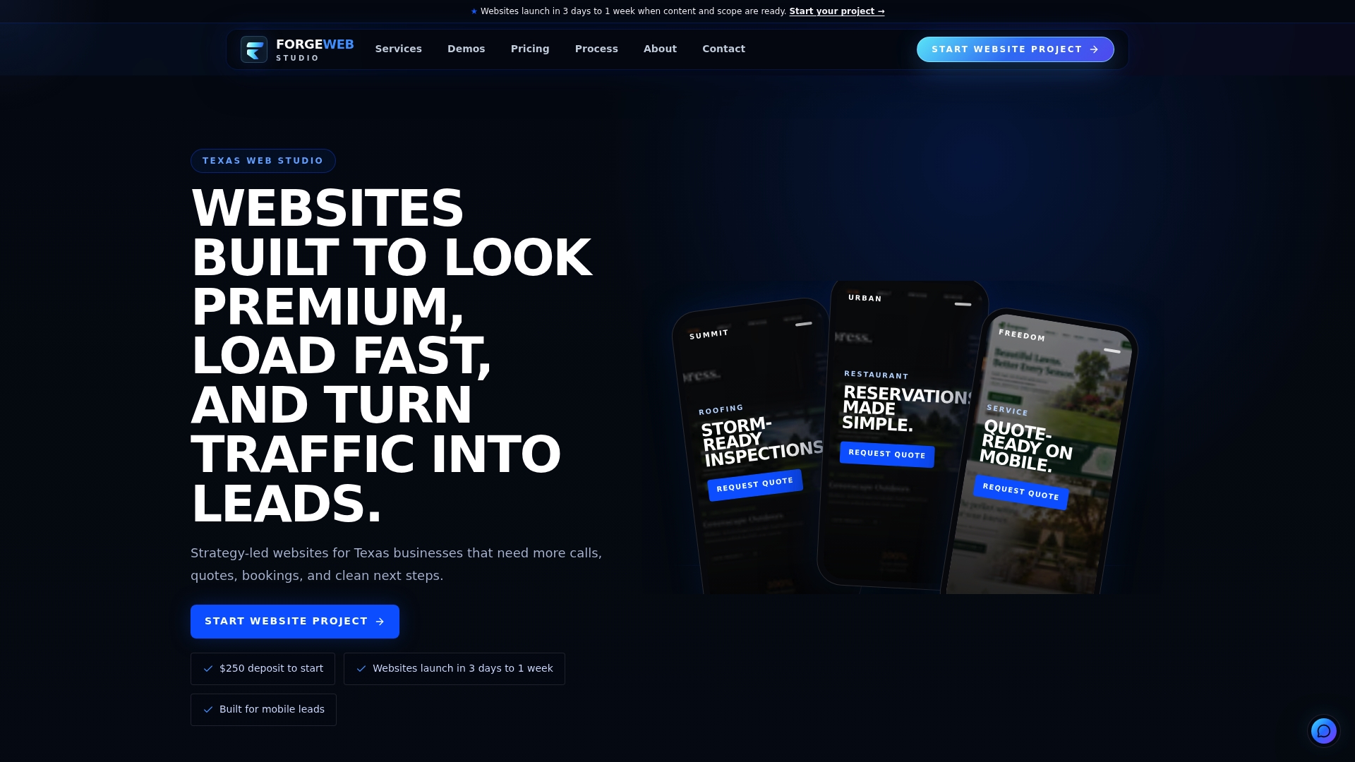
Most small business sites lose mobile visitors to the same three problems: slow load times, a CTA the thumb can't find, and a form nobody wants to finish on a phone. Forge Web Studio builds around all three from the start, with mobile-first layouts, speed optimization, and checkout flows scoped to convert, launched in as little as three days to a week rather than months.
Services that map directly to what this article covers:
- Web Design built mobile-first rather than adapted from desktop, with clear contact paths on every page.
- Responsive Website Development for sites that need to perform well across phone, tablet, and desktop.
- Website Redesign for existing sites that are slow, cluttered, or losing mobile visitors at checkout.
- Local SEO to make sure the traffic you fix conversion for is finding you in the first place.
Full pricing starts with the Starter Website for smaller projects, with Growth Website and Custom Business Website options for more complex builds. You can browse mobile-first layouts in the demo gallery or start a website project directly.
Sources
FAQ
Why is my website not converting?
The most common causes are slow load times, a call-to-action visitors can't find quickly, and forms or checkout steps with too much friction. Segment your analytics by device first: mobile and desktop visitors often fail for different reasons, so fixing the wrong one wastes effort.
Why is my mobile site not displaying correctly?
This is usually a responsive design issue where the layout wasn't built or tested for smaller screens, causing overlapping text, broken menus, or images that don't resize. Check the page on an actual phone rather than a desktop browser's mobile preview, since emulators often miss real rendering bugs.
Why am I getting clicks but no conversions?
Traffic without conversions typically means the landing experience doesn't match what the ad or link promised, the CTA is hard to find or unclear, or the page loads too slowly for mobile visitors to stick around. Running a mobile-segmented PageSpeed Insights check and a real-phone walkthrough of your funnel usually surfaces the gap quickly.
How do I get a website out of mobile mode?
Most modern websites use responsive design rather than a separate "mobile mode," so there is no toggle to switch off. If your site is showing a stripped-down mobile version you don't want, check your theme or platform settings for a mobile template override, or consult whoever built the site about switching to a fully responsive layout.