
Add a single, focused inquiry flow above the fold: a 3 to 5 field form, one clear call to action, and no competing links nearby. That one change typically cuts visitor friction and raises qualified enquiries within weeks, according to Baymard, which has spent years studying why forms lose people. Portfolio sites built around this principle have one goal per page, with nothing else competing for attention.
TL;DR:
- Short, clear contact forms with three to five fields are proven to generate more inquiries than longer forms with excessive questions.
- Placing a prominent call-to-action on every page, especially near the strongest proof points, significantly reduces the number of clicks required to reach the contact form.
- Trust signals such as client logos or specific project results near the form increase visitors' confidence and likelihood to reach out.
- Using mobile-first, simple layouts and native input types helps prevent form abandonment due to layout shifts or input difficulties.
- Fixing common issues like buried contact options and vague CTAs can boost inquiry rates within weeks with minimal effort.
Table of Contents
- What Portfolio Website Lead Capture Actually Means
- Choosing the Right Form Type for Your Portfolio
- Design and Copy That Turn Browsers Into Inquiries
- Fewer Fields, Fewer Drop-Offs
- Where Leads Go After They Hit Submit
- The Five Mistakes Killing Your Portfolio's Lead Flow
- Inside Forge-web-studio's Playbook for Portfolio Conversions
- Trade-Offs Freelancers Actually Face
- Get a Portfolio Built Around Lead Capture, Not Just Looks
- Where to Learn More
- Sources
- FAQ
What Portfolio Website Lead Capture Actually Means
A lead capture page has one job: get a visitor's contact information before they leave. An embedded form, by contrast, sits inside a larger page like a project showcase or about section, competing with images, navigation, and other content for attention. Both matter for portfolio website lead capture, but they solve different problems. A dedicated capture page works for paid traffic or a specific offer. An embedded form works when someone is already engaged, scrolling through your case studies and deciding whether to trust you.
The visitor journey on most portfolio sites follows a predictable arc: discovery (they land from a search, referral, or social link), evaluation (they scan your work and credibility signals), and decision (they either reach out or bounce). The decision moment usually happens right after they finish looking at your strongest project, not on your homepage. That's why so many portfolios bury their contact option on a separate page reachable only through the main navigation. By the time someone finishes reading a case study and feels convinced, the CTA is nowhere near them.
Smart placement fixes this. Consider these approaches:
- A sticky contact button that follows scroll on mobile, so the CTA is always one tap away.
- An inline inquiry box at the bottom of every case study, timed to appear right after the strongest proof point.
- A homepage hero with a single, specific offer instead of a generic "let's talk" link.
- Micro CTAs after each project thumbnail for visitors who don't read the full case study.
Two structural patterns shorten the path to contact reliably. The first is a single scrolling homepage with case studies as sections rather than separate pages, so the contact form appears just below the strongest work sample. The second is a project template that ends every case study with the same qualifying question ("Have a similar project?") tied to a short form, so the ask feels native to the content instead of bolted on. Both reduce the number of clicks between "I'm convinced" and "I've sent this person my email."
Choosing the Right Form Type for Your Portfolio
Not every visitor deserves the same form. A first-time browser skimming your site on their phone won't fill out a ten-field project brief, and a returning client ready to book won't want to re-explain their entire project through a chatbot. Match the form to the intent behind the click.
- Simple email signup. Best for early-stage visitors who aren't ready to commit but might want updates or a downloadable resource. Keep it to one field. Use it on blog content or a resource page, never as your primary contact method.
- Short contact form. The workhorse of portfolio website lead capture. Name, email, project type, and a short message field cover most inquiries without scaring anyone off. This is the right default for freelancers charging under a few thousand dollars per project.
- Multi-step inquiry form. Splits qualifying questions across two or three screens (project type, budget range, timeline, then contact details). Works well for consultants and designers whose projects vary widely in scope, because it filters serious inquiries from tire kickers before you ever see the message.
- Assessment or quiz-style form. Asks a few diagnostic questions ("What's your biggest challenge with your current site?") before revealing a result and a contact prompt. Effective for consultants selling a process, less useful for visual portfolios where the work should speak first.
- Booking widget. Skips the inquiry step entirely and lets qualified visitors grab time on your calendar. Works best once you already have consistent traffic and a clear enough offer that a call doesn't require a written brief first.
The decision rule is simple: match form complexity to project value and visitor certainty. A $500 logo project doesn't need a four-question qualifier. A $15,000 brand and web engagement usually benefits from one, because it filters out unqualified leads before they eat up your time on a discovery call.
Design and Copy That Turn Browsers Into Inquiries
Your headline should name the outcome, not the service. "Websites that convert visitors into clients" beats "Web design services" because it tells a visitor what they get, not what you do. Pair it with a subheadline that adds one specific detail: turnaround time, a niche, or a result you consistently deliver.
CTA wording matters more than most portfolio owners assume. "Get in touch" is vague enough to ignore. "Get a free project estimate" or "See if I'm a fit for your project" gives the visitor a reason to click right now instead of bookmarking your site for later. Place your primary CTA above the fold, then repeat it after every meaningful piece of evidence, your best case study, your testimonials, your process breakdown, so a convinced visitor never has to hunt for it.
Trust signals do the heaviest lifting on a portfolio site because visitors have no other way to verify you're legitimate. Prioritize:
- A one-line result from a real project ("Redesigned this site and their inquiries doubled in two months").
- Client names or logos, even just two or three, placed near your contact form.
- A short metric tied to a specific project rather than a vague claim about experience.
Layout discipline finishes the job. Give conversion pages one goal. Strip the navigation down to essentials, or remove it entirely, on any page built specifically to capture a lead, so nothing pulls attention away from the form. Sharpening CTA wording and placement is one of the cheapest changes you can make this week, and it compounds with every other fix on this list.
Pro Tip: Screenshot your own contact page and count how many clickable elements compete with your form. If it's more than three, you're asking visitors to make a decision instead of taking an action.
Fewer Fields, Fewer Drop-Offs
The average lead flow across the web carries 11.3 fields, down from 12.7 in 2019, but the flows that actually convert well tend to run closer to eight fields or fewer. For a portfolio contact page, aim even leaner: three to five meaningful fields is usually enough to start a real conversation. Name, email, project type, and a short message cover almost every use case.

Multi-step forms and conditional fields let you gather more without front loading the ask. Show the budget and timeline questions only after someone commits to the first screen, so the form feels like a conversation rather than an interrogation.
Accessibility isn't a separate checklist item, it's part of conversion. Web recommends testing every form with a keyboard alone, checking that focus order follows a logical path, verifying labels are readable by screen readers, and confirming the layout holds together at 200% zoom. A form that breaks under keyboard navigation loses real visitors, not just an accessibility audit score.
On mobile, use large touch targets, native input types (email keyboards for email fields, numeric pads for phone numbers), and fixed-height containers so the page doesn't jump as fields validate. Layout shift during form-fill is one of the quieter reasons people abandon halfway through.
Where Leads Go After They Hit Submit
A submitted form that lands only in an inbox is a lead you'll probably lose. Build the handoff before you launch the form, not after leads start slipping through.
- Simple stack. Form submits directly to email plus a Google Sheet row for backup. Fine for solo freelancers getting a handful of enquiries a month.
- Intermediate stack. A service like Formgrid routes submissions to Sheets or a lightweight CRM automatically, so nothing depends on you remembering to log it manually.
- Full stack. Form feeds directly into a CRM with automatic tagging by project type and a pipeline stage, so a new inquiry triggers a task instead of sitting untouched.
Whatever stack you choose, the post-submit experience needs three parts: a thank-you page confirming receipt, an automated confirmation email restating next steps, and an internal reminder that enforces a response window, 24 to 48 hours is a reasonable standard for a solo operator. Add a honeypot field, basic rate limiting, and a tool like Cloudflare Turnstile to cut spam before it reaches your inbox, and validate every field server side, not just in the browser. Capture UTM parameters and referral source on submission so you know which channel actually produces clients, not just traffic.
The Five Mistakes Killing Your Portfolio's Lead Flow
Most underperforming portfolios share the same handful of problems, and each one has a fast fix.
- Buried contact option. Fix: put a CTA on every page, not just a "Contact" link in the nav.
- Too many form fields. Fix: cut to the three or four fields you actually act on; ask the rest in a follow-up email.
- Weak or vague CTA. Fix: rewrite it around a specific outcome instead of a generic verb.
- No trust evidence near the ask. Fix: place one metric or client name directly above the form.
- No follow-up system. Fix: set a response SLA and automate the confirmation email so leads don't go cold.
Run a five-minute audit right now: open your site on your phone, count the taps to reach a contact form, count the fields on it, and check whether a testimonial or result appears anywhere near the CTA. If any answer surprises you, that's your next fix.
Small experiments beat full redesigns. Try swapping your CTA copy for two weeks and compare inquiry counts, or test removing one field from your existing form. A conversion-focused redesign case study that combined a single-path layout, progressive disclosure, and stronger trust signals took conversion from 0.5% to 3.5% and cut cost per lead by 80%. You don't need a full overhaul to see a version of that lift. Fixing buried contact info or cutting form fields alone often produces a noticeable jump within a month.

Inside Forge-web-studio's Playbook for Portfolio Conversions
Every site Forge-web-studio builds follows the same sequence, regardless of industry: mobile clarity first, a single contact path second, trust signals placed where the decision happens, and a build cadence fast enough that clients see results in days, not months.
- Design mobile layouts first, then adapt up to desktop, since most portfolio traffic arrives on a phone.
- Build one primary contact path per page instead of scattering multiple competing CTAs.
- Place trust signals (client names, short results, service area) directly beside the form, not on a separate "About" page.
- Launch fast. Forge-web-studio typically turns around a portfolio-style layout in days, so feedback and iteration happen while momentum is still fresh.
Texas service professionals working with focused, mobile-first lead flows tend to see enquiry conversion rates in the 8 to 15% range, well above the industry norm for cluttered, multi-goal pages.
Any freelancer or small studio can hand this checklist to a developer or implement it directly: cut your form to five fields or fewer, put your CTA above the fold, add one trust signal near the ask, and confirm your mobile layout doesn't force pinch-zooming to read anything.
Trade-Offs Freelancers Actually Face
A minimal contact form is enough for most freelancers starting out. If your projects are similar in scope and price, a name, email, and message field will do; you don't need a qualification flow to filter leads you'd take anyway. Multi-step forms earn their complexity once your project range gets wide enough that a $300 logo inquiry and a $10,000 rebrand inquiry are hitting the same inbox unfiltered.
The real trade-off is time against lead quality. Building a multi-step flow with conditional logic takes a weekend you probably don't have this week. So don't start there. This week, fix your CTA wording and cut your form to essential fields. This quarter, once you have enough traffic to test meaningfully, build the qualification flow if your project range justifies it.
Track before you redesign. A week of watching where people drop off tells you more than any theory about ideal form length. Small, measured changes beat a full rebuild almost every time, mostly because you actually learn what your specific visitors respond to instead of guessing from a general best-practices list.
— Dylan
Get a Portfolio Built Around Lead Capture, Not Just Looks
Most portfolio owners either stitch together a template themselves or hire an agency that takes months and treats the contact form as an afterthought. Typically, clients work directly with the founder, get a rapid build built specifically for mobile clarity and a single, clear lead path, and keep full ownership of their site and content when it's done, with no templates and no surprise fees.
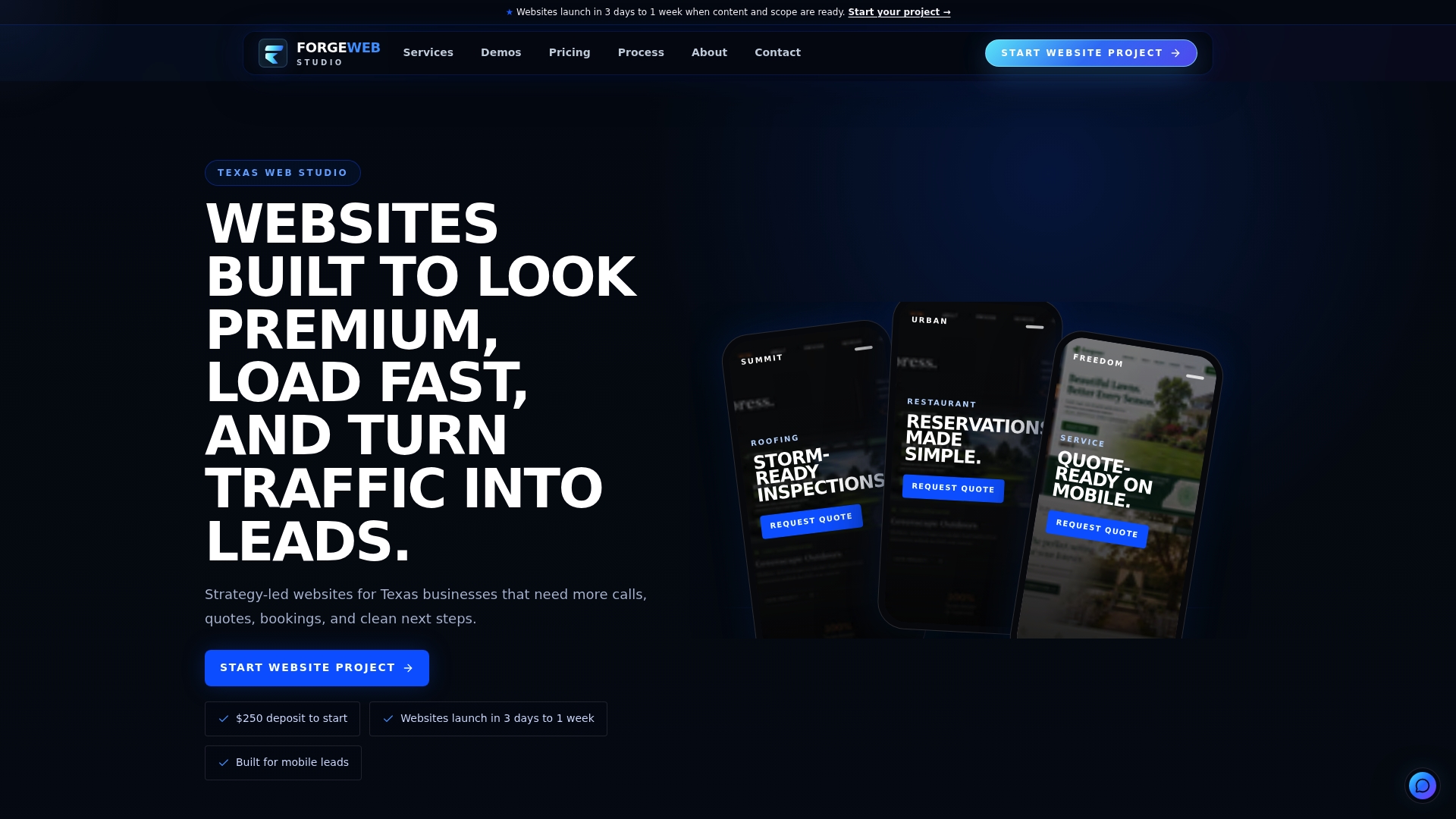
Timelines run from a few days to a week for many builds, and projects include contact flow, trust-signal placement, and local search setup as part of the process. Pricing starts at $500 for a Starter Website, with Growth and Custom Business Website tiers available depending on scope. Browse the full service breakdown or head straight to the project request page to get a quote on your own portfolio rebuild.
Where to Learn More
- Baymard's form-field research breaks down why shorter forms consistently outperform longer ones.
- Web covers keyboard, screen reader, and zoom testing for forms.
- The Formgrid implementation guide shows a practical form-to-CRM stack.
- Forge-web-studio's contact form best practices guide expands on field choices and post-submit handling.
Sources
- Checkout flow: average form fields
- Web
- How to build a $15K web design agency landing page with Next.js and Formgrid
- YieldMax: 3.5% Conv. Rate — Here's Exactly How | WebMarv
FAQ
What Is Portfolio Website Lead Capture?
It's the process of turning site visitors into contactable leads through forms, CTAs, and follow-up systems placed where visitors are ready to reach out. The goal is a short, clear path from viewing your work to submitting an inquiry.
How Many Fields Should a Portfolio Contact Form Have?
Three to five meaningful fields is a reliable target, since the average lead flow runs far longer than what actually converts well. Name, email, project type, and a short message cover most freelance inquiries without adding friction.
Where Should I Place My Contact Form?
Put it above the fold on your homepage and again at the end of every case study, right after your strongest proof point. A sticky mobile CTA that follows scroll also keeps the option visible without a separate navigation click.
How Fast Can Forge-web-studio Build a Lead-Focused Portfolio?
Most builds take 3 days to one week, depending on scope, with lead flow, trust signals, and mobile optimization included from the start. Pricing begins at $500 for a Starter Website, with details on every tier listed on the pricing page.
What's the Biggest Mistake Hurting Portfolio Conversions?
Burying the contact option behind multiple navigation clicks is the most common failure, followed closely by forms with too many fields. Both are fixable in an afternoon and often produce a noticeable increase in enquiries within a few weeks.