
A service landing page must do one job well: present a single, clear offer and give the visitor one obvious next step. Get that right first. Everything else, mobile layout, short forms, trust signals, is in service of that single priority, not a substitute for it.
TL;DR:
- Service landing pages should focus on one clear offer with minimal options to maximize conversions and avoid distracting visitors.
- Combining a benefit-driven headline with a short, simple form and specific trust signals improves user engagement and form completion rates.
- Reducing cognitive load by eliminating unnecessary form fields and ensuring mobile usability significantly boosts mobile conversion performance.
- Gating only high-value content and keeping core offerings easily crawlable helps attract visitors without damaging SEO or discoverability.
- Professional developers typically deliver faster, more optimized pages than DIY builders, especially for local search and mobile performance.
Table of Contents
- Annotated swipe file: patterns worth copying
- What every landing page section actually needs to say
- How to design forms and mobile flows that don't lose people
- Deciding what to gate and what to give away for free
- A build checklist and two templates you can hand to a developer
- How a rapid-build studio approaches this in practice
- What to look for when choosing a landing page design provider
- Questions worth asking before you hire a designer
- Red flags that signal a landing page project will go wrong
- DIY builders versus hiring a professional
- How to judge whether a finished landing page is actually good
- Mistakes that quietly sink most service landing pages
- Why most landing page advice undersells restraint
- Getting a landing page built without the guesswork
- Sources
- FAQ
Annotated swipe file: patterns worth copying
Most service landing pages that convert well share a handful of recognizable patterns. You do not need to reinvent these. You need to pick the one that fits your offer and execute it cleanly.
The hero-led single-offer pattern works best when the service is well understood and the visitor already has intent, think "emergency plumber" or "divorce attorney consultation." The headline states the outcome, a subheadline names who it is for, and the primary call to action sits above the fold with no competing links. Navigation is often stripped down or removed entirely so the page has nowhere else to send attention.
The package-pricing pattern suits services sold in tiers, web design, coaching packages, marketing retainers. Three columns, clear differentiation (what changes between tiers, not just the price), and one tier visually emphasized as the recommended choice. The mistake most businesses make here is listing features instead of outcomes: "5 pages" means less to a visitor than "a site ready to launch in a week."
The consultation or lead-magnet pattern fits higher-ticket or more considered services, legal, financial, enterprise software. Instead of asking for a sale, the page asks for a conversation: a short form (name, email, one qualifying question) in exchange for a free audit, quote, or consultation call. This pattern depends on the gate being genuinely light. A seven-field form kills momentum before it starts.
A few cues worth borrowing, and a few worth skipping:
- Use one hero image or short video that shows the outcome, not a stock photo of people shaking hands.
- Write the headline as a benefit sentence, not a label: "Get your HVAC fixed today" beats "HVAC Services."
- Place the primary CTA button in a color that appears nowhere else on the page.
- Avoid carousels and sliders in the hero: they split attention and often hide the second slide from most visitors.
- Skip auto-playing video with sound; it is one of the fastest ways to make a visitor leave.
The through-line across all three patterns is restraint. Pages that convert tend to cut options, not add them. A visitor who sees five possible actions usually takes none.
What every landing page section actually needs to say
A service landing page is built from a small set of components, and each one has a specific job. Skipping the job, even while including the section, is the most common reason pages underperform.
- Headline (H1): state the outcome the service delivers, in plain language, in under twelve words. "Website live in a week" works better than "Comprehensive Web Development Solutions."
- Subheadline: answer the question the headline raises, usually "for whom" or "how." This is where you name the audience or the mechanism.
- Benefit bullets: three to five lines, each describing a result the visitor gets, not a feature you built. "No long-term contract" is a benefit; "flexible billing engine" is a feature nobody asked for.
- Trust signals: a short client testimonial, a logo strip, or a specific stat (jobs completed, years in business, response time) placed near the CTA, not buried in a footer.
- Primary CTA: one action, repeated at the top and bottom of the page, with microcopy that names the next step ("Get my free quote") rather than a generic "Submit."
- Secondary CTA (optional): a lower-commitment option, like "See pricing" or "View examples," for visitors not ready to convert yet.
Benefit-oriented writing beats feature lists because visitors arrive asking "what does this do for me," not "what is in the box." A roofing company that writes "Class 4 impact-resistant shingles" will convert worse than one that writes "Shingles that survive hailstorms, so you don't call us again next year." Same fact, different framing.
Trust signals work best when they are specific. "Trusted by businesses" says nothing. "Average response time: under two hours" or a two-sentence quote from a named client says something a skimming visitor can actually register.
Pro Tip: Put your strongest trust signal directly under the primary CTA button, not in a separate section further down the page. Visitors hesitating at the CTA are the ones who need the reassurance most.
How to design forms and mobile flows that don't lose people
Most service landing pages lose visitors at the form, and most of that loss is avoidable. The fix is reducing how much a visitor has to think, not how much they have to type.
Nielsen Norman Group's research on cognitive load in forms identifies four principles that reduce the thinking required to complete one: structure, transparency, clarity, and support. In practice, that means telling visitors exactly what will happen after they submit and exactly what information you need before they start typing, not partway through.

On field count, the rule is simple: eliminate, automate, simplify. Drop any field you do not strictly need for the first contact. NN/g's guidance on form design is direct about this: minimizing fields and using a single-column layout increases completion rates, and removing unnecessary fields can meaningfully lift conversions. A minimal number of fields, such as name, email, and a qualifying question, can suffice for an initial service inquiry. Ask for budget, timeline, and project scope later, once someone has already raised their hand.
A few specifics that matter more on mobile than desktop:
- Use a single-column layout so the eye never has to jump sideways between fields.
- Trigger the correct keyboard automatically: numeric for phone and ZIP code, email keyboard for email fields.
- Make tap targets large enough to hit reliably with a thumb, not a cursor.
- Keep the CTA button visible above the keyboard when it is active, not pushed off-screen.
- Preserve whatever a visitor already typed if a form throws an error, and say specifically what needs fixing.
Baymard Institute's checkout and form research backs this up directly: matching input types to keyboard behavior and keeping the call to action visible while the keyboard is open are consistent markers of better-performing mobile flows, as is preserving input on error instead of clearing the form and making the visitor start over.
A short form that respects these details will consistently outperform a long one that doesn't, according to NN/g's form design research, which found that trimming fields and simplifying layout raises completion rates. Fewer fields, fewer keyboard switches, fewer surprises.
Deciding what to gate and what to give away for free
Every landing page has to answer one question before it is built: what content is freely available, and what requires an email address? Incorrect choices can affect SEO or lead generation effectiveness.
The useful rule comes from funnel stage. Someone searching for general information, "how does local SEO work," is not ready to fill out a form, and gating that content just sends them to a competitor's open article instead. NN/g's analysis of content gating makes this tradeoff explicit: hiding content behind a form can hurt discoverability, so the content that attracts visitors in the first place should generally stay open, while only the highest-value assets, a custom quote, a full audit, a downloadable template, get gated.
A few lighter-gating options that split the difference:
- Email-only forms for a checklist or guide, with no phone number or company details required.
- A partial preview (the first page of a report, the summary of an audit) with the full version behind one field.
- A gated calculator or quiz that gives a partial result free and a full breakdown after signup.
Structurally, keep your most important content crawlable above the fold rather than hidden in a form, use a descriptive H1 that matches what a search engine and a human both expect, and add basic schema markup for service pages so search engines understand what you offer. On measurement, track form-assisted conversions alongside raw organic traffic to the page: a page that ranks well but converts poorly usually has a gating or clarity problem, not a traffic problem.
A build checklist and two templates you can hand to a developer
A landing page does not need a designer to get the basics right. It needs a sequence followed in order.
- Define the single offer the page sells, in one sentence.
- Write the H1 and subheadline around that sentence.
- Gather three proof points: a testimonial, a stat, or a specific result.
- Set up one primary CTA and decide its exact wording.
- Build the form with two to five fields, no more.
- Add conversion tracking before launch, not after.
- Test the full page on an actual phone, not just a resized browser window.
Two templates cover most service businesses:
Template A, lead-gen page: hero (headline, subheadline, CTA), benefit bullets, social proof block, package or pricing comparison, short form (two to three fields), footer with contact details and a secondary CTA. Six blocks, nothing extra.
Template B, booking page: hero with a calendar-style CTA, service details and what is included, pricing or a starting estimate, an embedded booking calendar, and a trust block (reviews, credentials, guarantees) placed near the calendar widget.
On timeline and cost, a DIY build using a template adaptation can take a weekend, while a custom-built page from a developer typically runs from a few days to a couple of weeks depending on scope and revisions. Forge Web Studio's own process compresses that further, with rapid builds landing in three to seven days, a timeline worth knowing if speed matters more to you than building it yourself.

How a rapid-build studio approaches this in practice
Forge Web Studio builds landing pages around the same priorities covered above: a mobile-first layout, a single clear lead path, and local search visibility baked in from the start rather than bolted on later. The studio's stated approach centers on mobile clarity, lead flow, and local search optimization, with every client working directly with the founder on scope and pricing.
What that looks like in delivery:
- A typical rapid build runs three to seven days from kickoff to launch, aimed at Texas businesses that need a working page fast.
- Pages are built with clear contact paths and trust signals rather than generic templates with text swapped in.
- Pricing and scope are set upfront, with no surprise fees added mid-project.
A roofing company moving from a slow, image-heavy homepage acting as its only landing page to a dedicated, mobile-first page with one offer and one form is a common before-and-after: same business, same services, but a page built to do one job instead of ten. The demo gallery shows the pattern applied across different service types.
What to look for when choosing a landing page design provider
The providers worth hiring share a few traits that are easy to check before you sign anything. Look for a visible process, meaning they can describe how a project moves from kickoff to launch without vague language. Ask to see real examples of landing pages they have built for businesses similar to yours, not just a generic portfolio of homepages.
Timeline and pricing clarity matter more here than almost anywhere else in the hiring decision. A provider who gives a fixed scope and a real delivery window is easier to plan around than one who quotes "it depends" and leaves it there. Mobile performance should be part of the pitch, not an afterthought you have to ask about. If a provider cannot speak specifically to how they handle forms, load speed, or mobile layout, that is worth noting.
Finally, check whether the provider builds for lead capture or just for looks. A landing page is a conversion tool first. A provider who talks exclusively about design trends and never mentions CTAs, form fields, or tracking setup is optimizing for the wrong outcome. The right provider will ask about your offer and your current conversion numbers before they ask about your color preferences.
Questions worth asking before you hire a designer
A short list of direct questions tends to surface more useful information than a long discovery call. Ask how long the build will take from kickoff to launch, and get a specific range, not "it varies." Ask what the page will include by default: how many sections, whether a form is built in, whether mobile testing is part of the process or an extra.
Ask who owns the site and its content once the project is done. Some providers lock clients into their platform or charge ongoing fees to keep the site live. Ask what happens if you want to make a small change yourself after launch, and whether that requires going back to the designer every time.
Ask for one or two examples of pages they have built for a similar type of business, and ask what results those pages saw, even informally. A provider confident in their work will usually have an answer ready. One who deflects the question or pivots to generic praise probably does not have much to point to.
Red flags that signal a landing page project will go wrong
A few warning signs show up again and again in bad landing page projects. The biggest one is vague pricing, a quote that changes significantly once work has started, or a scope that keeps expanding without a corresponding price adjustment. Fixed, transparent pricing set before work begins is the standard to hold a provider to.
Watch for providers who push a generic template with minimal customization and call it a custom build. A page that looks identical to three other businesses in your area with only the logo swapped is not going to differentiate you, and it often signals a volume-based shop rather than one paying attention to your specific offer.
Be cautious of anyone who cannot explain their mobile testing process. If mobile layout is an afterthought rather than a stated step in their workflow, the finished page is likely to show it. Also watch for long timelines with no interim check-ins: a six-week build with zero visibility into progress leaves you unable to catch problems early. Finally, be wary of anyone reluctant to put the delivery timeline, deliverables, or ownership terms in writing. If it is not written down, it is not a commitment.
DIY builders versus hiring a professional
Tools like Webflow, Unbounce, and WordPress page builders have made it realistic for a small business owner to put together a landing page without writing code. These tools are a reasonable choice when the budget is tight, the offer is simple, and the owner has time to learn the editor and iterate on it.
The tradeoff is time and performance. DIY builds take longer than most owners expect once you factor in learning the tool, finding or shooting images, and testing on an actual phone instead of just a laptop. They also tend to underperform on the details covered earlier in this guide: correct mobile keyboards, tap target sizing, tracking setup, and copy that focuses on benefits rather than features. These are easy to get wrong without specific UX knowledge, and most DIY builders get at least one of them wrong on the first pass.
Hiring a professional trades money for speed and a lower chance of those specific mistakes. A developer who has built dozens of service pages already knows which form length converts, which CTA wording tends to underperform, and how to structure a page for local search from day one. For a business that depends on the page to generate real leads quickly, that experience is often worth more than the savings of building it alone, particularly when a rapid-build service can deliver a finished, tested page in about the same time it takes to learn a page builder from scratch.
How to judge whether a finished landing page is actually good
A landing page can look polished and still convert poorly, so visual quality alone is not a reliable test. The better approach is checking a short set of functional signals. Load the page on an actual phone and see whether the primary CTA is visible without scrolling, whether the form keyboard matches the field type, and whether the page loads in a few seconds rather than ten.
Check whether the headline alone tells you what the business does and for whom, without reading further down the page. If a visitor has to scroll to understand the offer, the hierarchy is wrong, a problem well documented in research on visual hierarchy, which treats clear primary-message recognition as a basic design requirement, not a nice-to-have.
Beyond the surface check, look at actual numbers once the page is live: form completion rate, bounce rate on mobile versus desktop, and time to first interaction. A page with a low bounce rate but a low form completion rate usually has a form problem, not a traffic problem. A/B testing one variable at a time, headline wording, CTA color, form length, is the most reliable way to find out what is actually holding a specific page back rather than guessing.
Mistakes that quietly sink most service landing pages
The most common mistake is offering too many choices. A page with three different CTAs competing for attention, "Call now," "Get a quote," "Learn more," splits traffic three ways and usually converts worse than a page with one clear path.
A close second is burying the offer. Visitors who have to scroll past a mission statement or a company history before finding out what the business actually does will often leave before they get there. The offer belongs in the first screen, not the third section.
Long forms are a persistent pitfall, especially for first-touch inquiries. A ten-field form asking for budget, timeline, project details, and company size before a visitor has even spoken to anyone is a significant barrier, and most of that information can wait for a follow-up call. Generic stock photography and vague trust claims ("trusted by businesses everywhere") also undercut credibility more than most owners realize, since specific numbers and named clients do more work than broad claims ever will.
Finally, skipping mobile testing on a real device is a mistake that shows up immediately in bounce rates. A page that looks fine on a desktop monitor can have a CTA hidden behind the keyboard or tap targets too small to hit reliably on a phone, and most service businesses now get the majority of their landing page traffic from mobile.
Why most landing page advice undersells restraint
Most guides treat landing page design as an assembly problem: add a hero, add testimonials, add a form, add urgency, add a guarantee. The evidence actually points the other way. The pages that convert best are usually the ones that cut the most, not the ones that include every recommended element.
The overrated piece of advice is urgency tactics, countdown timers, "limited spots," artificial scarcity. For a service business, these tend to read as gimmicky rather than persuasive, and they distract from the one thing that actually moves a visitor: a clear offer they understand in five seconds. The underrated piece is restraint in CTA count. One offer, one form, one button, repeated, beats a page offering five ways to get in touch.
If you take one thing from this guide, prioritize clarity over decoration. A plain page with a sharp headline, a short form, and one visible next step will usually outperform a beautifully designed page that makes the visitor think about what to do next.
— Dylan
Getting a landing page built without the guesswork
If you would rather skip the trial and error, Forge Web Studio builds landing pages around the same priorities covered in this guide: a single clear offer, a short form, and mobile-first layout from the first draft. The Starter Website is offered as a one-off project for businesses that need a focused page fast, while the Growth Website is designed for businesses needing more pages or deeper local SEO work.
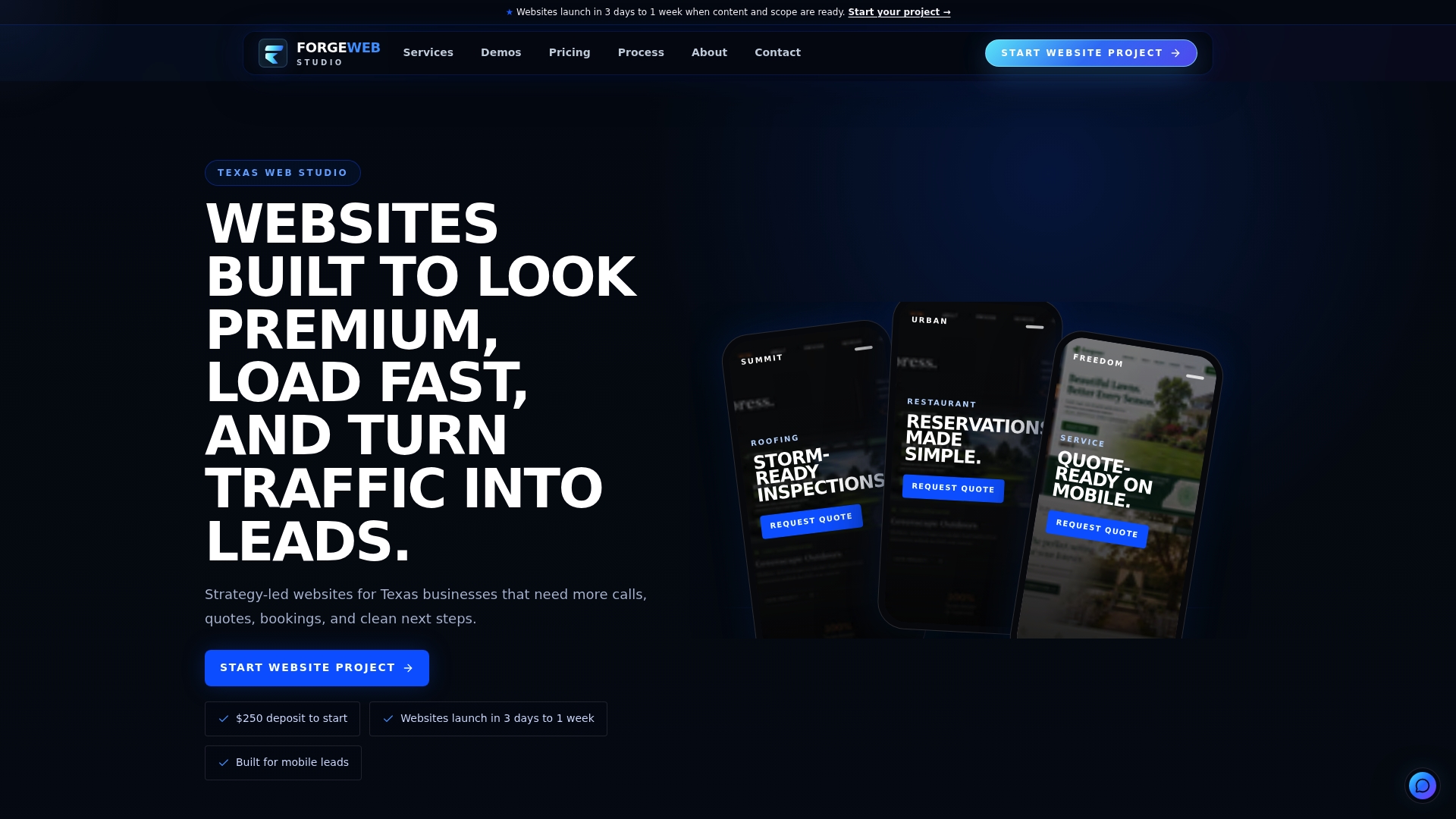
Every project starts with a deposit and moves directly with the founder, so there is no agency layer between your input and the person building the page. Most builds land in the three to seven day window mentioned earlier, with deliverables scoped clearly before work starts, no surprise fees added mid-project.
If your current page is underperforming rather than missing entirely, the Website Redesign service applies the same checklist to an existing site instead of building from scratch. Either way, you can check pricing and get started directly, or browse the demo gallery first to see the approach applied to other service businesses.
Sources
The form and cognitive load recommendations in this guide draw on NN/g's principles for reducing cognitive load in forms and its web form design research, both of which inform the field-count and layout advice above. Mobile keyboard and tap-target guidance comes from Baymard Institute's checkout UX research. The gating and SEO tradeoffs section is based on NN/g's analysis of content behind forms, and the visual hierarchy discussion draws on the Interaction Design Foundation's resources on the topic. For broader lead-generation context, Jarrod Harman's guide to optimizing websites for more leads offers a useful companion read.
- Few Guesses, More Success: 4 Principles to Reduce Cognitive Load in Forms - NN/g
- The Checkout UX Guide: Optimizing Your Ecommerce Order Flow with Research-Backed Insights - Baymard
FAQ
What is a service landing page?
A service landing page is a standalone page built to promote one specific service and drive one action, usually a form submission, call, or booking, rather than general site navigation. It typically strips out distractions like full site navigation so visitors focus on a single offer and a single call to action.
How much should I charge for designing a landing page?
Pricing varies widely by scope and market, so there is no single standard rate. As a reference point, Forge Web Studio's Starter Website begins at 500 USD as a one-off project, with more involved builds like the Growth Website starting at 1200 USD.
How do you structure a SaaS landing page?
A SaaS landing page generally follows the same core structure as any service page: a benefit-driven headline, a short explanation of what the product does and for whom, proof points like testimonials or usage stats, and a single clear CTA such as "Start free trial" or "Book a demo." The key difference is that SaaS pages often need a secondary CTA for visitors who want more product detail before committing.
What are the three types of landing pages?
Landing pages are commonly grouped into three types: lead-generation pages that collect contact details in exchange for information or a consultation, click-through pages that warm up a visitor before sending them to a purchase or signup page, and sales or booking pages that drive a direct transaction or appointment. Which type fits your business depends on how much buyer intent a visitor already has when they arrive.
Should a service landing page include pricing?
Showing pricing works well when your service has clear, comparable tiers, since it pre-qualifies visitors and reduces time spent on unqualified inquiries. When pricing depends heavily on project scope, a starting estimate or a tiered example, rather than a single fixed number, keeps the page honest without requiring a custom quote for every visitor.