
The most effective testimonials page examples combine four formats: short written quotes, video clips, social proof snippets, and at least one detailed case study. The single rule that makes any of them work is structure, not polish: show the problem, the action taken, and a measurable result. Disclosures and substantiation may also be legally required depending on how the endorsement was obtained.
TL;DR:
- Use specific, measurable results with clear quantification and attribution to build credible testimonials that foster trust.
- Include recent, verified reviews with real photos, full names, job titles, and linked profiles for authenticity and verification.
- Match testimonial formats to the sales funnel stage, using short quotes for quick decisions and case studies or videos for higher consideration phases.
- Ensure testimonials are legally compliant by disclosing incentives, sourcing accurately, and avoiding deceptive overstating or review gating.
- Focus on fewer, high-impact testimonials with verifiable outcomes to maximize visitor engagement and trust, rather than long lists of vague quotes.
Table of Contents
- What makes a testimonial actually work
- Which testimonial format fits your funnel stage
- Written testimonial templates you can paste and edit
- Video testimonial scripts that hold attention
- Turning social posts and UGC into on-site proof
- Case studies and review snippets, done honestly
- Where testimonials belong across your site and channels
- How to collect testimonials that are actually usable
- Seven design rules for a testimonial page that converts
- Legal and ethical limits you cannot skip
- How we build testimonial pages that hold up to scrutiny
- Why fewer, stronger testimonials beat a long list
- Get a testimonial page built around your actual results
- FAQ
- Sources
What makes a testimonial actually work
A testimonial earns trust through specifics, not adjectives. "Great service" tells a visitor nothing; "cut our response time from 3 days to 4 hours" tells them exactly what changed and why it matters. The strongest testimonials pair a clear before-and-after with a number the reader can picture.
Attribution matters almost as much as content. A quote with a full name, job title, photo, and company logo reads as real; an anonymous "J.D., Texas" reads as filler. Where possible, link the name to a LinkedIn profile or company site so a skeptical visitor can verify the person exists.
Freshness carries weight too. Industry reporting commonly notes that consumers weigh recent reviews more heavily and tend to discount testimonials that look old or untouched, which is one reason a Nielsen trust study on recommendation trust still gets cited years after publication.
A working testimonial page checklist includes:
- A specific, quantifiable result tied to a named customer.
- A real photo, title, and company (or a link to a verifiable profile).
- A visible date or rotation showing the content is current.
- A link to the original review platform or source post.
- Tracked metrics (click-through rate, lead form starts, conversion rate) tied to the page.
A large majority of global consumers trust recommendations from people they know more than any other form of advertising, according to Nielsen's Trust in Advertising research. That is the entire reason testimonials outperform ad copy: they borrow trust that a brand cannot generate on its own.
Which testimonial format fits your funnel stage
Not every format belongs on every page. Matching format to buyer intent keeps the page fast and relevant instead of cluttered.
- Short written quotes work best on landing pages and low-consideration purchases where visitors decide fast.
- Video testimonials move the needle most for B2B, services, and high-ticket purchases where trust takes longer to build.
- Social proof snippets (tagged posts, star ratings) suit awareness-stage content and paid ads.
- Full case studies serve bottom-of-funnel consideration, especially enterprise buyers comparing vendors.
- Third-party review snippets carry the most weight for local businesses where nearby trust signals matter.
Written testimonial templates you can paste and edit
Written quotes are the fastest format to collect and the easiest to template. Three structures cover most use cases.
- One-line quote with context: "[Result] in [timeframe] after switching to [product/service]." Name, Title, Company.
- Problem to action to result micro-template: "We were losing [specific problem] until we [action taken]. Now we [measurable outcome, e.g., saved 20% on costs or cut turnaround from 10 days to 3]."
- Two-sentence micro-case for cards: Sentence one states the challenge in one clause. Sentence two states what was done and the number it produced.
For credibility, format attribution consistently: full name, title, company, and a small headshot where available. Adding structured data (Review or Testimonial schema markup) helps search engines surface star ratings and quotes directly in results, which reinforces the same trust signal twice.
Pro Tip: Replace vague adjectives in every quote draft with one number; if a customer did not give you a number, ask a follow-up question until they do.
Video testimonial scripts that hold attention
Video testimonials convert well because tone and body language are harder to fake than text. Two structures cover nearly every use case.
- A 30 to 60 second UGC-style clip: open with a hook ("I almost didn't try this"), state the problem, show the action taken, state the metric, and close with a one-line recommendation.
- A longer client interview (2 to 4 minutes) for a full case study page: background, challenge, decision process, implementation, and results, each as its own short segment.
- Add captions by default since most visitors watch muted on mobile, and keep a vertical or square crop ready for social reuse.
- Host on a fast, dedicated video platform rather than embedding raw files, and track watch-through rate alongside page conversion.
Pro Tip: Film the result first. If a client gets distracted mid-interview, you already have the one clip the page actually needs.
Turning social posts and UGC into on-site proof
Customer posts on social platforms carry unusual weight because they were not written for your page, which makes repurposing them worth the extra legwork.
- Ask permission directly, and save the screenshot, the post URL, and a timestamp before the original post can be edited or deleted.
- Repurpose approved posts into image cards for the testimonial page, story highlights, and paid ad creative.
- A simple request template works well: "Loved having you as a customer. Mind if we feature your post on our site, with credit back to you?"
- If the post was incentivized (a discount, a giveaway entry), disclose that connection wherever the post appears, per FTC guidance on soliciting and paying for reviews.
Case studies and review snippets, done honestly
A case study is simply a testimonial with room to breathe. The reliable structure is challenge, approach, and quantified result, written in three short sections rather than one dense paragraph.
- Pick review snippets that represent typical outcomes, not just the single best one, to avoid the appearance of cherry-picking.
- Always link the snippet back to its source (Google, a review platform, a social post) so a visitor can verify it independently.
- When a cluster of short reviews mentions the same strength repeatedly, that pattern is more persuasive than any single five-star quote.
- A strong testimonial with a real number attached is often worth expanding into its own landing page, with the original quote as the opening hook.
Where testimonials belong across your site and channels
Placement determines whether a strong testimonial ever gets seen. A dedicated testimonials page works best as a hub: organized by industry or use case, anchored by one deep case study, and supported by shorter quotes for skimmers.
- Put a rotating quote or result on the home page, near the top, where first-time visitors land.
- Add relevant testimonials directly on product or service pages, next to the feature they support.
- Place a short, specific quote near the pricing page and again at checkout to counter last-minute hesitation.
- Reuse the same proof points in email sequences, sales decks, and paid ad copy, keeping the wording consistent across channels.
Mailchimp's placement guide recommends spreading testimonials across the home page, a dedicated page, the About page, and even the footer rather than concentrating them in one spot. Set a rotation schedule (quarterly is reasonable) so the page never looks frozen in time.
How to collect testimonials that are actually usable
Timing determines quality. The best window to ask is right after a win: a completed project, a renewed contract, or a strong NPS score.
- Send the request within a week of the milestone, while the result is fresh.
- Use a short-form email or in-app prompt rather than a long survey; completion rates drop fast after three questions.
- Ask targeted questions instead of "tell us what you think": What problem were you trying to solve? What almost stopped you from buying? What changed after you started? What number would you point to?
- Capture written consent to use the quote, name, and photo publicly, and store the release alongside the testimonial itself.
Pro Tip: Ask "what would you tell a friend considering us?" as your closing question. It almost always produces the quote you end up using.
Seven design rules for a testimonial page that converts
Good content still needs a layout that does not bury it. Seven rules cover most of what separates a page that converts from one that gets skimmed and abandoned.
- Lead with the strongest, most specific result and its quote, above the fold.
- Mix short quotes, logos, and photos with one deep case study rather than presenting a wall of identical cards.
- Show aggregate star ratings and link out to the original review platform for verification.
- Design mobile-first: large type, short line lengths, and thumb-friendly scrolling, since most testimonial pages get the bulk of their traffic on phones.
- Add search or category filters once a library passes roughly 15 to 20 testimonials, so visitors can find proof relevant to their industry.
- Place a clear call to action after the strongest proof point, not just once at the very bottom.
- Track the page with UTM parameters and event tracking so you know which testimonials drive clicks into the funnel.
Combining short, scannable proof with one long-form case study is a pattern Mailchimp's testimonial guide points to directly, and it balances skimmers against buyers who want evidence before committing. Our own design and trust-signal patterns follow the same logic: proof needs structure as much as it needs honesty.
Legal and ethical limits you cannot skip
Testimonials sit inside advertising law, which means they carry real compliance requirements. The FTC's Endorsement Guides require clear disclosure whenever an endorsement was paid for, gifted, or otherwise incentivized, and advertisers must hold adequate substantiation for any performance claim a testimonial makes.
- A vague disclaimer like "results not typical" is often insufficient if the overall impression still misleads a reasonable consumer.
- Featuring a customer review on your homepage can legally convert that review into your own endorsement, with the same substantiation duty attached.
- Selective publication or "review gating," where only positive reviews are invited or shown, is treated as a risky and potentially deceptive practice under the Federal Register's 2023 revised guides.
- Using a stock photo instead of the real customer, or an "after" image that overstates the result, can also turn an honest testimonial into a deceptive one.
- The Consumer Review Fairness Act limits how far a business can contractually restrict a customer from posting an honest review, so testimonial agreements need to respect that boundary.
Document consent and keep the substantiation behind any number you publish.
How we build testimonial pages that hold up to scrutiny
The demo sites we put together lead with one result-driven quote above the fold, paired with a short micro-case and a visual proof element like a logo or screenshot, because that combination does the most work in the least space. Our demo gallery shows this pattern applied across different industries, from service businesses to restaurants.
Mobile clarity and lead flow stay the priority in every build: a testimonial page is only useful if the contact path next to it is obvious on a phone screen. Quick turnaround times enable a testimonial page refresh or a new one to be scoped and go live in a short timeframe.
- Lead with a specific, sourced result rather than a generic quote.
- Include at least one deep micro-case alongside shorter testimonial cards.
- Keep contact and booking paths visible without scrolling past the proof.
- Track calls, form submissions, and conversion rate for 30 to 60 days post-launch to confirm the page is pulling its weight.
Why fewer, stronger testimonials beat a long list
A testimonial page with six verifiable, specific results outperforms one with thirty vague quotes, because visitors stop reading after the first few and judge the whole page by what they saw. Volume without verification reads as padding, and padding undercuts the exact trust a testimonial page exists to build.

Video and full case studies are worth the extra production time only when the buyer journey is long and the purchase is considered, like enterprise software or a service contract. For a quick retail purchase, a handful of sharp written quotes with real names does the job just as well and costs a fraction of the effort.
The test I apply to any testimonial before it goes live: would this specific claim survive someone emailing the customer to check it. If not, it does not belong on the page.
— Dylan
Get a testimonial page built around your actual results
Most small business sites either skip testimonials entirely or bury three generic quotes in a footer, which wastes the trust customers already gave them. We build testimonial pages as part of every Custom Business Website project, structured around the specific results your business can point to rather than a generic template.
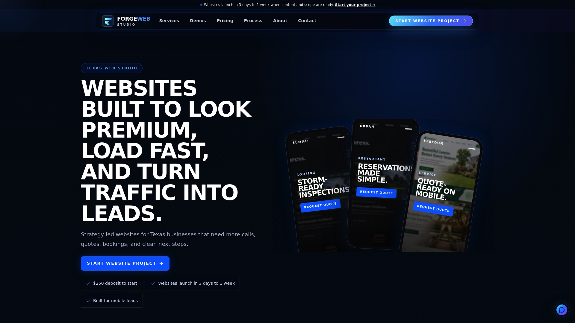
A typical scope includes one dedicated testimonials page, short quote cards pulled from your existing reviews, and one expanded case study if you have a result worth featuring in depth. Plans start with the Starter Website at $500 one-off, with the Growth Website from $1,200 and Custom Business Website from $2,500 depending on scope, and every project begins with a $250 deposit. If you already have a site and just need the proof section fixed, our services page covers redesigns and local SEO work that often ships alongside it. Reach out through our pricing page to scope a testimonial page for your business.
FAQ
What is an example of a good testimonial?
A strong testimonial names a specific problem, the action taken, and a measurable result, such as "we cut onboarding time from two weeks to three days after switching tools." It also includes a real name, title, and company so a reader can verify the source.
What is a testimonial example?
A testimonial is a customer's own statement about their experience with a product or service, usually paired with their name and a measurable outcome. Common formats include a short written quote, a video clip, a social media post, or a longer case study.
How do I write a testimonial?
Start with the problem before using the product or service, describe the specific action or decision that followed, and close with a number or concrete change that resulted. Keep it to two or three sentences and avoid vague praise like "great experience" without a detail attached.
Can you give me some examples of positive customer reviews?
Effective reviews read like "reduced our monthly costs by a specific percentage within the first quarter" or "fixed a recurring issue that three other providers couldn't solve," because both name a concrete outcome. Reviews that only say "excellent service" or "highly recommend" carry far less weight without a specific detail attached.
Sources
- Beyond martech: building trust with consumers and engaging where sentiment is high | Nielsen
- Federal Register: Revised Endorsement and Testimonial Guides (examples)